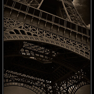
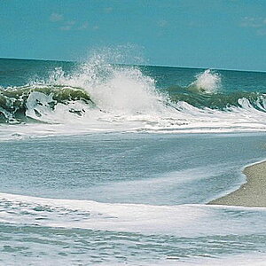
I just feel unconfortable about the light~~~I think the light is too flat on the pic. Unforturnately, I can do nothing on it~~~My DC is totally atomatic~~~
I didn't know if you wanted this in the critique forum or not but I put it here. Let me know if you want it in the general gallery.
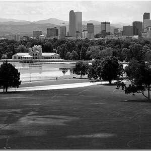
I like this picture ideally and the light, although a little harsh, doesn't really take away from the picture. The only thing that really hurts this picture is the shadow in the front middle. I don't know if that's your shadow but any time I look at it, it's your shadow in my eyes. Other than that, I like the composition and the layout has me looking around the picture for more. Good work!
thank you very much for your opinion~~~!!! hobbes~~~
The shadow is my shadow~~~The original pic of this one has the longer shadow on the pic~~~I have already cut most of them off ~~~may be not enough!
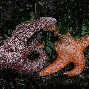
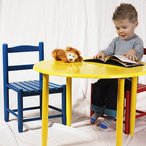
I really love the photo too Shan. The colors are great. I agree with Jon Mikal about the border though. I didn't notice it until he mentioned it....hehe...but then it bugged me. Otherwise really wonderful photo and title.
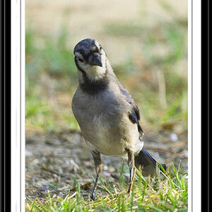
Its not bad, I don't really like the excess on the right side though,
but hey, personal pref....I don't think that other shadow from the guy, looking at the......wall should be there.


![[No title]](/data/xfmg/thumbnail/32/32637-865ab9beec7e00237b64e4fcb8fe947f.jpg?1619735555)