White Flowers in Sepia

PixelRabbit

A naughty little bunny...
Joined
Nov 28, 2011
Messages
6,593
Reaction score
3,719
Location
Ontario
Can others edit my Photos
Photos NOT OK to edit
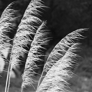
I've been messing around with these flowers trying to make them really pop. There are a couple white ones dispersed in the purple and I kept finding the rich purples in the background take away from them.
I tried B&W and didn't like it much but I like how this one turned out.
Thoughts?

 
Judi, I understsand where you're coming from, as I've been experimenting with B&W, and B&W/color florals myself. I like your composition, especially since it's such a interesting flower. Also your decision to use Sepia rather then B &W is a interesting chocie. One that turned out quite well. On my monitor it seems under exposed compared to many of your own posted pictures. Also the background just seemss a tad to dark that doesn't seem to add anything to the ambiance of your composition.

I tried a quick edit to brighten the background and tone down the brightness and saturation of the flower.

$7006825492_c8298c1cd2_z.jpg
 
Hey Joel, thank you!

I see where you went with the edit and I like that option :) I didn't really see that in it when I was editing, I'm glad you did!

In mine the very dark BG was intentional, I tried to just about obliterate it and make it as dark as I could while keeping the flower as bright as I could (even held my hand above the purple ones back to shade them even more). The one thing I didn't want to do was under expose the flower, which by my monitor it looks good. From some comments I've recieved on a few of my pictures lately I'm wondering if it may be time to recalibrate my monitor.
 
Here it is in colour.

 
Judi, I think most of the issues is that we almost always deal with color rather then B&W or Sepia. After looking at the original color image, I now understand why you made those decisions as to the tonal values of the background. I took the opposite point of view, and tried to make your image look more older and those less saturated, where the range of tones would be a lot less. Softening the white flower just makes it blend as if your picture was taken in the 50s or mid 60s.

Now your color image is just so much more vibrant. The purple flowers add to, not subtract, as the bokeh background works perfectly.

Every monitor/screen that's not calibrated is more a crap shoot then anything else. I downloaded two simple charts that lets me adjust my screen so that I can see the full tonal range from white to black. My graphics card, which is built into the motherboard, doesn't allow me much options or adjustments, so I went with quality rather then fps for gaming.

BTW, if that's your daughter in your avatar, she's adorable.
 
Thanks Joel, two people seeing different potentials in one image is one of the reasons I love photography :)
I'm definitely going to check monitor to rule it in or out as an issue.

My display pic is actually me ;) thank you!
It was taken by my Dad in about 1972.
 
Judi, now that's pretty cool. I'm willing to bet that no one would have guessed it was you.
 

Most reactions

Back
Top