4th of July with the new 5DM3

hmmm.... sorry I tried to help. I won't do so again! :)

Lighten up, Francis. :) If I didn't want feedback I wouldn't have asked. I get that the saturated, cross processed look doesn't suit every sensibility. The positive feedback from credible sources was within the context of a fun, alternative look. YMMV

For a more serious take, how about the revised version?

gsgary, do you think the revision is too saturated as well? The floaty and bathing suit are truly that vibrant. I had to drop the saturation and raise the luminance to keep them from overpowering the scene. Much more and they will deviate too much from what I know to be true.
 
Here is a more conventional view for the haters!

hmmm.... sorry I tried to help. I won't do so again! :)

Lighten up, Francis. :) If I didn't want feedback I wouldn't have asked. I get that the saturated, cross processed look doesn't suit every sensibility. The positive feedback from credible sources was within the context of a fun, alternative look. YMMV

For a more serious take, how about the revised version?

gsgary, do you think the revision is too saturated as well? The floaty and bathing suit are truly that vibrant. I had to drop the saturation and raise the luminance to keep them from overpowering the scene. Much more and they will deviate too much from what I know to be true.

Francis? (Ignored!) :)
 
Last edited:
This has been an insightful exercise if for no other reason than to convince me that I need to calibrate my monitor. Viewing the revision on a family member's monitor I'm noticing problem areas that I did not recognize on my own.

I'd like to get the wide pool view down just right. I'm fairly content with the composition and technical aspects, but the processing has been a challenge. I'll be back when I think I've got it closer to where it needs to be. Appreciate the input.
 
Honestly I don't think you need to get creative with colours. This photo tells a story. I see a cute, happy little girl who is having a blast in the pool with the family. I don't see a need to take away from that.
 
Honestly I don't think you need to get creative with colours. This photo tells a story. I see a cute, happy little girl who is having a blast in the pool with the family. I don't see a need to take away from that.

That's a good point. Trying this again.

7529651608_7978d84de8_c.jpg
 
Honestly I don't think you need to get creative with colours. This photo tells a story. I see a cute, happy little girl who is having a blast in the pool with the family. I don't see a need to take away from that.

That's a good point. Trying this again.

7529651608_7978d84de8_c.jpg


Still a lot of color, looks a bit like HDR
 
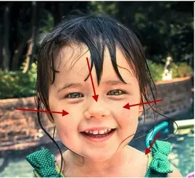
Thanks for the detailed input. I'm really having a difficult time with the face. Her right eye and cheek fell in a shadow and there were bright spots on the bridge of the nose and under the left eye. Specifically where your arrows are pointing. I tried to burn those spots and keep uniform saturation, but as you point out that seems to have "blanched" those areas. Perhaps I was too concerned with "creating" even lighting on the face? Or, perhaps too heavy handed in my efforts to do so?

re: the colors. The scene truly was that vibrant. IIRC, I dropped the vibrance and saturation considerably. I dropped saturation and raised luminance only slightly in the purple, magenta, red and orange channels. I boosted the blues just a bit, but I'm guessing that isn't the problem area. The purple floaty IS truly what you see. The color and vibrance in the most recent revision truly reflects it's real appearance. It is NOT boosted.

I added just a light brushing of saturation to the bushes at top left because they looked rather dull after I dropped global saturation and vibrance. I went over the blue and green pool toys in the background with a heavy desaturation and burn brush to deemphasize them.

I have a tendency to get heavy handed with the vignette. But with a colorful, busy background I thought in this case it would help direct focus toward the subject. I gave additional burning to the fence and trees along the top edge. Too much?

I gave a fair amount of contrast because the face and skin tones just seemed flat. Perhaps, I had made them flat in my effort to even lighting on the face. Then I was having to make up for that in contrast. Taking a step back, maybe I was chasing my tail?

Thanks again for the ongoing feedback. This is a learning process.
 
re: the colors. The scene truly was that vibrant. IIRC, I dropped the vibrance and saturation considerably. I dropped saturation and raised luminance only slightly in the purple, magenta, red and orange channels. I boosted the blues just a bit, but I'm guessing that isn't the problem area. The purple floaty IS truly what you see. The color and vibrance in the most recent revision truly reflects it's real appearance. It is NOT boosted.

This picture just looks way too worked.
It is a good example of a situation where someone perhaps could have shown you a better look rather than trying to get you to one with words.
Your insistence on two things:1) not calibrating your monitor so we don't know what you see and 2) not allowing editing, just short circuits a learning process.
 
I am not averse to others editing my images, I just prefer to have a say in when and by whom. If you or any of those other folks participating in this critique want a go, have at it.
 
Here is a different look.

7538013974_5f39a09823_c.jpg


I'll get an original up, too.
 
I don't know, see what you think:

$new--5.jpg
 

Most reactions

Back
Top