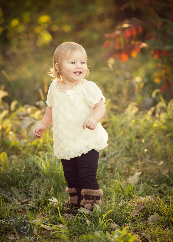
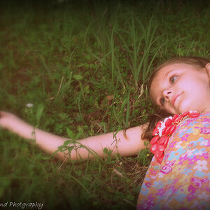
Yeah, like Lew mentioned, the vignette is too much. WHat I liked the most about the first shot, and why I specifically mentioned it being "naturalistic" os that in the original shot, the child is ringed by little highlighted areas of backlighted foliage/grasses. One at her hand, the next at 10 o'clock behind her head, the next at 1 o'clock with the red, one at 3 o'clock,. and then at the 6 o'clcok position, just a couople blades of backlighted grass--with the child LIGHT, and ADVANCING from the background.
In the edit, the darkness at the corners just looks, well, obviously alrtered, manipulated, and the child is overall, much closer in tonal value to the entire background area. The naturalistic, light, airy feeling of the original has been replaced with what looks to me like an "edited" version of reality.
I am not convinced that the original's white balance was off, but then, I do not like scientifically accurate color when it comes at the expense of artistic interpretation, and I'm no longer a big fan of realistic color, especially 15 years into a new century. In fact, I am sick and tired of "accurate color" all the time, on every shot. I'm tired of white balance comments when the intent is obviously to have some type of interpretive color rendering. VPS is dead. Portra is almost dead. Kodakcolor Gold is dead. The MacBeth Color Checker was always annoying. The color looks of the 1980's are dead, long gone. This is the era of Instagram and Hipstamatic; the color in both of these is fine, but the vignette looks like Lightroom one-click vignette, which is why it looks "edited" to me.


 So I was super excited! I had a mother and 2 daughters and just shot these today. My eyes are killing me tonight so here's my only edit so far, I couldn't wait because the cuteness overload got to me.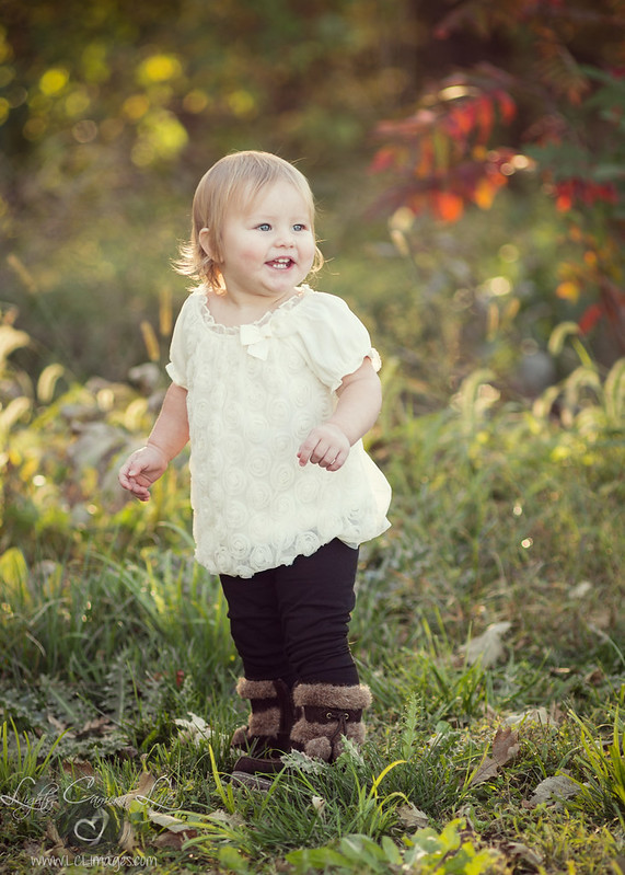


![[No title]](/data/xfmg/thumbnail/37/37137-43b5701b1efb7322c2c9fa6a1e30ccfa.jpg?1734169836)

![[No title]](/data/xfmg/thumbnail/37/37138-63809b91a8061d61d48c541f18a69861.jpg?1734169836)