A trip to the nature park. *warning* Spiders! Let's try this again, I just posted in the wrong forum lol. I deleted the previous info on the last post.
#1 An "Orb Weaver" walking down his web. I decided to take an excerpt from Lightspeed's "How to Book" and he is facing the wrong way!
 Orb Weaver
 by
blackrose1981, on Flickr
I won't comment on macro techniques or spiders as that has been adequately covered by Gibson and LS, but because you pointed me to this thread, I'll make some general composition comments that might give you something to think about.... or not. ")
Not knowing much at all about spiders, #1 is not doing anything for me. I wouldn't know it was a spider had you not told me. So I basically have to look at it as "something" in a spider web. Certainly someone who knows spiders will get more out of it than I. The red color always strengthens the subject so I think the size of the... SOW.... works. But if it's an animal, I want to see eyes. I'm also not fond of the sand in the web. I realize this is not something you have control over without damaging the web, but because they are soft, especially toward the lower left of the frame, bothers me. Perhaps if they were tack-sharp and glistening in the light....
#2
 White-backed Garden Spider
 by
blackrose1981, on Flickr
I think this is a stronger shot. The form is readily identifiable to me (a spider layman) and there are some striking lines and angles there. The subject is well separated from the background and I think the brown sticks(?) in the background contribute to keeping the eye in the frame. I'm not sure I look seeing the underside of the spider, but it still looks pretty good.
#3 a squirrel hiding in foilage, sorta. I'm not sure if I'm going to something about what's in his face yet, I kinda like the foilage/hiding feel this adds..
The white balance is on the blue side. Remember that eye level is usually more interesting because it's not a perspective we are used to seeing. This would be a stronger image imo if you were on the ground shooting level straight at him. Watch the foreground. Those two twigs are effectively cutting him into three parts. Finally, all the green is really jumping out at me but the squirrel is quite subdued as far as color goes. You might want to back off the saturation on the green channel and maybe even do some light burning so that the squirrel holds more weight in the image.
#4 A lone feather. I found this lone feather along this really long trail. Love the detail and the way it contrasted with the ground.
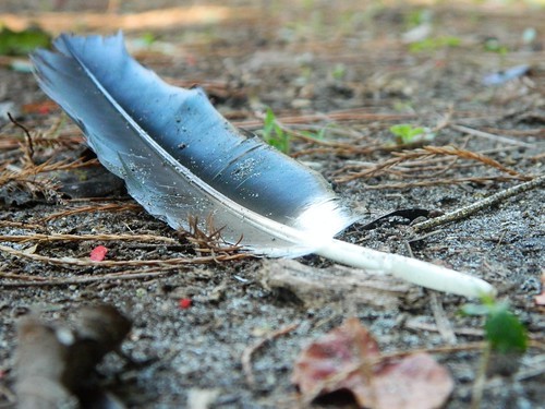 Lone feather
 by
blackrose1981, on Flickr
Not bad. The highlights appear to have lost some detail. I like that you got down low. I like that you composed the feather on a diagonal which makes the image more 'exciting' than horizontal or vertical. It has a good feel to it. It doesn't give me any strong feelings, but it holds my attention well enough.
This was an accident. But technically a *first* self portrait lol. (not really meant for CC).
Awsome.
Sauce.
")


![[No title]](/data/xfmg/thumbnail/38/38722-8003d9d84f1c7164b5c8f2b884c2e428.jpg?1734172598)

