OK, I'll just quickly change the AF area mode... um... oh. I guess I'll have to find the menu for that and lose my artistic train of thought.
The thing about Canon controls is that some are placed for access, some appear to be placed at random and none are placed for logic. Four round buttons in a row on the top-right screams of an engineer's design, not a photogapher's one. I can access these controls, but I think to actually think about what I'm accessing and forget about the artistic process for a moment. Ugh.
For example, what does metering have to do with white balance? Why is it on the same button? Same thing goes for for ISO and flash exposure compensation: what are they doing together? Yes, I understand they do affect eachother, but they do not have a direct and frequent relationship like, say, metering and AE-L. AF/Drive, I can understand, but I would bet that it's a successful mistake and not a deliberate design.
What is the power switch doing way the heck down there? And why has it been made in the most frustrating, awkward angle to use and given the tightest, most unnatural feeling tolerance?
The back wheel is OK, but the top wheel is painful to operate because it's too rigid and has too tight a tolerance to be operated right beneath the top joint of your index finger. That little control nub on the back always feels like it's going to cut my thumb open.
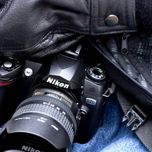
Now, let's take the D300 has the Nikon example, as most tend to agree that it's the standard for Nikon ergonomics. As I see it, these controls are designed in primary, secondary and tritary groups.
First, you have the power and backlight switch wrapped around the shutter button, where your index finger automatically places itself. Just behind that is the frequently-used mode and exposure compensation buttons. The control have just the perfect weight, tolerance, feel and placement. One under your thumb, one under your middle finger.
All of the AF stuff is right under your thumb: area mode, point selection, point lock, AF-L/AE-L (which is aligned so it intersects perfectly with the exposure controls and AF controls). The controls all have a distinct feel, so it's very easy to know what you're adjusting without looking at them. The lesser used AF-ON button is placed in a location where you won't naturally move your thumb, which is perfect so that it doesn't get in the way when are ignoring it most of the time.
QUAL/WB/ISO/DRIVE ... all secondary controls are placed off to the top left, where you'll think about them in a secondary way. And these controls have secondary functions themselves, in exactly the priority you think about them, using the front control wheel. Perfect.
The tritary controls (menus, viewing pictures) are all placed off the back left so that they are completely out of your way when you're shooting.
Don't get me wrong, this makes no difference to the pictures you make. But it may make a difference to the pictures you won't make because you spent the peak moments fiddling around with menus and illogical controls.

I want the 1DMk4 really-really bad.

 ) but for the record i can change my WB, and iso by using my right hand. yeah its true my camera might be upside down or on a table but i can do it :thumbup:









![[No title]](/data/xfmg/thumbnail/38/38444-6063bb59cb410c520a1ccccbe58db9c7.jpg?1734172308)