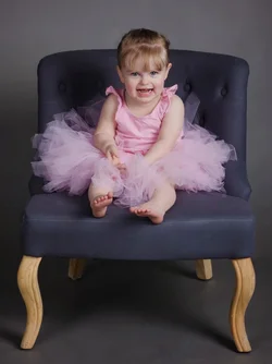
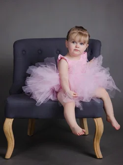
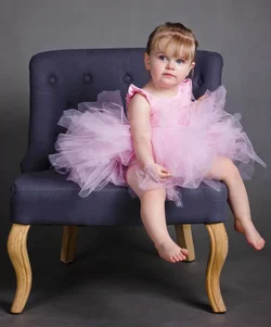
I think this needs simply "more space" around the chair and child. Which might be tricky to achieve for a number of mostly technical reasons associated with APS-C sensors, angle of view, and 9-foot backgrounds in home studios...
ANyway, the chair is very large compared to her, and the chair is kind of close to the edges of the frame on all sides, leading to a cramped feel. This aesthetic, of "living room furniture shown on studio seamless backdrop" is relatively new, and I have seen some good examples of it. What makes this trope work is having some of the "studio seamless" shown in the photo...that's not occurring here...the chair is just jammed into the picture area, with no space to breathe. The CHAIR is so,so big that it dominates the entire frame space.
You could take shot #2, and frame it square, and put a border around it. Might work best that way, square format, bordered. Or even...dare I say it, Instagrammed????????
Lighting is okay, I guess. I think the fill light is too strong though, and is actually casting a leg shadow on the chair, and also lighting up her ear on the left side. Basically, the chair leg shadows show two mights, fairly close in total power, sort of cross-lighting the set not with main and fill, but two dueling main lights. Just 'okay'. Getting rid of the fill light entirely, and having just ONE shadow direction would probably light this scene and her and her tutu in a better, more "arty" manner. JUst one guy's opinion though.