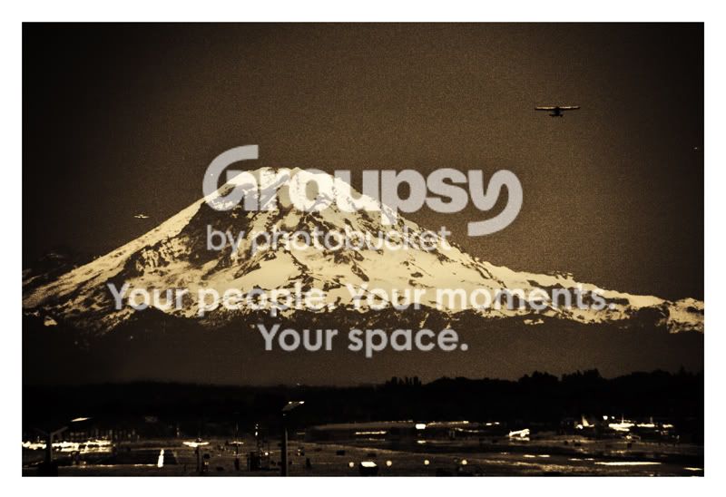
I tend to look foward to your posts because I think you are one of the Meisters on this forum with respect to post processing. I feel a bit amiss or maybe ambivalent about this one. The grainy-ness seems to work in the sky, but I don't see it throughout which would seem more appropiate. I think that maybe it's the grainy-ness that shows up between the tree-line and the bottom of the slopes of the mountain that has the void that makes it seem disjointed. The white specs (2x) to the left of the mountain seem to be just floating about and not contributing. I like the sepia tone. Sorry I can't be more help or hinderance.



 As in the Space Shuttle and International Space Station; Boeing. Oops.