What's new

c&c needed, horse in the field

mmaria

Been spending a lot of time on here!
Joined
Sep 4, 2013
Messages
6,494
Reaction score
2,991
Location
Wonderland
Can others edit my Photos
Photos OK to edit
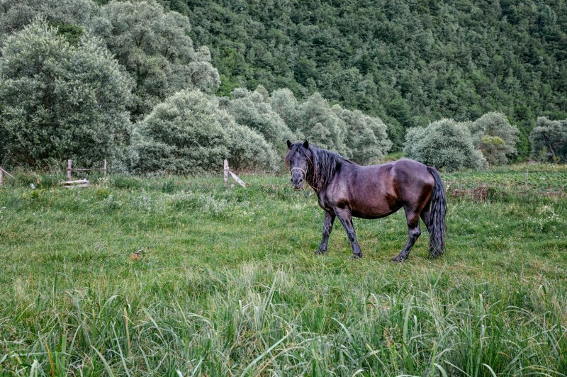
I always struggle with editing green, whatever I do it doesn't seem right... it always look oversaturated to me, and when I desaturate it, it doesn't feel right... so, I'm clueless

Could you critique this/help me?

280614_0108-Large-800x532.jpg
 
The horse looks RICH in color! The greens-- the trees, the reeds, and the grass, all of the greens look a bit dim...needs more luminosity and more saturation in all of the greens I think. Not a lot more, but at least 20% more.
 
The horse looks RICH in color! The greens-- the trees, the reeds, and the grass, all of the greens look a bit dim...needs more luminosity and more saturation in all of the greens I think. Not a lot more, but at least 20% more.
lol, I told you so... I always have problems with green (red and pink also) I just can evaluate the right saturation

The composition is good.
well at least I did that right ;) It was quite interesting being there, I can't remember the last time when I was that close to a horse
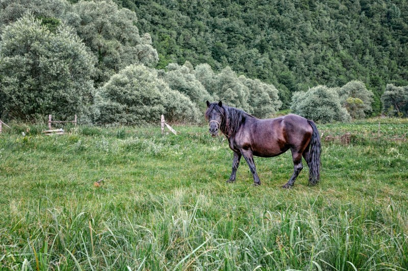


I just changed the opacity of one curves layer to 100%. better now or it needs more?


280614_0108-Large-2-800x532.jpg
 
Remember there are countless shades of green in the universe and use that knowledge. You have at least 4 or 5 of them. That horse needs to back up from the buffet line, however.
280614_0108-Large-800x532copy_zpsf4a2c833.jpg
[/URL][/IMG]
 
^^i think the above explains the point a little bit too much...i.e a little too much saturation, but it is true it is a bit undersaturated in colors.

I feel the composition is very well done. The various shades of green throw things off although.
 
ok people... now?

280614_0108-Large-3-800x532.jpg
 
Last edited:
The various shades of green throw things off although.
any kind of green makes me :grumpy: because I really can't be objective. Other colors are a bit easier but gren grrr... I completely depend on your eyes guys ;)
 
Have you done much to the horse? To my eyes it looks like you've adjusted the lighting, contrast and saturation on the horse to the point where its gone beyond the grass in the "normal" exposure of the scene. So when you're then trying to bring the grass up to match the horse you have to go into the "unreal" levels a little - however the grass looks far worse when bumped up the same levels.

Tone the horse back and then try again to balance the two
 
Have you done much to the horse? To my eyes it looks like you've adjusted the lighting, contrast and saturation on the horse to the point where its gone beyond the grass in the "normal" exposure of the scene. So when you're then trying to bring the grass up to match the horse you have to go into the "unreal" levels a little - however the grass looks far worse when bumped up the same levels.

Tone the horse back and then try again to balance the two
I haven't done that much to the horse really... but yes, I do see what you're saying... I guess I need to look at it with fresh eyes tomorrow.


Thank you all!
 
oh guys.... is it ok now?

280614_0108-Large-4-800x532.jpg
 
Try boosting the yellows.
 
I have a hard time adjusting colors. I can't look at it too long or else I completely lose a sense of what color I'm even looking at!

There are different shades of green in this: the grass has more of a yellow undertone while the trees in the background have more blue. It makes it tricky to adjust. I have no idea how to adjust those independent of each other AND of the horse, since he looks really vibrant.

I'm wondering about a simple contrast boost. It's hard to put my finger on what I want, because the colors look pretty good to me in that last edit, and the horse is gorgeous and the composition is lovely...but it's missing something. Perhaps the light is too even? I find myself wanting to see the horse more clearly, which is odd since you'd think that the horse would already stand out. Maybe it's just a matter of a tighter crop?

I'm ever so helpful ;)
 
Oh Leonore, I soo understand you :lovey: thank you!

I've just used hue/saturation adjustment for boosting saturation slider first time ever! I use the saturation slider to desaturate everything and change lightness and hues.

It wouldn't ever cross my mind to boost yellow runnah, so thank. In ps it looks better but here I don't know... I'm a bit frustrated at this point. That small thing and that many times to adjust!
 

Create an account or login to comment

You must be a member in order to leave a comment

Create account

Create an account on our community. It's easy!

Log in

Already have an account? Log in here.

Back
Top Bottom