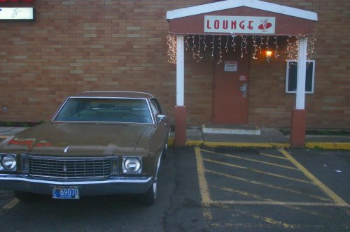
I feel that it is cropped too tight. The edge of the car is cut off and the top of the roof peak is cut off. There is something in the top left corner...but what is it?
The colors are muted but that seems to fit the subject. The exposure seems a dark to me, and it looks like it could use some sharpening.
It does have a certain feel to it...especially if you are familiar with this kind of place...looks like a hotel/motel bar to me.
I agree about the crop being too tight...maybe a black and white or sepia tone to it would fit a bit better, b/c the coloring in this doesn't really seem to work for me. It also seems to be slanting downhill just a little bit...
I am going to have to agree with all of the above regarding croppingand as eromallagadnama said, I really think this picture would work inB&W with some good contrast.

")

![[No title]](/data/xfmg/thumbnail/42/42461-e2a94a39b9483a804af86010fc52244b.jpg?1619740192)


![[No title]](/data/xfmg/thumbnail/35/35946-771bfce9b2727c9126587d96c471da80.jpg?1619737254)