NancyMoranG
Been spending a lot of time on here!
- Joined
- May 9, 2012
- Messages
- 2,881
- Reaction score
- 1,054
- Location
- Anywhere we want! Just us And the RV
- Can others edit my Photos
- Photos OK to edit
I don't post photos much but I like the concept here and want to make it a better shot.
My photos are OK to edit !
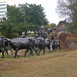
It started to rain on me and I did remove quite a few drops from image. I got here without any time to set up or ponder about the shot. I can go back to this location again.
what should I do different and in pp?
I never feel like I get clear/sharp photos like all of you?!
thanks.
.jpg")
My photos are OK to edit !
It started to rain on me and I did remove quite a few drops from image. I got here without any time to set up or ponder about the shot. I can go back to this location again.
what should I do different and in pp?
I never feel like I get clear/sharp photos like all of you?!
thanks.
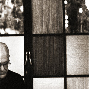
") Honestly, I've seen this Karsh image held aloft as a pinnacle of sharpness, but if you really look you'll see (even at this low res) just how little is actually in focus (clue - look at the jacket and you'll see the depth of focus clearly):
Honestly, I've seen this Karsh image held aloft as a pinnacle of sharpness, but if you really look you'll see (even at this low res) just how little is actually in focus (clue - look at the jacket and you'll see the depth of focus clearly):