What's new

Cover girl

Luiz

TPF Noob!
Joined
Sep 30, 2011
Messages
14
Reaction score
0
Location
São Paulo Brazil
Can others edit my Photos
Photos NOT OK to edit
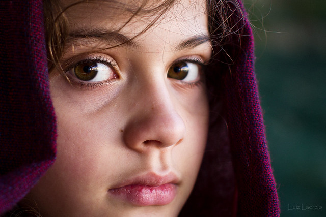
Hello everyone, this is my first topic and I hope you like ... (tribute Steve McCurry)
Critiques and comments always welcome
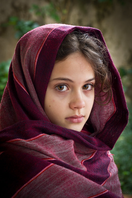


Scialle Rosso por Luiz L., no Flickr
 
Last edited:
Pretty good reproduction of the afghan girl.
 
nice connection with her eyes. Something is missing and for the life of me can't place it, perhaps a bit too much DOF? The shot is sharp and composed well, it just lacks the 'mood'. Sorry I am caught with a lack of words.
 
Very well done. I think maybe the lacking mood Trever is seeing is caused because we know it's not "her"?
 
OK, I figured it out and yes DOF is a big part of it.

Steve McCurry Photography

Look at his portrait shot, the first one with the girl in a blue robe and yes, the DOF is very small, a few inches by the looks of it. Also noted is the grime on her face which makes the shot so spellbinding. Her eyes so bright and clear in comparison the the hardship of her life .... well that's how I see and feel about his shot there, which btw I had never seen before.

I'm not knocking your shot at all, I just put a finger on what it was that I felt would/could improve to give me a better connection with the subject.


EDIT #10/95 of his portraits is the one you were inspired by. His work is really damn good. Thanks!
 
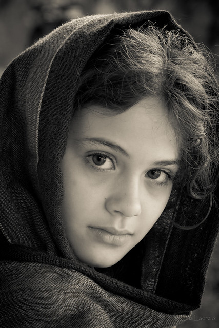
I think that this would look great as a high contrast B&W :)
 
Looks good but something is a bit off to me. Obviously this is just my opinion but perhaps a bit of fill on the left to take out the light shadow and her left eye seems crammed in the corner, a slight turn to pull her eye out would help. Again my opinion as a amatuer.
 
OK, I figured it out and yes DOF is a big part of it.

Steve McCurry Photography

Look at his portrait shot, the first one with the girl in a blue robe and yes, the DOF is very small, a few inches by the looks of it. Also noted is the grime on her face which makes the shot so spellbinding. Her eyes so bright and clear in comparison the the hardship of her life .... well that's how I see and feel about his shot there, which btw I had never seen before.

I'm not knocking your shot at all, I just put a finger on what it was that I felt would/could improve to give me a better connection with the subject.


EDIT #10/95 of his portraits is the one you were inspired by. His work is really damn good. Thanks!


What you said and the eyes. The eyes are lacking something. For some odd reason I'm not pulled into them. I think it may be the size of her pupil. In #10/95 her pupil is quite small and the contrast between eye color and her wrap pulls you into the eyes more. Maybe try different color headwraps.
 
photo is good but the scene feels like it needs something more on the postprocessing.
 
If we are comparing this shot to the Steve McCurry shot...there are some important differences. As pointed out, the DOF and the size of the pupil/iris...but mostly, I think it's lighting.

The Afghan Girl is very side lit (from being inside a tent or shed, if I recall). The light on her face fades off very smoothly (soft light) but also notice the ratio. The left side of the face (on McCurry's shot) is completely in shadow. The shot we have here, does have side lighting, but the transition (lighting pattern) isn't the same the the ratio is not nearly as dramatic.

And of course, I think the thing that captivates us with The Afghan Girl, is that the white area of her eyes are so strikingly bright, which is in strong contrast to the rest of the photo...and her irises are also quite bright, plus they match the background, which helps.
 
OK, I figured it out and yes DOF is a big part of it.

Steve McCurry Photography

Look at his portrait shot, the first one with the girl in a blue robe and yes, the DOF is very small, a few inches by the looks of it. Also noted is the grime on her face which makes the shot so spellbinding. Her eyes so bright and clear in comparison the the hardship of her life .... well that's how I see and feel about his shot there, which btw I had never seen before.

I'm not knocking your shot at all, I just put a finger on what it was that I felt would/could improve to give me a better connection with the subject.


EDIT #10/95 of his portraits is the one you were inspired by. His work is really damn good. Thanks!


What you said and the eyes. The eyes are lacking something. For some odd reason I'm not pulled into them. I think it may be the size of her pupil. In #10/95 her pupil is quite small and the contrast between eye color and her wrap pulls you into the eyes more. Maybe try different color headwraps.

I agree, I think it is the lack of the eyes "popping" that is throwing people off. I think the lack of grime is a secondary reason why it seems off. Good composition and exposure though.

Oh, also what Mike said about the direction of lighting. :lol:
 

Create an account or login to comment

You must be a member in order to leave a comment

Create account

Create an account on our community. It's easy!

Log in

Already have an account? Log in here.

New Topics

Back
Top Bottom