Navigation
Install the app
How to install the app on iOS
Follow along with the video below to see how to install our site as a web app on your home screen.

Note: This feature currently requires accessing the site using the built-in Safari browser.
More options
You are using an out of date browser. It may not display this or other websites correctly.
You should upgrade or use an alternative browser.
You should upgrade or use an alternative browser.
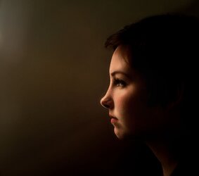
Critique My First Photo
- Thread starter ldawson
- Start date
- Joined
- Jun 9, 2013
- Messages
- 20,580
- Reaction score
- 12,709
- Website
- moderndinosaur.wordpress.com
- Can others edit my Photos
- Photos NOT OK to edit
I think it's a strong portrait, although I would definitely crop much of the dark space on the right side of the frame. I'd be curious to see a square crop.
OP
OP
ldawson
TPF Noob!
- Joined
- Oct 29, 2017
- Messages
- 2
- Reaction score
- 5
- Can others edit my Photos
- Photos OK to edit
I think it's a strong portrait, although I would definitely crop much of the dark space on the right side of the frame. I'd be curious to see a square crop.
something along the lines of this?
Attachments
- Joined
- Jul 8, 2005
- Messages
- 45,747
- Reaction score
- 14,806
- Location
- Victoria, BC
- Website
- www.johnsphotography.ca
- Can others edit my Photos
- Photos OK to edit
Very nicely done. I really like the lighting here, and Limr's recommendation for the square crop is spot on.
- Joined
- Jun 9, 2013
- Messages
- 20,580
- Reaction score
- 12,709
- Website
- moderndinosaur.wordpress.com
- Can others edit my Photos
- Photos NOT OK to edit
I think it's a strong portrait, although I would definitely crop much of the dark space on the right side of the frame. I'd be curious to see a square crop.
something along the lines of this?
Yes, I think that works better. The negative space behind her head in the original didn't seem to serve much purpose.
birdbonkers84
Been spending a lot of time on here!
- Joined
- Jan 17, 2017
- Messages
- 1,246
- Reaction score
- 768
- Can others edit my Photos
- Photos NOT OK to edit
Welcome to the forums, I really like the image, agree with Limr's feedback too ")
Designer
Been spending a lot of time on here!
- Joined
- Apr 13, 2012
- Messages
- 18,505
- Reaction score
- 4,853
- Location
- Iowa
- Can others edit my Photos
- Photos OK to edit
Unless, of course, she has a stylish hairdo. In which case, you need that extra space, and a "hair light". Since a hair light is a specifically calibrated and aimed light, it might detract somewhat from the mood of this shot.I am a new photographer and i really need some constructive criticism Please feel free to give tips and tricks so I can improve. FIRE AWAY
At any rate; what this shot needs is some separation between your model and the background, and you can do that by hinting at some faint light on the back of her head. Or a rim light on the back of her head.
Anyway, you can keep the mood by cropping a lot of the right edge, such as you did in the square crop. The problem with your version of the square crop is that you've actually cropped into the back of her head, which is disconcerting to a viewer. We know the sizes and proportions of a human head, and you've indicated that this young lady might have some physical deformity causing an abbreviated head shape.
Here's my version:
I brought the shadows up a bit so we could see the shape of her head, and then cropped to (almost) square putting her eye on the "thirds". I liked the bit of light on her neck, so I wanted to keep all the neck I could get. That left me with a not-quite square crop.
- Joined
- Jun 9, 2013
- Messages
- 20,580
- Reaction score
- 12,709
- Website
- moderndinosaur.wordpress.com
- Can others edit my Photos
- Photos NOT OK to edit
I don't necessarily disagree with Designer's reasons or edit, but for me, it just makes it an entirely different kind of portrait.
FITBMX
Been spending a lot of time on here!
- Joined
- May 11, 2014
- Messages
- 3,860
- Reaction score
- 1,423
- Location
- Burns, KS, USA
- Can others edit my Photos
- Photos OK to edit
I would like this portrait as much if it had a backlight, I like the lighting in this a lot! And the square crop is spot on!
Great work, and welcome to TPF!!!
Great work, and welcome to TPF!!!
stevebohne
TPF Noob!
- Joined
- Oct 29, 2017
- Messages
- 10
- Reaction score
- 5
Unless, of course, she has a stylish hairdo. In which case, you need that extra space, and a "hair light". Since a hair light is a specifically calibrated and aimed light, it might detract somewhat from the mood of this shot.I am a new photographer and i really need some constructive criticism Please feel free to give tips and tricks so I can improve. FIRE AWAY
At any rate; what this shot needs is some separation between your model and the background, and you can do that by hinting at some faint light on the back of her head. Or a rim light on the back of her head.
Anyway, you can keep the mood by cropping a lot of the right edge, such as you did in the square crop. The problem with your version of the square crop is that you've actually cropped into the back of her head, which is disconcerting to a viewer. We know the sizes and proportions of a human head, and you've indicated that this young lady might have some physical deformity causing an abbreviated head shape.
Here's my version:
I brought the shadows up a bit so we could see the shape of her head, and then cropped to (almost) square putting her eye on the "thirds". I liked the bit of light on her neck, so I wanted to keep all the neck I could get. That left me with a not-quite square crop.
View attachment 148928
Mmmmm...the subject is past the middle of the frame. Don’t cate for that composition at all. I agree with the comment about separation but the biggest problem is that the main light is too high. A little lower would have resulted in a better catchlight in the eye.
Sent from my iPhone using Tapatalk
DGMPhotography
Been spending a lot of time on here!
- Joined
- Mar 23, 2012
- Messages
- 3,160
- Reaction score
- 718
- Can others edit my Photos
- Photos OK to edit
Dang, if this is your first-ever portrait, you're gonna pass all of us up in no time.
Good work.
I think it would have been nice to add just the TINIEST bit of hair light, and keep your original crop.
I wonder what this was shot with?
Good work.
I think it would have been nice to add just the TINIEST bit of hair light, and keep your original crop.
I wonder what this was shot with?
Last edited:
Frank F.
engineering art
- Joined
- Oct 24, 2016
- Messages
- 2,022
- Reaction score
- 1,081
- Location
- Bonn
- Can others edit my Photos
- Photos OK to edit
Strong composition, yet I do not think she will be very happy with it because: light that illuminates a surface in a very flat angle will bring out the surface structure prominently. Great for wood not so great for skin that has the slightest unevenness.
+1 for Leonore's 1:1
Did an edit and had trouble with JPEG Artifacts in the file I could not get rid of. So I chose to cover the artifacts with artificial noise...

+1 for Leonore's 1:1
Did an edit and had trouble with JPEG Artifacts in the file I could not get rid of. So I chose to cover the artifacts with artificial noise...
Last edited:
Frank F.
engineering art
- Joined
- Oct 24, 2016
- Messages
- 2,022
- Reaction score
- 1,081
- Location
- Bonn
- Can others edit my Photos
- Photos OK to edit
@DGMPhotography It is nice if you say, why you disagree for all of us to learn...
Most reactions
-
 399
399 -
 304
304 -
 282
282 -
 266
266 -
 253
253 -
 202
202 -
 188
188 -
 188
188 -
 178
178 -
 158
158 -
 139
139 -
 136
136 -
 127
127 -
 118
118 -
 93
93
Similar threads
- Replies
- 7
- Views
- 386
![[No title]](/data/xfmg/thumbnail/34/34065-43f99c081a04bd087c00711d2fe010ee.jpg?1619736261)