lizzmc4
TPF Noob!
- Joined
- Dec 5, 2013
- Messages
- 12
- Reaction score
- 1
- Location
- Anna Maria, FL
- Can others edit my Photos
- Photos NOT OK to edit
Follow along with the video below to see how to install our site as a web app on your home screen.

Note: This feature currently requires accessing the site using the built-in Safari browser.
")
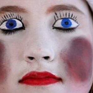
I think you need to stop down a little. You're having trouble nailing focus, I think. The eyes all seem a little soft in these. Not *horrible* but a bit soft. As noted, there are some overexposure problems, I think you're going for a "light, airy" look but you wind up just blowing out highlights all over. A more gentle touch, and the use of a curves of similar adjustment in post-processing will accomplish the same thing but is a less graphically severe way.
I am trying to get passed the watermarks ( Seems like you are not really interested in advice; it's more like you are trying to advertise yourself. )
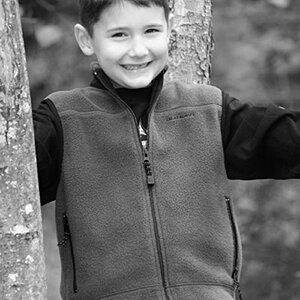
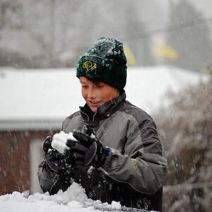
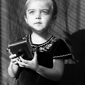
OK I'll be a little blunt. Kids are cute. #1 and #3 the subjects and poses are adorable. the giant watermark is a huge distraction. Both are really contrasty. Color is slightly off in #1, #3 could be a bit warmer. #2 does nothing for me


![[No title]](/data/xfmg/thumbnail/36/36677-3b91df53323d0850489794f28b3b9800.jpg?1619737677)


![[No title]](/data/xfmg/thumbnail/41/41796-690c109012575e084970902dbd3894ba.jpg?1619739896)