C&C per req:
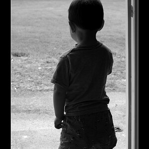
1. Nice image, good pose and lighting however the majority of the boy is slightly soft. You've got the face sharp which of course is the most imporant thing, but a slightly greater DoF would have rendered his arms and legs into crisp focus making for a (IMO) stronger image. Also be careful to avoid cropping little bits of people; in this case his left toes. If you need to crop the actual person, always do it boldly, and never at/near a joint if you can avoid it.
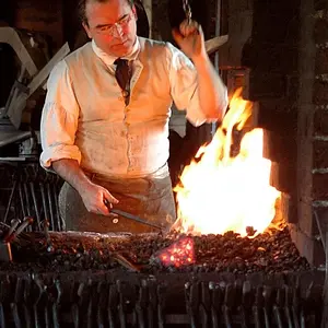
2. I really like this one; an excellent pose/background, good lighting and great expressions, once again though, portions of the boy seem just a little soft. I would also consider cropping just a bit more off of image left to eliminate more of the roof of the building in the background.
3. Nice; here again I think a little cropping, in this case the top of the image, to remove the background distractions and note that you've sliced off just a bit of her kneecap.
4. Very good use of natural lighting. I'm not especially fond of the building in the background, but that's minor.
5. Good; this one should be leveled. You've got it on just a slight angle which isn't really enough to be deliberate or artistic. As well he's lost some more toes.
Overall a very nice set of images, with only very minor thoughts for improvement.
Just my $00.02 worth - your mileage may vary.
~John



 Over-all great job!!





![[No title]](/data/xfmg/thumbnail/35/35266-f58b019dadff6920c09071a847f052c3.jpg?1734166927)