Family Session CC

hmreyna

TPF Noob!
Joined
Apr 13, 2015
Messages
21
Reaction score
5
Can others edit my Photos
Photos OK to edit
Hello all!!

I was looking around online for the right kind of forum for good, helpful cc constructive criticism because I feel like the skin color has been off on all my sessions. I hope this is the right place to post, but if there is another forum you can recommend, please feel free to post that forum/site!!

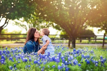
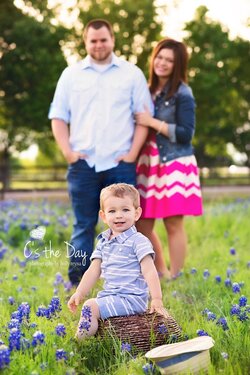
So, I use an expodisc for custom white balance on 90% of sessions. For some reason, my white balance has been completely off for sessions even with the expodisc. I've always struggled with skin coloring and the expodisc does help, but it also has a yellowish tint. Anyway, here is an example of a little bluebonnet mini session I shot this weekend. You can see on some of the pictures that the little boys skin color is way off, like he looks dead or something. I would LOVE helpful cc and how in the heck I can fix the 'off' skin color!

I know this is a lot of pictures for cc, and I'm not looking for criticism on my style, really I just know my skin coloring or coloring in general is off on some of them and helpful advice on how to fix it would be GREATLY appreciated!

Thanks so much!
Holly

web10.jpg
web11.jpg
web14.jpg

Holly
web1.jpg
web2.jpg
web3.jpg
web5.jpg
web6.jpg
web8.jpg
web7.jpg
web13.jpg
web9.jpg
web10.jpg
web11.jpg
web14.jpg
 

Attachments

  • web10.jpg
    web10.jpg
    182.7 KB · Views: 110
  • web11.jpg
    web11.jpg
    244.8 KB · Views: 131
  • web12.jpg
    web12.jpg
    191.4 KB · Views: 119
Last edited:
Lots of photos, so I'm not going to comment on all. Generally, I like the shots. Nice colors. Few comments:
  • I understand the 'lens flare', but it's in every. single. shot. Also, it's on the left in some shots and on the right in others. Too fake for my tastes. I'd suggest removing it in some of the shots. Or, at the very least, tone it down.
  • web8 is a good shot; however, I'd suggest portrait or at least cropping the mom out on the right.
  • IMO, web7 is cute, but it doesn't seem like it should be included as a deliverable.
  • The hat in front of the boy in web12 is distracting.
  • web1 and web6 are my favorites, and where I think the 'lens flare' works best.
 
This one is sure a nice family shot! http://www.thephotoforum.com/attachments/web12-jpg.98811/

And this one too is lovely http://www.thephotoforum.com/attachments/web2-jpg.98801/

Your color is pretty consistent on the skin tones, and it does not look outrageously out of the norm; color film and color materials change from era to era...this doesn't look like Kodacolor Gold 100, or VPS, or Portra...it looks like 2015 digital SLR color. I do see that the bluebells have different degrees of color saturation on some shots, like on this shot:http://www.thephotoforum.com/attachments/web6-jpg.98805/ which does not look quite natural or expected because the left side of the frame here on Web6.jpg has a strong lens flare or flare effect, which would tend to wash out the color, but instead, the blue there on that flare side is a bit intense. I would go to Selective Color in PS, or to the HCL panel in Lightroom, and work with the blues a bit to get them a bit less-intense, and so they match a bit more closely with the lower left side in this gorgeous shot, web 2: http://www.thephotoforum.com/attachments/web2-jpg.98801/

But overall, the color in this set looks about like what a lot of younger people will be expecting. This set has lively, vibrant color. If there's a color that's too intense, it would be the pink of her dress, which is very powerful. But then again, it looks great on her, and she's got a perfectly coordinating lipstick on...

I think the way you handled the afternoon backlighted conditions is simply gorgeous. Really,really lovely. And you did a fine job of showing off their joy as parents of a toddler boy. I might tilt #11 to the right to eliminate the dutch tilt, and sacrifice the right hand side tree in the background, and have daddy become the visual support for the little boy...that could work too. There are so many shots here, it's cumbersome to view them since they are uploaded as thumbnails, and so sequential, immediate viewing of them is not an option w/o downloading them and then slide-showing them.

I don't get the idea that the boy "looks dead" in any of these...he's a toddler...he's young...his skin is not all UV damaged by years outdoors...his skin tone looks reasonable. This is digitial SLR color 2015, and this is not a J. Crew catalog with 100% color matching accuracy spelled out in the contract. This set looks, generally very good, with just a tiny thing here or there.
 
What do you think is wrong with them? Which way is the color off?
 
Welcome to the site. I struggle with skin tones as well but have improved.

To me these look like they could use a little warming up. But the faces seem to lack texture in them, are you smoothing the skin?

I would suggest getting a x-rite color passport and using it. It has a wb side and a side to help with color balance and will help you warm up or cool down a photo. I've only had mine a few weeks but I love the difference. (I was using an expodisc before this. still have it.)
 
As a side note; please do not post the same issue/images in two different forums.
 
Designer, okay like image 4 and 5, you don't see the color being off. It's the hue or saturation or something that doesn't look spot on. Even number 6, to me he looks too peachy. I've tried to warm it up, then it looks too yellow, I'll take out the yellow, then he'll look cyan. I'm just struggling with getting skin tone spot on and looking for suggestions on how to improve. Ronlane, someone has suggested the x-rite color passport to me before. Is it easy & VERY fast to use? With the expodisc it only takes me seconds to get a custom white balance.
 
YES, editing the post and putting the images in as full-size really helps, making it possible to see the photos side-by side with preceding and following images to compare against. Thank you for the update to your OP. Seeing the shots this new way makes it much easier to view this as a set of images, and not 14 tiny postage stamp-sized thumbs. As far as the lens flare effect, you always kept it on the left hand side, and the location/origin of it looks realistic, since that is where the evening sun was coming into the scene from, so that helps a lot. And, if this client loves flare, well...there you go.
 
Designer, I apologize for that. I wasn't sure which forum to use, as I asked in my original post, I was looking for the correct forum to get the most helpful cc. Also, if anyone could point me in the right direction for the best feedback for family photography, I'd love that! :)
 
Last edited:
Wow. Thank you both so much for the great cc! I do have a style of working with a lot of lens flare, and I know my clients, especially this one, LOVES it, so I did make it pop for this session. Although you're so right on, I need to not put it in every.single.image. Thank you for that, something I definitely need to work on. The hat in 12 does need to be cloned out!!

Darrel, image 6 is one I was struggling on with the color. I would remove the yellow and then he looks cyan. I would remove that and he looked dead. lol. Then I would add some warmth and it would be too peachy. I am so nit picky with my skin coloring, I always feel like it's off. So thank you for the comment! Also, I changed them to full image so hopefully viewing them is much easier!!
Thanks for being so understanding of the feedback! :smile:

#10 has the flare on the right. Maybe try removing it, and seeing how it looks. I realize, that if you put it on the left, it'll pretty much go right over the mom/child. Aside from that, it's a great set, and I'm sure they'll love them.

ETA: also, where did the hat come from? I don't see it in any of the other shots? :lol:
 
You just open it and have the person hold it in front of their face. Take a photo and set custom wb like you do with the expodisc. Then you can flip it and take a second photo for the color. An extra photo is worth it, for piece of mind. (Or it is to me.)
 
Wayday! Yes! I really need to hear what I need to do to improve! I'm struggling lately!!

Mom pulled out the hat about halfway through our sesh and her little boy would absolutely NOT keep it on his head and she kept asking for me to try again!! haha
 
OP: I've merged your two threads into on in the 'People Gallery' as it's the more appropriate. In future, please do not cross-post or start multiple threads on the same topic.

Thanks!
 
So the extra photo is taking a picture of the same thing? Or what do I take a picture of? I see all those colors on the color passport so what do I do with those? Maybe I need to start on thread on how to work it?! I will absolutely purchase for peace of mind and getting a perfect white balance. I also have the whibal card and use that one for indoor studio sessions. When I use the expodisc for studio lighting it's WAY too warm. Weird.
 
Designer, okay like image 4 and 5, you don't see the color being off. It's the hue or saturation or something that doesn't look spot on. Even number 6, to me he looks too peachy. I've tried to warm it up, then it looks too yellow, I'll take out the yellow, then he'll look cyan. I'm just struggling with getting skin tone spot on and looking for suggestions on how to improve.
Actually, no, I don't see that the skin tones are way off, but I've not seen these people in person so it's hard to say. One way to make sure the WB is correct is to select an area that you know is white, like those white stripes in the child's onesie. I think that is what the expo disc is supposed to do, although I have not used one myself.
 

Most reactions

Back
Top