
PixelRabbit
A naughty little bunny...
- Joined
- Nov 28, 2011
- Messages
- 6,593
- Reaction score
- 3,719
- Location
- Ontario
- Can others edit my Photos
- Photos NOT OK to edit
EDIT 12/12 **New bird image added at end**
Hi All, I just got my first DSLR less than a week ago. Canon 60D with 18-200 lens")
I immediately realized exactly how much I have to learn! So I'm going to jump in with both feet right off the bat and ask for some input on my three fav pictures I have taken so far.
Thanks in advance for your replies and input
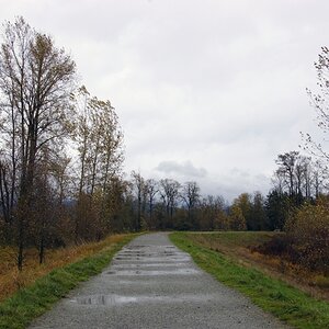
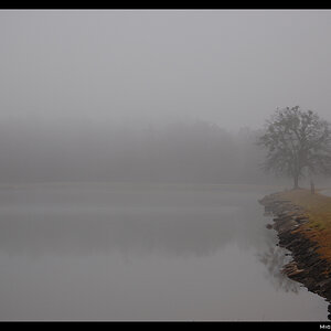
First one it was dreary outside yesterday and my faithful sidekick Miss Gabby and I went for a walk around the property to try to find some colour amongst the decay before winter sets in. I like the photo but feel it would do well with more light.

This one I love the bird but don't like the overall composition, I needed to get the entire "feeder" he is sitting on and perhaps taking the shot from a higher angle?

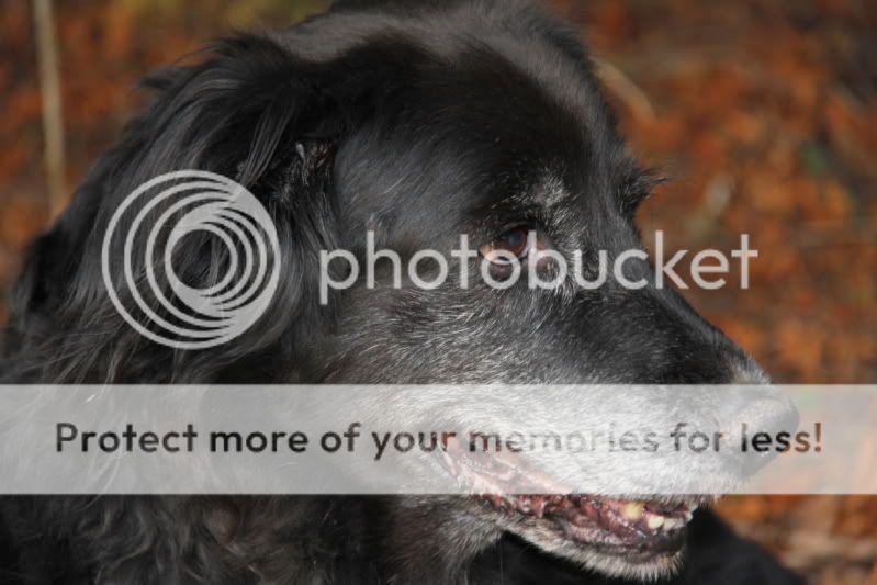
And finally this is my Miss Gabby, I'm rather pleased with this one but again I think some "light" is missing somehow.
Hi All, I just got my first DSLR less than a week ago. Canon 60D with 18-200 lens
I immediately realized exactly how much I have to learn! So I'm going to jump in with both feet right off the bat and ask for some input on my three fav pictures I have taken so far.
Thanks in advance for your replies and input
First one it was dreary outside yesterday and my faithful sidekick Miss Gabby and I went for a walk around the property to try to find some colour amongst the decay before winter sets in. I like the photo but feel it would do well with more light.
This one I love the bird but don't like the overall composition, I needed to get the entire "feeder" he is sitting on and perhaps taking the shot from a higher angle?
And finally this is my Miss Gabby, I'm rather pleased with this one but again I think some "light" is missing somehow.
Last edited:


![[No title]](/data/xfmg/thumbnail/31/31085-9786bf0c16c072633ecdfad477c23095.jpg?1619734600)


![[No title]](/data/xfmg/thumbnail/31/31012-f5e0c7cdea2f2c3e44737e3f61c2461a.jpg?1619734567)