View attachment 64413
c&c welcome, of course, and thanks in advance!
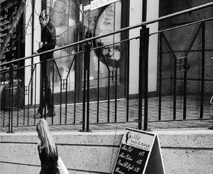
If I were to score this an a matted print in a judging situation, this image would score a 63, based mostly on plugged up dark tones, excessive dead and uninteresting space throughout the majority of the frame, and a lack of a
successfully-executed concept. Like the huge preponderance of photos that I think we all make/take/shoot/snap/grab, whatever, this photo really does not rise to the level of P for Pick in Lightroom. It's a shot made on the street, from a distance, and as such it shows us the scene from afar, and does not involve us very actively. It's filled with modern urban clutter.
You want to talk about the "strength" or "virtue" of two humans snapped while walking, and a sandwich board sign as some kind of Holy Grail of virtue, well, fine, but this is a street snap, and not a very compelling one based on the reactions here. We could also go on to liken the horizontal lines of the concrete wall with the horizontal rails of the fence, as well as the horizontal rails that decorate the building facade. Or we could wax rhapsodic about the four white boards flanking the nail and hair salon's doors and groove on how those horizontal lines "echo" the upright steel fence posts. And hey--there's a brick wall in the upper-right corner, and the lower-left or OPPOSITE corner is ALSO a flat surface, but in a different orientation. Yeah...if you sit down and take a fine-toothed comb to this, we can come up with many similarities between elements. That's because people love to try and connect things that, often times, are not really connected in ANY substantive, meaningful way. And that's what you're try to hammer into our heads, Andrew--that this snap has some kind of magically amazing geometry that elevates it.
Again, I'd give this a 63 if I were to score this image.





 , this time to the point, that Terri has to intervene. And there are tons of other offerings starved for evaluation, with zero or one responses.


![[No title]](/data/xfmg/thumbnail/37/37624-7f9c9a5c8c7bcb5e62f67313e2e48dbc.jpg?1734170748)
![[No title]](/data/xfmg/thumbnail/37/37625-7e132688457d56e50320a8c99a79fe38.jpg?1734170749)