Hate my processing - Love the Photo..

Raj_55555

Indian God of Photography
Supporting Member
Joined
Apr 14, 2013
Messages
2,677
Reaction score
2,044
Location
India
Website
www.rajarshiphotography.com
Can others edit my Photos
Photos OK to edit
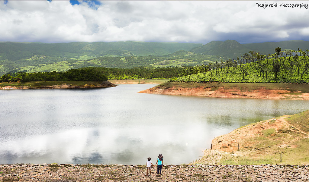
Have been working towards learning post processing since the last month, but this particular photograph is really making it hard for me. I am not really happy with the final result even after spending over an hour on this - any inputs?

35770116943_b5a7783dc5_b.jpg


!!Link to RAW file!!
Would appreciate any support with this.
 
Here's a quick edit.

Landscape.jpg


Edit.
Globally
Exposure -0.55
Highlights -90
Shadows -24
Whites +34
Clarity +77

Masked the clouds
Exposure -1.56
Shadows -5
Blacks -19

No colour edits.

I could have masked the people to raise the exposure there as well but I have to get to work.
Hope this helps.
 
It looks a bit too saturated. IMO the foreground greens are a little too bright.
It is a lovely shot.
 
IMG_4880.jpg


Nice shot Raj, bit over processed maybe, but lovely and great potential. This is a simple lightroom adj using cameras own landscape profile. If you like the adj I'll give you all the settings
 
Raj, the way you brought out the sky looks completely unnatural. In fact, it almost looks placed behind the mountain range, not floating above it. Then where you chopped off the trees on the right gives it an obvious faked look, like you composited the sky -- but you didn't...

You've then applied way too much contrast/clarity to the hillside and background. It's natural to expect to skyline to be in haze, there's nothing wrong with bringing it out a little, but the way you've tried to pull all the detail out of it, again makes it look composited in.

Again, the heavy contrast is working against you on that far shoreline where the shadow of the trees is reading like a drop-shadow of the shore itself, and it looks like it's hovering off the page, giving the image a weird 2-D effect with faked dimension.

The hillside to the right frame, looks incredibly over-saturated compared to the background and treeline just left.

I actually like how the girls look on the bottom, but why is there a random blurred spot on the bottom right frame?

Then, just above, the grassy patch, it looks like you brought the clarity/contrast into negative numbers and removed detail.


Be smart about your processing. I want your eye to start on the children then work up the scene to behold what they are viewing just as they are. Right now all the elements on the image are competing for your eye's attention. There was no need to spend hours on this, and it seems you are just processing just to process, and why you'd unhappy with the edit.

I'll take a stab at an edit when I'm home.
 
- any inputs?
I think I understand what you wanted to do with this, and I agree in principle. I think making the colors more vibrant is certainly a valid choice, and your edit has done that.

For many of us, the colors are simply too vibrant, which makes the scene look unnatural. Perhaps just a bit less intensity would be the key to success.
 
Hi Raj! nice to see you on here.

You know, the original is a lot of gray and beige, there's just not a lot of color in the scene. This might be better staying with pastel shades; there doesn't seem to be enough color in the original to be able to end up with a bright colorful photograph. It's a nice composition that just needs some adjustment and a light touch I think.
 
I like the shot Raj.

I'll share my edits, hope you don't mind. I decided to process it the way I typically would (my own style). I'm a sucker for black and white and that's exactly what I did because when I saw the photo I immediately thought going black & white would make it even stronger.

Erwin-170812-13650-2.jpg


But I'll also share a color version too.

Erwin-170812-13650.jpg


It was a fun photo to edit! The sky a little blown out though...watch the highlights!!
 
I like that B&W edit, I was going somewhere similar with it, just didn't post it.
 
Great shot!

Post takes a considerable amount of work. Often its best to do some work, take a break and a fresh look. 1 hr is no time to spend on a photo.

I would just press reset and try again. With less contrast!

You had some great critiques already and advice so I'll leave it to that.
 
Thank you everyone for the valuable inputs everyone, always a learning here.. I think I see where I was going wrong. I should have just stopped in between, and started afresh.

Great shot!

Post takes a considerable amount of work. Often its best to do some work, take a break and a fresh look. 1 hr is no time to spend on a photo.

I would just press reset and try again. With less contrast!

You had some great critiques already and advice so I'll leave it to that.

Exactly! The more time I spent on this, the more I felt invested. I should have stopped, and restarted.

- any inputs?
I think I understand what you wanted to do with this, and I agree in principle. I think making the colors more vibrant is certainly a valid choice, and your edit has done that.

For many of us, the colors are simply too vibrant, which makes the scene look unnatural. Perhaps just a bit less intensity would be the key to success.

I know, and I thought I was past the HDR hole.. :lol:

@nerwin Love the b&W edit.. thank you! :1247:

Hi Raj! nice to see you on here.

You know, the original is a lot of gray and beige, there's just not a lot of color in the scene. This might be better staying with pastel shades; there doesn't seem to be enough color in the original to be able to end up with a bright colorful photograph. It's a nice composition that just needs some adjustment and a light touch I think.

Thanks Sharon.. I went lighter with my processing this time. :1247:

@Braineack Thank you for the inputs and taking the time out to process the image. Looking at your version, I knew that is exactly what I was aiming for. I think this was a byproduct of me learning multiple new techniques in photoshop, as you said I was processing for the sake of processing - trying to implement everything I know. I have reworked on my image, and am now happy with the result. Thank you! :1247:

35770116943_8a02556048_b.jpg
 
Hello Raj,

Conceptually the image is very beautiful where nature and its beauty is depicted. The only thing which seems bit bizarre is the sky which would have been better and I suppose you will surely make it better next time. Other than this, mountains and trees have been captured very nicely.
 

Most reactions

Back
Top