domd
TPF Noob!
- Joined
- Feb 11, 2014
- Messages
- 6
- Reaction score
- 1
- Location
- Melbourne, Australia
- Can others edit my Photos
- Photos NOT OK to edit
Hi guys, I'm a beginner. I got my first camera in November last year with a set of strobes and have dragged them out for 7 or 8 shoots since then to practice. I'm interested in what you more experienced types see when you look at my shots and what you would consider would be the best learning for me to pursue to up my skills in the fastest possible way.
Now I tried to post this same thread at another forum and no one believed that I was a beginner. Which is absurd, I'm proud of my work so far but it still pretty raw compared to some of the stuff I come across here on a quick peruse. Anyway it became a total witchhunt with them trawling through my photobucket to drag out old shots taken with expensive cameras to prove I'm not new. Suffice to say that as a show and no budget film producer I've paid for a lot of shoots over the years by some very talented photographers and I own the rights to all those shots but these are the first ones I've taken myself. So be kind! But not too kind!
From my first shoot:

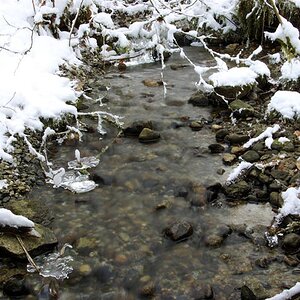
From my second shoot:

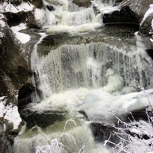
From my third:

Fourth:

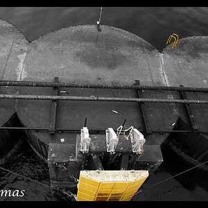
Fifth:

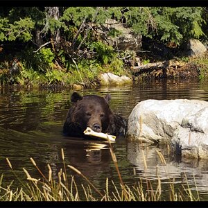
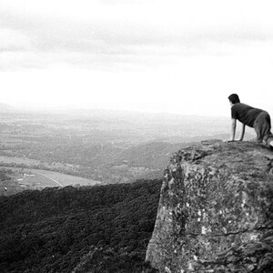
Nothing of interest from my sixth so lets skip to seven:


Now I tried to post this same thread at another forum and no one believed that I was a beginner. Which is absurd, I'm proud of my work so far but it still pretty raw compared to some of the stuff I come across here on a quick peruse. Anyway it became a total witchhunt with them trawling through my photobucket to drag out old shots taken with expensive cameras to prove I'm not new. Suffice to say that as a show and no budget film producer I've paid for a lot of shoots over the years by some very talented photographers and I own the rights to all those shots but these are the first ones I've taken myself. So be kind! But not too kind!
From my first shoot:

From my second shoot:

From my third:

Fourth:

Fifth:

Nothing of interest from my sixth so lets skip to seven:


")


![[No title]](/data/xfmg/thumbnail/41/41925-e3c7dc0bf7e49541e177841ac968253a.jpg?1619739945)