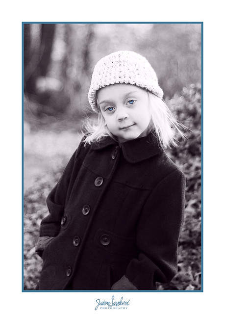
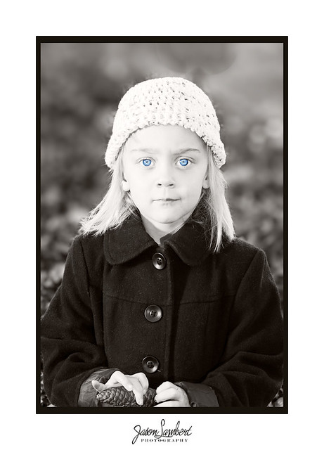
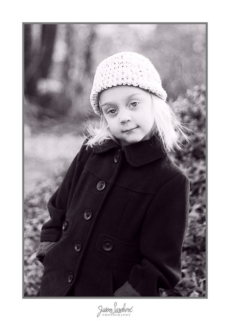
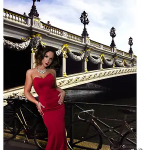
I really dislike the background rendering of that lens on the first shot...very "hashy" and jarring bokeh, just pulls me eye toward the background and makes her photo look bad. The second frame's background rendering is also bad; it looks like you did some type of quick cloning tool work or something.
As to the overall "look" of these...I'm just not feeling it...these photos seem too artificially "severe", for lack of a better word...it's hard to pinpoint exactly what that entails, but the tones appear white,mid-tone,and then very dark...there just does not seem to be much nuance...and her expressions are well, sort of that 1980's style neo-realism downer look...
As far as branding goes, I like the way the images are marked on the digital matte, and NOT on the image itself. I think a 1:1:1: to 1.5 unit white digital matte effect would look better than the current 1:1:1:1 matte proportions on these. More space, 1.5 units of white, at the bottom of the images, would "visually anchor" these tall images, and make them look better.