Is anyone interested in a real critique thread?

Unfortunately no one uses them. I think if TPF had a critique gallery solely for that like POTN, then that would be an excellent idea.

Here's an image of mine that hasn't been posted very many places. This was shot with one light using a beauty dish camera left. The background blur was done in PS and you can see where I ****ed it up with the blur on the girl's forehead, but other than that, what's everyone think?

I'm not really sure where to start in this thread, so I guess I'll just go with the last one posted...

I really like the feel of this shot, but like others have said, I wish there was a little more detail in her hair. And I can't help but wonder if you knew that you screwed up the blur on her forehead... why didn't you go back and fix it before posting? :lol: :sexywink:

I didn't notice it until it was several days after being uploaded to Flickr.

Ahh, okay, gotchya. :sillysmi:
 
First to address a couple of your questions. You are right, with the lens you used, increasing DOF would be tough, but you could have just shot this with a different lens. This shot didn't really require a macro lens or focusing as close as you did. I also agree with you that the DOF is a bit too limited on this shot. As far as the edges of the glass, that's more of a setup issue. On a white background like you chose, the best way to get great definition on the glass is to use a large black panel to either side of the glass so that the reflection is picked up. This gives you that definition you are looking for and looks natural since just about every shot of clear glass on a white background uses this method.

As far as subject matter and your intended theme, I can see what you were going for, but it's difficult to arrive at as complicated story as you are trying to tell without some supporting information...perhaps a wider shot with a few extra 'props' to give it some context would be in order...Maybe setting the jar on top of a pile of bills marked 'Final Notice' 'Foreclosure', etc.?

I think you can really make this shot work and tell the exact story that you are wanting to tell, but as a standalone object, it doesn't really work for me. Now, if you just want a shot of an almost empty penny jar, use a larger light source, use a different lens or just don't shoot at the min focus distance so that you can get some greater DOF, and use black panels to add definition.

If you're really interested in these types of shots, the book 'Light, Science, and Magic' is worth it's weight in pennies?

I guess I'll post one. I hope I'm not encroaching on manaheim's turf, lol.


08031124 by J E, on Flickr

Full size (2995x4531) here, in case anybody is interested:
http://farm7.static.flickr.com/6138/6008382065_a5d475a81d_o.jpg

What I was going for: You know those shots of the penny jar that are supposed to show how you should save money and maybe imply that everybody is kinda broke these days - having to resort to counting pennies - I was going for the opposite of that. I wanted to show an empty penny jar. A jar that had already been pillaged. What's left over after you count all of your pennies. (edit- "desperation", I guess - you've counted your pennies, and this is what's left.)

What I like: Well, the jar is pretty much empty, so to me - it conveys the point I had hoped to make. (To me anyway - not sure if other people read it the same way I do...)

What I don't like: DOF - I think it needs more, but I don't know that it's possible with the gear I have (shot with Canon 100mm macro, at f/11 or 16 - not 100% sure now...) - short of focus stacking, that is. I also feel that the edges of the jar are not defined enough (and I do not know how to fix that (in camera)). I think it might work better in portrait orientation, but I thought that would show too much 'nothing' (empty bottle).

ps - ignore the dark edges - I'm not really sure why/how that happened, but it's only a few pixels wide - easily cropped out (or 'fixed').

I'm kind of undecided between 'dirtying it up' more, or going for something more 'pristine'.


EDIT
BTW - in case anybody is interested - this was shot on B&W film (Efke 50, developed in Rodinal). So don't ask to see the 'color' version - because there is no such thing. ;)

Also - I know that my profile says "not OK to edit" - that really means 'ask first'. In this case, you have permission to edit.
 
I'm not sure about the blue tint.
I think you need to calibrate your monitor...

It was B&W from start to finish - shot on B&W film, scanned in B&W, edited in B&W, and even now it's in a greyscale colorspace...

Yes, sorry about that. I was using someone else's computer this morning. Now that I am looking at it on my own monitor it is indeed untinted.
 
Damnit... I had some other comments for the folks who posted but screwed them up trying to reply to Compaq without having my image posted three times. :lol:

In short...

1. The light comes from the column of light in the center of the carosel. The picture is looking up and left of center.
2. The contrast comments are interesting... I LIKE lots of contrast in my shots. Otherwise they look flat and dead to me. Do folks see contrast as a bad thing? Maybe how much is just a question of style.
3. I see what you mean on all the converging and non-converging lines. It's a big part of what attracted me to the shot... all the lines... it's just chaos... and yet they clearly all serve a purpose, so it's not. Both things are evident (to me, anyway), and therefore it makes the shot kind of amusingly painful to look at. But again, not sure if that's a good or bad thing.
 
If you're really interested in these types of shots, the book 'Light, Science, and Magic' is worth it's weight in pennies?
I have it, but haven't really read much of it yet. :lmao:
Yes, sorry about that. I was using someone else's computer this morning. Now that I am looking at it on my own monitor it is indeed untinted.
You should tell them to calibrate their monitor, lol.
 
Why a "real critique thread?" Is it a haven for one's reputation? I may be a poor role model but I cast my reputation to the wind and left honest and sometimes harsh feedback wherever I felt it was appropriate for a long time. A lot of people called me small, mean, insecure, a curmudgeon, nonconstructive, angry, stifling of new talent, oppressive, and sometimes worse. I also gained a lot of respect from a handful of people. Years later I come back here and I don't feel much different. I don't feel a need to reject the social trend towards only saying encouraging, feel-good things to other people. I feel a need to disregard it entirely.
 
Damnit... I had some other comments for the folks who posted but screwed them up trying to reply to Compaq without having my image posted three times. :lol:

In short...

1. The light comes from the column of light in the center of the carosel. The picture is looking up and left of center.
2. The contrast comments are interesting... I LIKE lots of contrast in my shots. Otherwise they look flat and dead to me. Do folks see contrast as a bad thing? Maybe how much is just a question of style.
3. I see what you mean on all the converging and non-converging lines. It's a big part of what attracted me to the shot... all the lines... it's just chaos... and yet they clearly all serve a purpose, so it's not. Both things are evident (to me, anyway), and therefore it makes the shot kind of amusingly painful to look at. But again, not sure if that's a good or bad thing.

It is chaos. That was exactly my thoughts too, and that's not a bad thing....(It's not a best effort from you...probably not even close if you step back)....:oops:
 
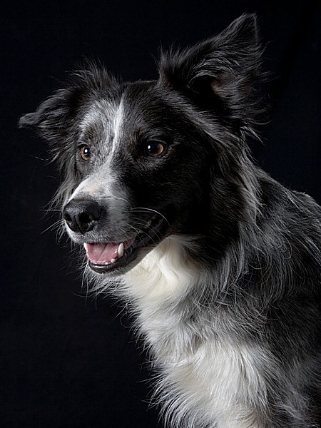
Headshot :lol:

1221198821_HR3ae-L.jpg


I can't think of any way that we can organize this to make it neater but perhaps we can ask the OP of each critique to call 'enough' and go on then,

We seem to have caught up to this picture above.

This is a great headshot, which is its achievement and its failing at the same time.Well lit, perfectly sharp ,great 'expression, yet for anyone who doesn't especially like dogs or who isn't involved with this particular dog, it's a one look shot to appreciate its qualities and then a so what.

Like any studio shot, it is out of context and thus aimed for one specific market.
 
Not sure if we are allowed to retort...Some of the very best shots I have seen on this site are actually of dogs. This one is a stand out. Maybe we can figure out why the dog pictures come out so much better than the people pictures. I know I am setting up this weekend with my dog...after seeing this photo I am struck by it and I am inspired.
 
Not sure if we are allowed to retort...Some of the very best shots I have seen on this site are actually of dogs. This one is a stand out. Maybe we can figure out why the dog pictures come out so much better than the people pictures. I know I am setting up this weekend with my dog...after seeing this photo I am struck by it and I am inspired.

The lighting is very easy, dog is about 5 feet from background he is looking towards a shoot through brolly fitted to a 300watt head at about 45degs to dog just above aimed down second light is opposite behind fitted with 7" reflector with a honeycomb 300watt head about the same hight as main light and about 1 stop under and there was a silver reflect opposite main light to bounce a bit of light on the shadow side, settings were F13,1/125, iso100
here's the setup ata dog show (had to use the bar area)
http://gsgary.smugmug.com/Competitions/Miscellaneous/IMG3258/1221933208_r4LVK-L.jpg
 
Well I love the shot and lucky for me that I have all the gear you used for this set up. :thumbup: Thanks for sharing the details and the dog is beautiful! (Hopefully earning you some ribbons and more)
 

Most reactions

Back
Top