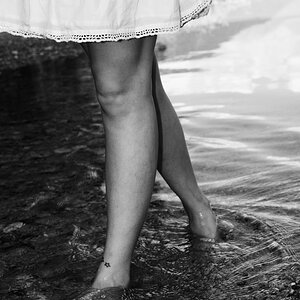
#1 i like as a horizontal shot, but maybe with a little less on the left side. I like the tats showcased in this one.
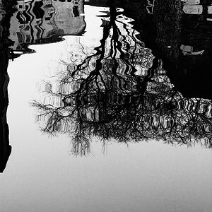
#2 i totally see as a portrait orientation. the big black patch on the left doesn't seem to do anything for the photo.
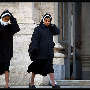
#3 is nice as a headshot, but (and im not really a fan of B&W anyway so my knowledge on the subject is limited) It looks like you have nice lights and nice darks, but not much in midtones.
as a personal preference on #3, i would have stopped the lens down a smidge and gotten a little more DOF to get his ears and neck in focus instead of just his face.
#1 i like as a horizontal shot, but maybe with a little less on the left side. I like the tats showcased in this one.
#2 i totally see as a portrait orientation. the big black patch on the left doesn't seem to do anything for the photo.
#3 is nice as a headshot, but (and im not really a fan of B&W anyway so my knowledge on the subject is limited) It looks like you have nice lights and nice darks, but not much in midtones.
as a personal preference on #3, i would have stopped the lens down a smidge and gotten a little more DOF to get his ears and neck in focus instead of just his face.
The black patch is the wall of the elevator, it's in the foreground to give more tridimensionality to the photo...It may have been better if I took it more from the right getting a better angle in the shot. What do you think? Would it be bette to take it with more angel or taking away de foreground element completly?
I think the biggest problem with the black patch in #2 is that its impossible to tell what it is just from the picture. you know its an elevator 'cause you were there, but noone else does. It could just as easily be a wall, or a vending machine, or your finger in the way of the lens.
if you were further camera right, and angled a little, it might give a better showing of the elevator and contribute to the image. for the purposes of this image though, I think it would be better cropped out and made in to a centered portrait.
Thanks for the help. Yes, I thought It was obvious...I new it could be because I was there and new what the place looked like but I wasn't sure how much It was my fault by knowing the place.
I don't crop my images... For many people it's stupid but It helps me to be focused and not being lazy...also I only print big, so it's about image quality to...What I mean is that I get your point and I will reexamine the shoot with the critiques you all give

")

![[No title]](/data/xfmg/thumbnail/37/37112-9474bbad05f760cbef79df3379b23509.jpg?1619737882)


![[No title]](/data/xfmg/thumbnail/37/37659-7302b7a4f9ae50a952748e8b395695fe.jpg?1619738174)