Bend The Light
No longer a newbie, moving up!
- Joined
- Jun 8, 2010
- Messages
- 2,591
- Reaction score
- 375
- Location
- Barnsley, Oop-Nooerth, UK
- Website
- www.flickr.com
- Can others edit my Photos
- Photos OK to edit
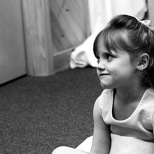
This is Kathryn,
She came to me in August for a boudoir/sexy shoot for her boyfriend who's currently serving in Afghanistan. I asked her back then if she'd be interested in modelling for me, and we finally got it together today. Here are a few of my favourites. Trying to get away from white backgrounds that I use with the kids, although I still have some in this shoot.
What do you think?

30-12-2012 Kathryn 2 by CTS.Studio1, on Flickr

30-12-2012 Kathryn by CTS.Studio1, on Flickr

30-12-2012 Kathryn 3 by CTS.Studio1, on Flickr

30-12-2012 Kathryn 4 by CTS.Studio1, on Flickr
Thanks
She came to me in August for a boudoir/sexy shoot for her boyfriend who's currently serving in Afghanistan. I asked her back then if she'd be interested in modelling for me, and we finally got it together today. Here are a few of my favourites. Trying to get away from white backgrounds that I use with the kids, although I still have some in this shoot.
What do you think?
30-12-2012 Kathryn 2 by CTS.Studio1, on Flickr
30-12-2012 Kathryn by CTS.Studio1, on Flickr
30-12-2012 Kathryn 3 by CTS.Studio1, on Flickr
30-12-2012 Kathryn 4 by CTS.Studio1, on Flickr
Thanks
") Plus, you'll get the visual pop back!
Plus, you'll get the visual pop back!


![[No title]](/data/xfmg/thumbnail/32/32926-ec27ecead8c80d803404500d8f888dbf.jpg?1619735754)