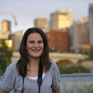
Less of Kathryn...But somehow, More!

Much! Just remove the fly hair from the right eye and golden! Did you try this in black and white?

Also maybe bringing color back to her eyes and lips... or just the lips... hmmm.

I did seee that hair, but left it...not sure why. :)

Not tried black and white yet...on my list. :)

Much! Just remove the fly hair from the right eye and golden! Did you try this in black and white?

Also maybe bringing color back to her eyes and lips... or just the lips... hmmm.

NO... PLEASE... do not selective color this... it would kill it! lol!

No plans to do that. :)

I agree with Charlie, NO SELECTIVE COLOR!. The rework looks very good to me.

Nope. Thank you.

Thanks folks. I had another play:


30-12-2012 Kathryn 1 rework by CTS.Studio1, on Flickr

Any better?

BTL.... GORGEOUS! I love it.. love her... SIGH! There goes my heart again..... ;) Very nice!

Oh dear...:)

I agree I love it too, was just qurious if he played around with it. Sorry for the suggestion.:(

With all the contrast,it just appears like a good B/W to me.

And it does, but not with spot colour. :)

I agree I love it too, was just qurious if he played around with it. Sorry for the suggestion.:(

With all the contrast,it just appears like a good B/W to me.

No big deal! lol! Just most of us here agree that 99.9% of all selective color use is terrible! It is way overdone!

Once in a while it can work. Not here though.

Actually.. I agree that B&W might be fun here. I played with it.. and went for the Mata Hari look...lol! BTL.. Hope you don't mind!

View attachment 30557

Like it very much. I would have gone dark with the eyes as focus...Thanks.

See... Should I say it....lol. I think the heavy contrasting colors in the photo did do an excellent B/W... I gotz a little skill. :wink:

I probably wouldn't have gone that dark with it, but it does look cool. It, to me gave it a timeless look. maybe add a little softening and who knows

Maybe. On my list to do.

See... Should I say it....lol. I think the heavy contrasting colors in the photo did do an excellent B/W... I gotz a little skill. :wink:

I probably wouldn't have gone that dark with it, but it does look cool.

I was playing.. and I love the emphasis on those eyes! :)

Yep.

Me too! It is almost enchanting.

She's lovely in the flesh too. And she will come back and model for me, gratis, whenever I want, so plenty of practise time. :)
 
Actually.. I agree that B&W might be fun here. I played with it.. and went for the Mata Hari look...lol! BTL.. Hope you don't mind!

View attachment 30557

Any chance of a couple of lines to say what you did here? I'm going to have a go myself, but love this conversion.
Also, do you mind if I post this elsewhere (I know it's my original, but the edit is yours and I want Kathryn to see it (amongst others)). :)
 
Thanks folks. I had another play:


30-12-2012 Kathryn 1 rework by CTS.Studio1, on Flickr

Any better?


It's always fun when someone has REALLY good base material that leaves open a bit of room for interpretation. I mean these pictures are stunning, but you can see where a little change in look or adjustments on some sliders can have a very different effect.

Like charlie's... so cool. Nice edit, man.

For me, I thought your re-do was excellent, but it lacks POP... now that may well be a style choice, and I can't argue with that... and I think you did an EXCELLENT job of it if that was your intent, but to me just a little bit more work on the curves and a little sharpening and bam...

lessmore.jpg


Those eyes jump right off the page.

BTW, I wouldn't look at this in IE. IE handles color very poorly these days.

I think I am always erring on the side of caution when it comes to colour/pop. I quite like a good mono, dark, moody, and forget that it doesn't always translate well into colour. Again, your edit is great, and I am playing with various from this set, messing with "pop" and with vignetting, with mono, etc.

Hope everyone knows I am taking all this in, and playing some more. I enjoy doing the "weekend warrior" studio work with the kids and so on, but it's nice to get a "model" in and just do it for doings sake. :)

BTW, not used Interweb Exploder for a long long time - poor colour and bloated. Firefox is my browser of choice (despite it getting "bigger" it still works well and is colour managed. :)
 
And you're talking to a guy who always pushes sharpening/contrast to the breaking point, so you need to take what I say with a grain of salt... frankly I would have pushed the one I did a bit further on the sharpening, but was trying to keep some of your softness in.

On your new ones, I think your analysis is right on. Too much correction in the skin. The b/w one I think you may have pushed a bit too far... she looks somewhat like a street urchin to me.
 
I need to stop using IE... these look terrible in IE...

lessmorebw.jpg
 
Actually.. I agree that B&W might be fun here. I played with it.. and went for the Mata Hari look...lol! BTL.. Hope you don't mind!

[/QUOTE

Any chance of a couple of lines to say what you did here? I'm going to have a go myself, but love this conversion.
Also, do you mind if I post this elsewhere (I know it's my original, but the edit is yours and I want Kathryn to see it (amongst others)). :)

BTL.. feel free to post it where you would like! I had a nice image to work with. Let me see if I can figure out what I did... lol! (that was yesterday!)

BTL... as near as I can remember, I ran the color shot through Portraiture on Normal Setting, and then I used the one of the High Contrast Presets in Nik Silver Efex Pro. And then played with the contrast and brightness a little bit. Lowered all of the color sliders to minimum except yellow and red. Saved it. In PS, I sharpened the eyes... and that was about it. I have been ill.. so not at my best at remembering what I did. lol! She is a lovely girl! you captured that nicely!


Cool - Pretty much my work-flow too, so I could probably recreate that. :)

Cheers
 
Last edited:

Most reactions

Back
Top