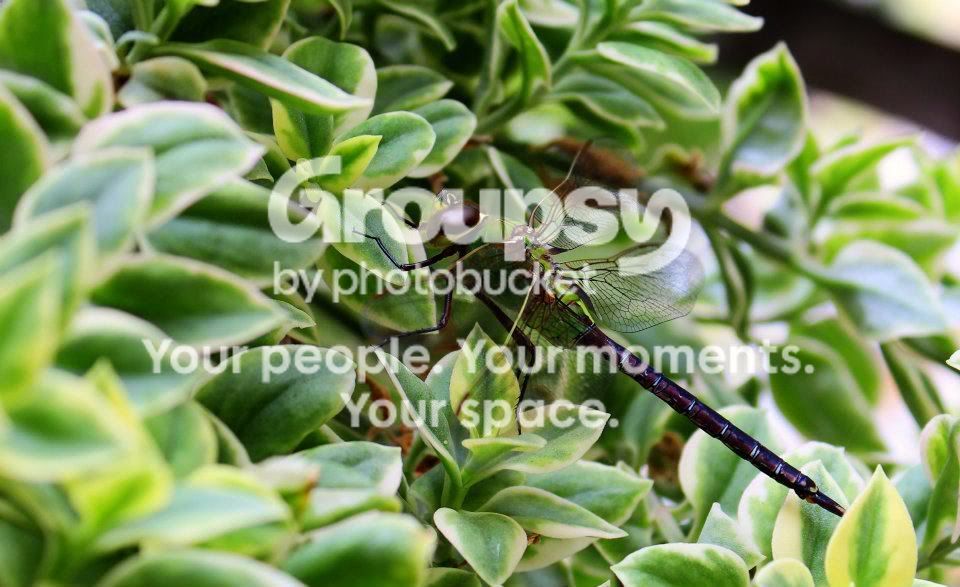
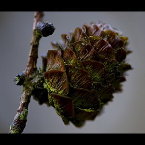
The first is the best of the lot, but the busy background is really taking away from your dragon fly. I agree on the cropping as well.
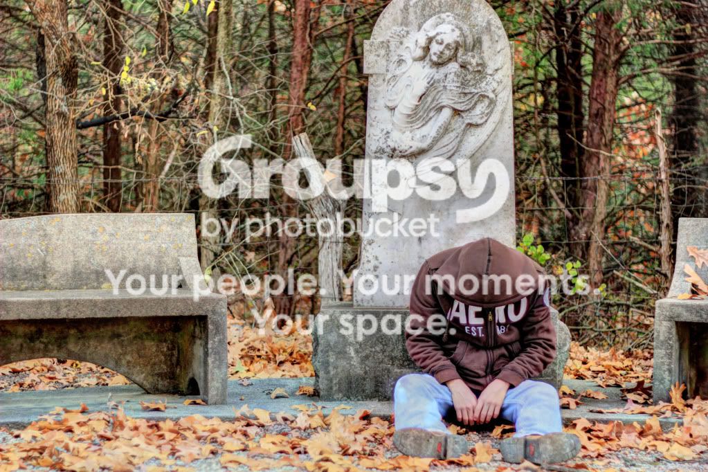
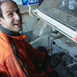
The second one does nothing for me. I like the THOUGHT behind it, but the poor composition really kind of ruins the whole premise. It doesn't balance, it's not following any of the basic rules of composition nor is it breaking those rules in any useful manner.
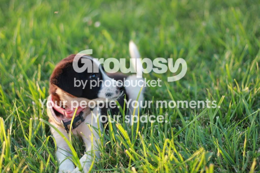
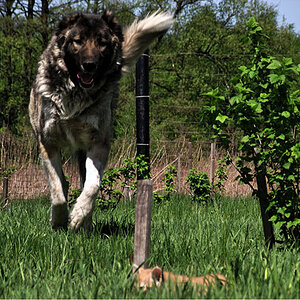
The third is out of focus. The composition starts out nice, but the paws that are touching or cut off make it look more like an accidental snap shot than a shot that you were consciously thinking through.
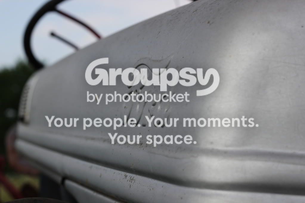
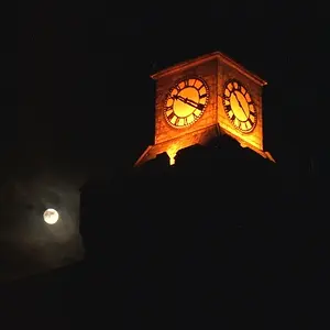
The fourth... It just isn't speaking. It's got a bunch of dirt that is distracting as well as whatever is in the background
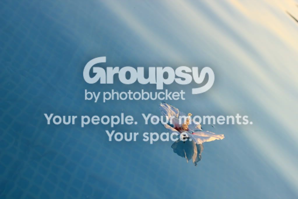
The flower is yet another great thought, but the fact that we are looking at the back of the flower really takes from it. I want to tilt it so that it feels right. The simple composition is well laid out, but the tilt is hurting a little.
Your colors seem to be spot on and you are consciously trying to use good creative composition. Your exposures look good, but they also don't look like you are really controlling them, per se.