Magenta

This isn't a bad idea at all, what it lacks is execution.

When you're doing thing kind of thing, you're adding:

- a mass, an object, to the frame
- some color to the frame

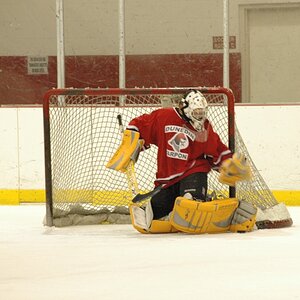
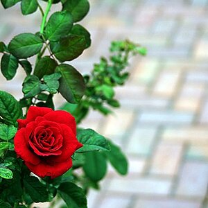
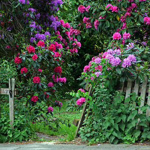
Think of it in terms of graphic design, and make that mass/object work relative to the other masses and objects in the frame. You probably want to balance things against one another, at least as a starting point, and the colors should play well together. Generally either picking up one another, being closely related in hue, saturation, and value, OR being complementary -- more or less opposite one another on a color wheel.

Your second one works better since you've gotten balance through symmetry (which is not the only way to do it) and the colors are less prominent and hence less problematic.
 
Ok, maybe I'm in the minority here - I mean I pretty much strike out in the "artistic soul" department - but when I saw this my first thought was, blood spatter. Sorry man, but I can't imagine a less visually appealing affect. Again, probably just me.
 
I see the fist image as part of an advertisement (still at work.) It feels like the color should be bigger and there should be message about not being a teen mom. Maybe your true calling is in graphic design lol.
Like the last one the most. It is less in your face.
On the end - to each his own - right?

Like this?

View attachment 60432

I'm sure the girl's mom would really appreciate that one.. lol
 
Well... Now you've gone beyond photography and into the world of graphic design.

Now I'd say take it to a seasoned graphic designer and see what they say.

I suspect they'll say the same thing I thought about this as a photographic choice, which is "what are you trying to SAY with that wash of pink?"

"It just looks cool" is not an answer for such a strong message and situation, IMO.

Haha, it was just a joke. I'm still lost navigating photography world. Point taken though!
 
I was just a joke of course, but still.

always a joke when things don't go your way. This is like the 4th thread of yours that you've done that in...
 
always a joke when things don't go your way. This is like the 4th thread of yours that you've done that in...

You think I seriously want to create a teen pregnancy ad....? I know I'm not even that good at photography, there's no way I'd try to break off into graphic design now. Lighten up a little.

Besides, things are going my way. I'm getting feedback which I can use to improve my photography. That is the point.
 
Last edited:
You think I seriously want to create a teen pregnancy ad....? I know I'm not even that good at photography, there's no way I'd try to break off into graphic design now. Lighten up a little.

Sorry I thought you were referring to the picture in the first place, I realized the teen ad was just having fun.

Yep
 
Why would you think that you have improved based upon this submission? Please be detailed.
 
Why would you think that you have improved based upon this submission? Please be detailed.

Yo, where's your quote? Whatcha talking about?
 
Last year, Majeed and I drove to the Columbia Gorge during the springtime, when the greens are "exploding" all around. There is a type of fern that grows there in the misty, damp climate, and during its spring growth period, it has a rather light-hued but really VIBRANT, loud color that screams GREEN! I decided to take a photo of one of the waterfalls with one of these new ferns in front of my Canon's 85mm lens. Here is the picture, exactly as I shot it. I think it's interesting that when color-correcting in Photoshop, green counteracts magenta, and magenta counteracts green!

$144047890.oNixlpuz._MG_2553_AViewThroughAFern_1200x.jpg

"A View Through a Fern", 2012
 
Last year, Majeed and I drove to the Columbia Gorge during the springtime, when the greens are "exploding" all around. There is a type of fern that grows there in the misty, damp climate, and during its spring growth period, it has a rather light-hued but really VIBRANT, loud color that screams GREEN! I decided to take a photo of one of the waterfalls with one of these new ferns in front of my Canon's 85mm lens. Here is the picture, exactly as I shot it. I think it's interesting that when color-correcting in Photoshop, green counteracts magenta, and magenta counteracts green!

View attachment 60482

"A View Through a Fern", 2012

GREEN! Yes!!

Colors are fun, however...

I decided to give mine the B&W treatment...

$DSC_0780.jpg

Whacha think?
 

Most reactions

New Topics

Back
Top