Megan's Bridals

bennielou

TPF Noob!
Joined
Nov 27, 2009
Messages
1,798
Reaction score
172
Location
Dallas, TX
Can others edit my Photos
Photos OK to edit
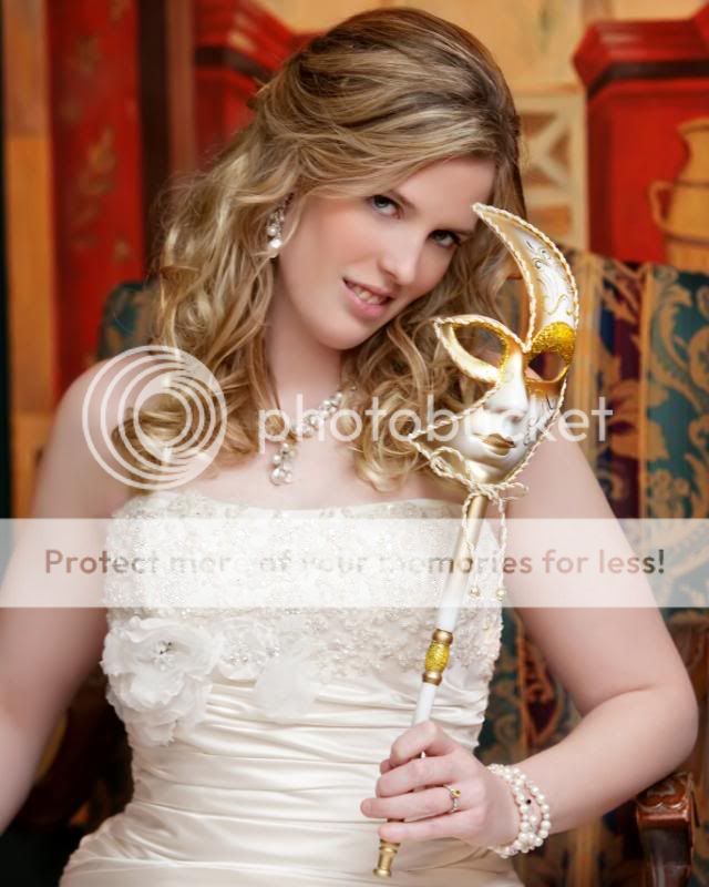
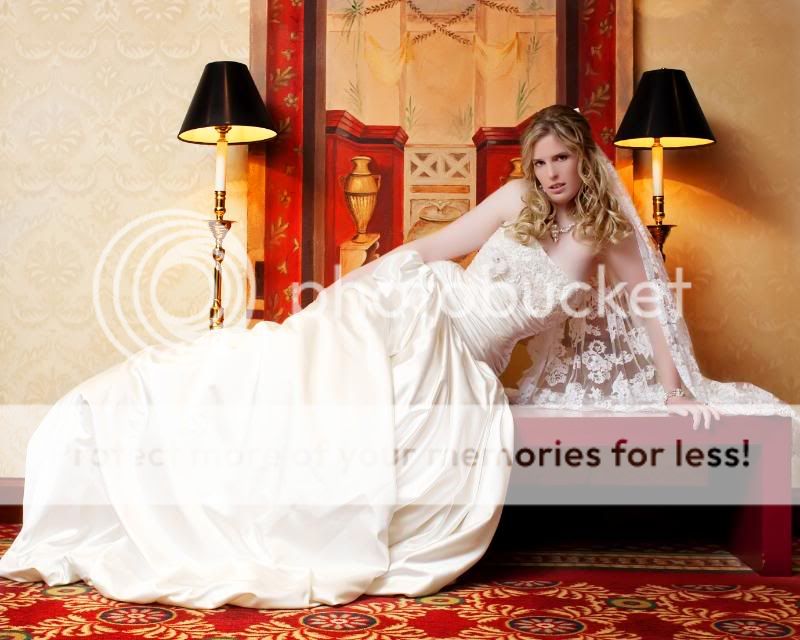
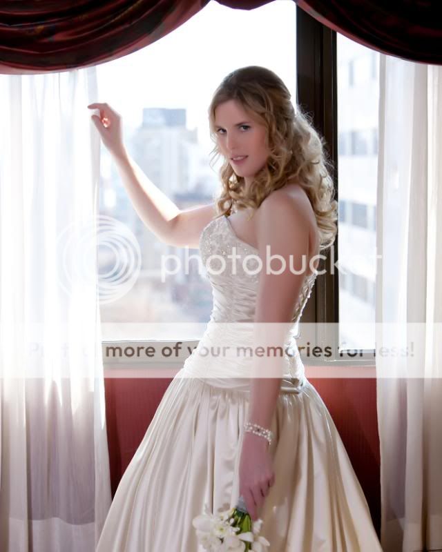
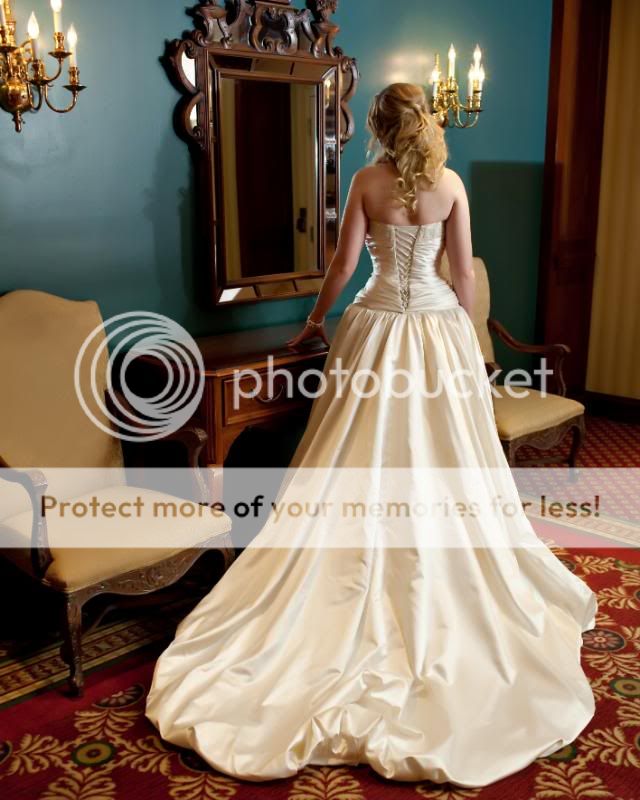
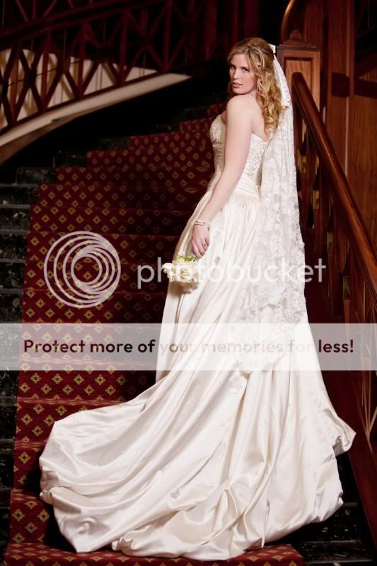
Megan is a poster here, and hired us to come up to TN to shoot her wedding. We had a blast, and she's a doll. (And at 6' tall, even taller than I am!) I completely lucked out that she is gorgeous as well.

1.
megblog01.jpg


2.
megblog02.jpg


3.
megblog03.jpg


4.
megblog04.jpg


5.
megblog05.jpg
 
11. Bridal Jewlery
megblog12.jpg


12.
megblog13.jpg


13.
megblog14.jpg


14. And just for something completely wacky :)
megblog15.jpg
 
What I dislike: too much over postprocessing on skin, it is too soft; This could affect natural skin tones, which look a bit odd for me;

What I like: dynamic photos as 5,13,14 (and NOT so static, staged, arranged as No. 9)

Overall nice photos, lighting quite good, some of them could be a little bit lighter. But your client should be happy with the result. Keep it up good work :)

Sorry of my English

Donatas
 
Very beautiful bride. I like them all but my least favorites are the ones of the bride surrounded by graphiti. My fav is the one of her going up the stairs, and the full length of her looking out the window. With the graphiti ones I just feel placing a bride in front of such vandalism and dirtiness isn't my cut of tea. A bride in white is suppose to be pure, and innocent. Maybe the bride is into graphiti I don't know.
 
Great looking bride, looks like she is really fun to work with!

Not sure if its me, but many of them seem to be soft / slightly out of focus.

1- hey left eye, her teeth/mouth all seem to be somewhat blurry. I like the concept and the choice of background to go with the mask. Her right arm also seems blurry. Is this processing or in camera?

2- the dress seems blown out. I dont mind the pose, I find it nice, but I find the shot is too far out to take advantage of the pose, and it also makes the lights on the upper left of the frame distracting. Maybe getting in closer and playing more with that reflection in the mirror?

3- Again, the dress seems blown out and her face seems dark / shadowed. Pose is nice, and a nice way to show off the dress, but need to have better exposure on the dress to take make the texture or paterns stand out

4- I really dislike that lamp in the foreground, totally breaks the image for me. Dont like the centered focusness of the image and I find the bright blown out light in the back a bit too bright and blinding, even when I try and keep my eyes focused on her face. The gown is dark, under exposed and blurry, not really adding much to the image. If the gown is not enhanced and the focus of the shot, I dont think you need to compose to ensure its all included. A more horizontal composition would cut out that lamp and the darkness at the bottom.

5- Too much head space on top. Or the stuff in the head space isn't interesting enough to make it a great image. Trees + blown out background...meh. Her face also seems out of focus / blurry, with the front of the dress being sharp? I'm thinking too wide of an aperture

With those comments in mind...
Set 2
6- better composition than the original, but still a blown out dress, blurry eyes and uneven lighting

7- Much much better than 4. A bit too centered, but not so bad. The window isnt as bright, the lamp isnt there. Seems like you had a slow shutter speed as her hand is blurry. And keep the bouquet fully in the picture, you cut off part of it.

11- Still blurry on the eyes and face, the lighting is a bit flat.

I'm CCed out...

Is is how you uploaded the images that is making them off? I would not expect to see this type of work with basic issues from a professional paid photographer, so I'm thinking there is another issue somewhere... my crappy work monitor maybe?
 
What I dislike: too much over postprocessing on skin, it is too soft; This could affect natural skin tones, which look a bit odd for me;

What I like: dynamic photos as 5,13,14 (and NOT so static, staged, arranged as No. 9)

Overall nice photos, lighting quite good, some of them could be a little bit lighter. But your client should be happy with the result. Keep it up good work :)

Sorry of my English

Donatas

Hi Donatas,
Your English sounds pretty good to me! :)
The skin work is something I'm known for, and some brides hate it, while others seek me out specifically for it. Photographers have about the same ratio.
Thanks for the kind words on the lighting. Thanks also for giving the thread a look over and for your thoughful critique.
 
Very beautiful bride. I like them all but my least favorites are the ones of the bride surrounded by graphiti. My fav is the one of her going up the stairs, and the full length of her looking out the window. With the graphiti ones I just feel placing a bride in front of such vandalism and dirtiness isn't my cut of tea. A bride in white is suppose to be pure, and innocent. Maybe the bride is into graphiti I don't know.

Thanks for the comments. Yes, I think she's super beautiful too.
Actually, she's a wedding/portrait photographer as well, and since we weren't from Tennesse, she took us to her favorite spots. She really loved the graffitti area.
Thanks again!
 
Great looking bride, looks like she is really fun to work with!

Not sure if its me, but many of them seem to be soft / slightly out of focus.

1- hey left eye, her teeth/mouth all seem to be somewhat blurry. I like the concept and the choice of background to go with the mask. Her right arm also seems blurry. Is this processing or in camera?

2- the dress seems blown out. I dont mind the pose, I find it nice, but I find the shot is too far out to take advantage of the pose, and it also makes the lights on the upper left of the frame distracting. Maybe getting in closer and playing more with that reflection in the mirror?

3- Again, the dress seems blown out and her face seems dark / shadowed. Pose is nice, and a nice way to show off the dress, but need to have better exposure on the dress to take make the texture or paterns stand out

4- I really dislike that lamp in the foreground, totally breaks the image for me. Dont like the centered focusness of the image and I find the bright blown out light in the back a bit too bright and blinding, even when I try and keep my eyes focused on her face. The gown is dark, under exposed and blurry, not really adding much to the image. If the gown is not enhanced and the focus of the shot, I dont think you need to compose to ensure its all included. A more horizontal composition would cut out that lamp and the darkness at the bottom.

5- Too much head space on top. Or the stuff in the head space isn't interesting enough to make it a great image. Trees + blown out background...meh. Her face also seems out of focus / blurry, with the front of the dress being sharp? I'm thinking too wide of an aperture

With those comments in mind...
Set 2
6- better composition than the original, but still a blown out dress, blurry eyes and uneven lighting

7- Much much better than 4. A bit too centered, but not so bad. The window isnt as bright, the lamp isnt there. Seems like you had a slow shutter speed as her hand is blurry. And keep the bouquet fully in the picture, you cut off part of it.

11- Still blurry on the eyes and face, the lighting is a bit flat.

I'm CCed out...

Is is how you uploaded the images that is making them off? I would not expect to see this type of work with basic issues from a professional paid photographer, so I'm thinking there is another issue somewhere... my crappy work monitor maybe?

Hi Big Twinkie,

Thanks for taking the time to look and to comment.

Actually, beside #11, all are quite sharp. There are no blown areas, so I suppose it could be your monitor. (I calibrate weekly)
The uploading process does have a tendency to soften them up somewhat, but it's not far off.
I'm pretty solid on "basic" photography. :sexywink: Or at least brides around here think so...I'm fully booked for 2010.
Or maybe you just don't like my style, which is cool. But I really do appreciate you taking time to comment.
 
I just got home and I had to check again on my calibrated monitor, and great to see that many of the blown issues were due to my work monitor. :)

The softness issues are there, but like you said, this is often due to uploading and such.

Your style is your own, which is cool. I like some of your shots, but the rest are probably just artistic differences.

And just a quick note (and not directed at you) but I know a few people who are booked for the next little while and I dont consider them great photographers. Enough to get them above Uncle Jim with his P&S camera, but not enough to actually be considered a photographer.


I went to your site, and we are definately different. Different is cool. More choices for brides. :sexywink:

It again it is down to personal preferences. All I know is I'm working, and have been for many years now. I'm awarded, published (mags, campaigns, an Art Album "Spectacular Weddings of Texas" available at Amazon and Barnes and Nobles), and booked. -Not trying to be a braggart, I just feel the need to defend myself. And you may have all those things on your slate as well. I don't know.

Again, some people like my work, while others hate it.
It's ok if you hate it. Really. :)
I'll still be working. Hopefully we both will. Different strokes, ya know?

I will say that I feel the need to defend myself with your posts. They are extremely passive aggressive, IMO.

In one post you insinuated that I didn't have basic skills of a paid photographer. In this one, you have stated that booked photogs aren't good photographers.

I don't want to argue, and I don't want to dance around all the insinuations. You think I suck, and I'm fine with it. We are extremely different. We couldn't have more polarized styles. And again, that's cool.

Hoping you have a terrific booking season!
Cindy
 
Last edited:
"Thanks for the comments. Yes, I think she's super beautiful too.
Actually, she's a wedding/portrait photographer as well, and since we weren't from Tennesse, she took us to her favorite spots. She really loved the graffitti area.
Thanks again!"
I don't know how to repost a quote so I just copy & pasted it.....
About the graffitti ones, I knew she had to have some connection with the art of graffitti. I know she probably loves those then!!!!
 
Very beautiful bride. I like them all but my least favorites are the ones of the bride surrounded by graphiti. My fav is the one of her going up the stairs, and the full length of her looking out the window. With the graphiti ones I just feel placing a bride in front of such vandalism and dirtiness isn't my cut of tea. A bride in white is suppose to be pure, and innocent. Maybe the bride is into graphiti I don't know.

Thanks for the comments. Yes, I think she's super beautiful too.
Actually, she's a wedding/portrait photographer as well, and since we weren't from Tennesse, she took us to her favorite spots. She really loved the graffitti area.
Thanks again!


ahhhh i figured out how to quote the post now.....
 

Most reactions

New Topics

Back
Top