What's new

My Business Website...Tear it up!

I'm not a savy web user, but..and it could be my browser. On your home page, your "Full Story" buttons are covering the first letter of your Work, Process, and Craftsman buttons. When I hover over them they go fall back to the side where they should be..if I'm making any sense? LOL That's the only thing I see, and like I said, could be my browser here at work. On IE and probably outdated version.

Great work by the way!
 
I think it is a very nicely designed webiste. Very easy to navigate, and nice to look at. I also like that it scales to the size of your browser window.

However, there is one thing that was kind of glaring at me. I am not a firm believer in all the important tidbits being above the fold (Life Below 600px | Paddy Donnelly), but I do think the website would be more eye catching if all of the nav squares fit above the fold. The footer is not such a big deal, but I think it would be very slick to have essentially a full page displaying all of the photos/nav without having to scroll to see all the images.

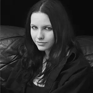
The other thing is, well... You need a more in-focus self portrait! :lmao:

Nice work though. I don't know if you had it professionally designed, or did it yourself. But it looks good.
 
I'm not a savy web user, but..and it could be my browser. On your home page, your "Full Story" buttons are covering the first letter of your Work, Process, and Craftsman buttons. When I hover over them they go fall back to the side where they should be..if I'm making any sense? LOL That's the only thing I see, and like I said, could be my browser here at work. On IE and probably outdated version.

Great work by the way!

Are you using IE6? If so, you should consider switching browsers ASAP.
 
I think it is very classy and elegant,very well designed. I found it super easy to navigate to where ever I wanted, very user friendly. Even though it has big images, it loaded very fast which is a big plus. I like it, and it showcases yourself very well. Congrats!
 
I think so Tyler, it's here at work..actually been getting the pop up that I can update, just haven't done it yet..lol
 
I think so Tyler, it's here at work..actually been getting the pop up that I can update, just haven't done it yet..lol

Please, for the sake of web designers, do it!
 
I love the clean look of it.
My gripes would be

1) like Tyler said, I would try to condense it for less scrolling. I also agree that the self-portrait ( while I like the shot framing and all ) could be a bit sharper.

2) I am not big on the "Arabic-esque" font at the bottom

3) I dislike the blackfont nav bar at the top. It looks too generic. I would rather it match the logo color and then change when scrolled over to either white with the stroke being the logo color, or perhaps to a gray color.
 
I love the layout and design of the site. It looks great and it's easy to get around. The 'full story' button is different, can't say that I've seen that anywhere before...it works, but I'm not sure that everyone will 'get it'.

I do like that it re-sizes, but one thing that I didn't like....in the process part of the site, the image re-sizes to suit the browser window, but when my window is the width of my monitor, the picture is so large that much of it goes out the bottom and I need to scroll to see the bottom...and thus, I can't view the whole image at once. It works great if I resize my window, taking it in (to the side) by about 20%.
I'm not sure how you would fix this (if it's even an issue). Maybe limit the maximum size of the image :scratch:
 
I also think it would look better if, when you click the "FullStory" for your bio, there is not a second link that needs to be clicked to actually get the full story. I think it should be a full page image like you have, with the text overlayed on the left side in a contrasting color (or even in a seperate box ) giving your bio.

Also, proof read. I notice several minor errors in the "Process" captions.
 
The "Craftsman" paragraph is a bit long. You may want to consider breaking it up into 2 paragraphs.
 
Overall I really like the clean design and presentation, very elegant, very professional. Awesome job!

I like how it resizes dynamically. Cut off text is meh to me. I like the clean layout of the front page, on your recent work I dont like how some of the titles are on top of the rings, I would think the rings would be on top. Also the Full Story button is great, but I would want to see it a little further to the side so it doesnt distract from the ring. Your navigation on the bottom right is quite elegant, might be hard for people without the video game experience I have to select the small dots though. Just a smidge larger perhaps? In the process slides some of the black text is hard to read on B&W photos. Like the photos though, especially your fingers. Just my minds musings on potential improvements, take them at your own peril.
 
I don't want to have to click on a dot to get to the information about you. There is no need to have a giant self portrait and a hard to see dot to actually view your information. I would take a cue from your home page and have the text and self portrait on the same page. The text over the faded portrait does not fit the rest of the website design.
 
Your website opened quickly and I like the layout. The only things I noticed were that the font/colours of the footer with your contact details are very faint as is the Facebook and Twitter link at the top of the page. It might just be my laptop though!

I realise that you get back to the "Home" page by clicking your name at the top of the website but, you might want to consider having a "Home" tab to take viewers back to the Home page?

The jewellery you create is amazing and I think the photos show the products off very well. :thumbup:
 
I don't want to have to click on a dot to get to the information about you.

At what point do you need to click on a dot to get information? The dot that says "Full Story" is just a hover effect. You can click anywhere in one of the squares to get to the back page.
 

Create an account or login to comment

You must be a member in order to leave a comment

Create account

Create an account on our community. It's easy!

Log in

Already have an account? Log in here.

New Topics

Back
Top Bottom