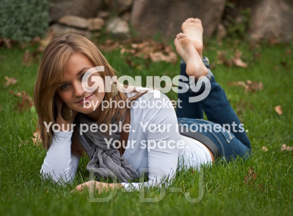
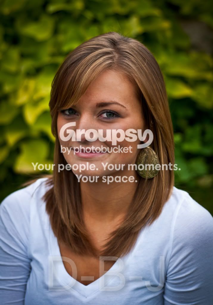
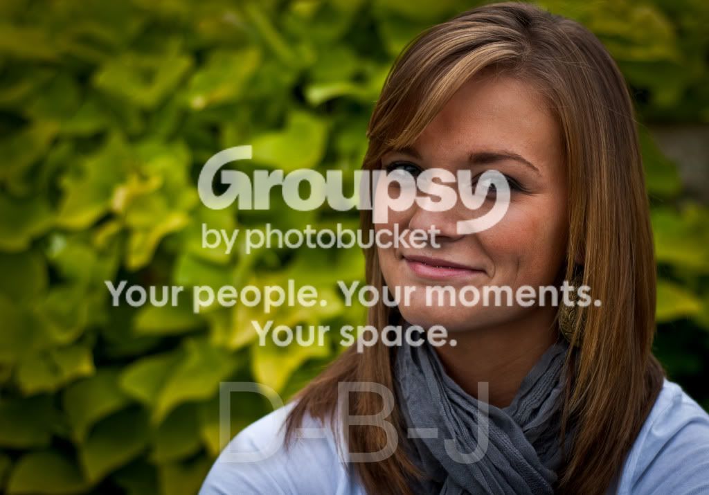
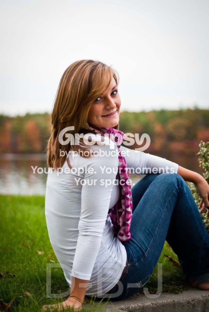
Colors are very natural. Overall these look a slight bit muted; perhaps nudging up the ISO a little bit would have helped, since these look a tad bit "under" to me. The first shot is the best pose and composition. The horizontal framing on shots 2,3,and 5 simply makes very little sense at all...not sure why those are framed as horizontals...
Frames 1 and 7 are good examples of making use of all of the compositional space! On frame 6, the shot of her lying on her tummy, with feet up in the air...cropping off the feet on the right hand side of the frame and showing empty space on the left hand side of the frame doesn't make for a very well-conceived pose; contrast shot #1 with shot #6,and you can see that shot #1 is a so-called "completed pose", whereas the cutting off of the feet on shot #6 leads to an incomplete pose...the framing kills the shot...the last,critical step was not completed...a bad framing decision ruins #6, but the showing of the entire body's pose in shot #1 makes it a very strong shot!
Overall, for a first effort, pretty good on the lighting and processing. More good things to take away from this session than bad things I think.A little bit of eye-sparkle would have REALLY elevated these shots to another level.