For a first wedding you did a pretty good job.
The sharpness and clarity are not there for the nifty fifty. Is this because you haven't sharpened in raw processing properly?
Your white balance is all over the place-which also looks to be processing problems, more than camera. It's not all that easy to learn to see the consistent colors. You'll get there.
1&3 are killed by the tilt.
1 may even be a missed focus. I am just not getting why that one is so soft. It should be sharp. Your color isn't BAD on that one, but it's cooler and a bit to the greener, whereas the third one is pushed toward the warm side.
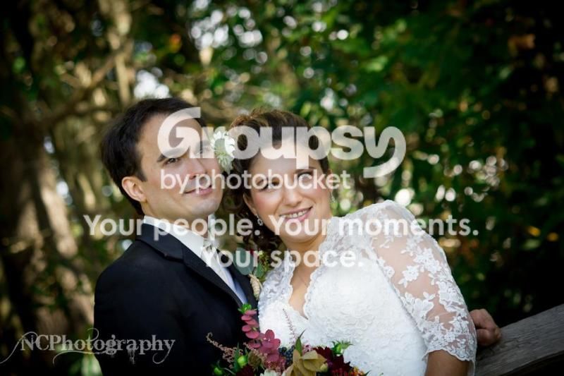
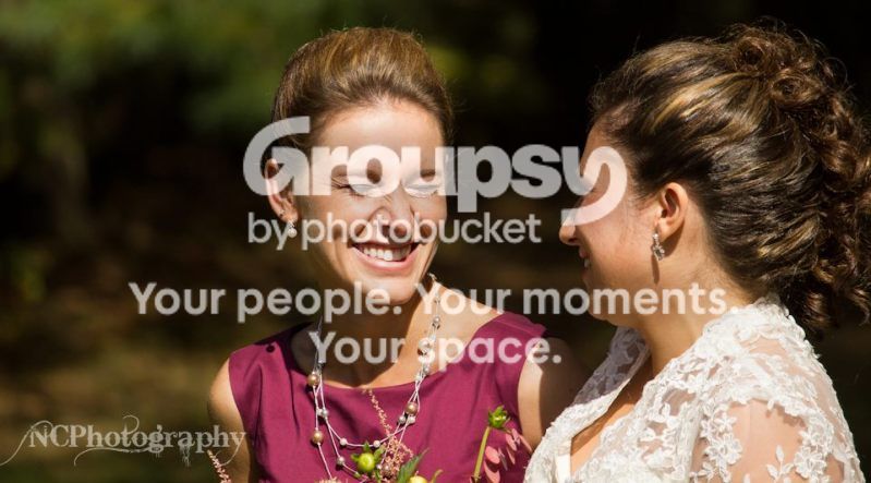
2 is a good use of dynamic/dramatic look to keep the ring shot from being boring, but definitely looks like missed focus on her ring.
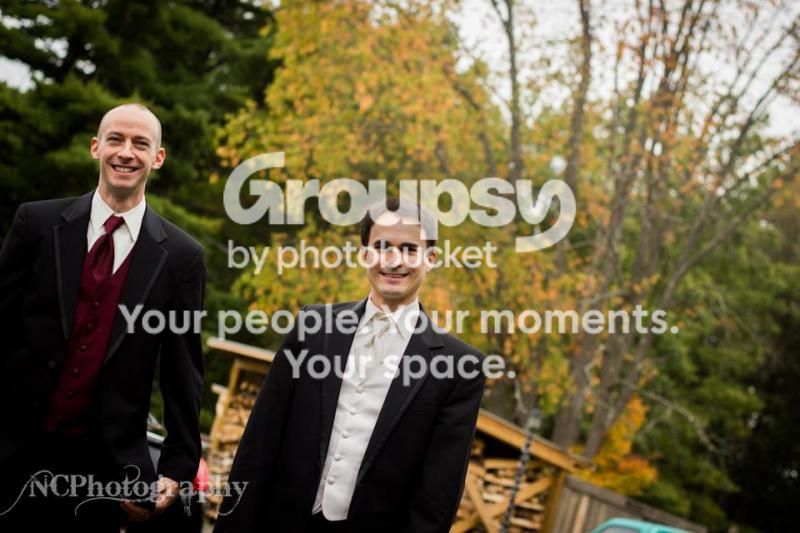
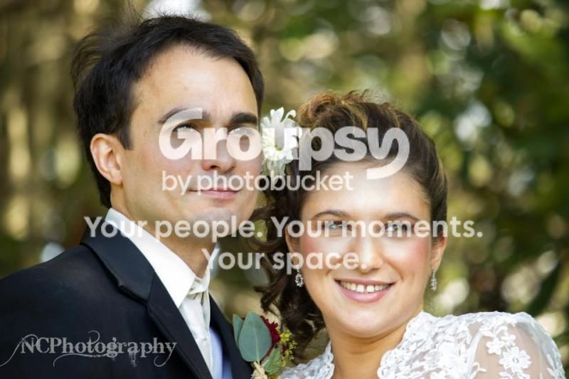
3 isn't a photo of the groom and groomsman, one is getting pushed out of the photo with a huge negative space and no purpose on the other side. It may crop better in the 8x10 format, but I have a feeling it's just a toss. The groom has heavy shadows around the eyes.
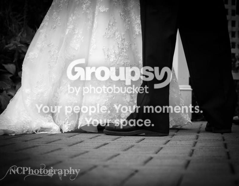
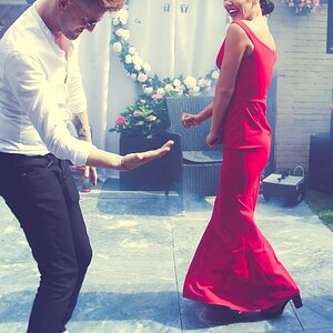
4 I'm just going to skip because I don't see anything in it. If her shoes were peeking or something. As it is it just doesn't hold anything for me. THe exposure on it is great holding on to detail in the dress as well as most of his black pants.
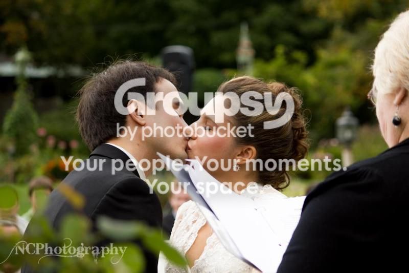
5 It was nice of the minister to get her book in there for you. It really ruins the shot. Not a good choice of angles to shoot the most important shot of the wedding from. NEVER leave that shot to chance. The color is very nice and warm. Exposure is good. FOcus seems slightly short, but it could very well be that you use photobucket. Use flickr for uploading. Make sure you resize your images if you do not have a paid flickr account to under about 2000 pixels or flickr does it for you and it does change your image. Photobucket isn't color managed and it changes your images no matter what you do. I am pretty sure that if you look at the image on your computer compared to that in Photobucket they aren't the same.
6 is pushing the limits of warm. I am guessing that the moment held some special meaning for the bride, but as a shot without explanation it kind of flops for us. Probably great to the bride.
7 You've reverted back to the green/cool side of things and on this one it's a bit too green. Again the focus is softer than it should be and I am not sure why. It doesn't really look like missed focus that I can pick out. Maybe shutter too slow?
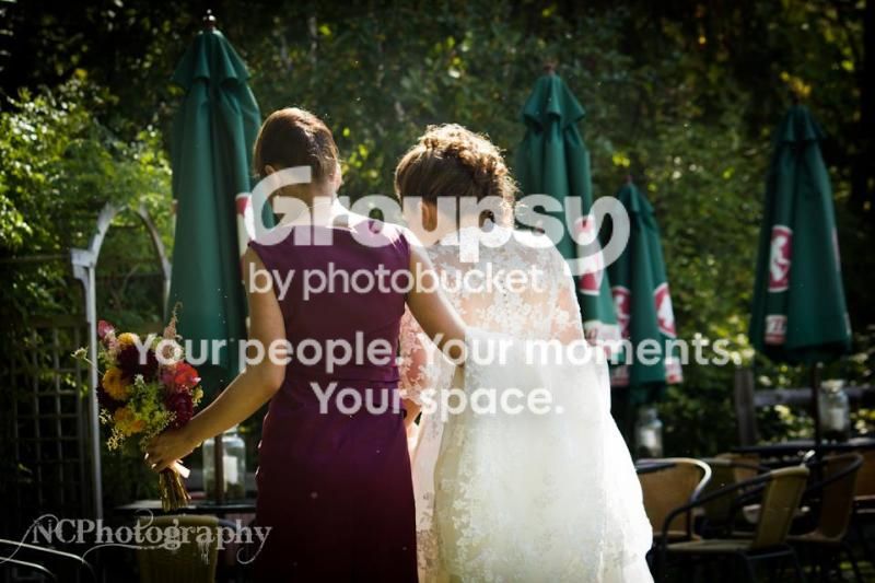
8's totally useless to an outside viewer. Perhaps it has meaning if it were explained. Backs are sometimes great subjects, but there has to be meaning derived from it. Focus is soft again, but I can't pinpoint the problem. At times I think the bouquet is sharp, then I think no... Then maybe it's the arm and the flat back of the train... I THINK it's short, but it could just be photobucket!







![[No title]](/data/xfmg/thumbnail/42/42040-7a66cabbeffd44783ea44a91ef4d0e70.jpg?1734176423)