I agree with Jaemie's points as well. I do have a couple additional thoughts on the composition.
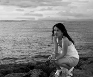
I personally would have liked to see just a little more space under her feet. You didn't crop off any of her feet, but they're still so darn close to the edge of frame that it feels a touch cramped, almost as if she's standing on the edge of the frame and not on the rocks. Had she been just a tad higher in the shot (keeping much more room above her than below) it would have felt more right to me.
I know it is generally a no-no to run a horizon through your subject's head, and I don't fault Jaemie for that bugging her. On the other hand, I'm not sure how you could have shot this particular scene in a better way. I like your perspective relative to your wife, so let's assume that you're not changing your shooting angle drastically (as that would create a totally different shot). You have three scenic elements to work with - the rocks, the water, and the sky - I like their relative proportions in this shot. But let's say that you did want to not have the water/sky line run through your wife's head. You could change your perspective slightly to move it up or down. If you move it up above her head you've reduced the sky to about half of what it is now - in my opinion that is too little a portion of the shot, plus you would be cutting out the bright part of the sky and leaving only the flatter grey portion near the horizon. Conversely you could bring the sky down to just below her head, but that would put the horizon right about the middle of the frame (generally thought of as another no-no). Anything beyond these (ie, removing the sky or making it more than half the background) would require a substantial change in angle relative to your wife. So yeah, based on the location and the pose I think you composed it well. And maybe it's because her dark hair frames her face and sets it off from the background, but I don't really mind the height of the horizon anyway.












![[No title]](/data/xfmg/thumbnail/31/31039-558cdb3d311dc67b7a2134527e230488.jpg?1734159138)


![[No title]](/data/xfmg/thumbnail/31/31036-0a0c3867fff22fb2065056d7aeea64ed.jpg?1734159135)