Newbie Looking for Some CC!

itsjustbreality

No longer a newbie, moving up!
Joined
Jan 14, 2017
Messages
125
Reaction score
63
Location
Somewhere in NY
Can others edit my Photos
Photos OK to edit
Hello!

I am new here. I posted an entire book about my photography experience in the welcome forum (haha), so I'll spare you the details here. Long story short, I've been exposed to photography here and there, but just started taking it seriously. I'm a serious hobbyist for now with the aspiration of starting a fledgling business a year or two down the line.

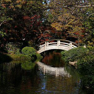
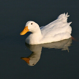
I'm looking for some constructive criticism! Below is a very small sampling of images from an engagement session I did a few weeks ago. I would love to get some feedback and input on how to make my images better, and to be a better photographer!

For reference my camera at the moment is a Canon Rebel T2i with a kit lens, and I also have a 50mm 1.4 I use mostly.

Thank you all so much! :)

L&G-6570.jpg L&G-6890.jpg L&G-6956.jpg L&G-7162.jpg
 

Attachments

  • L&G-6890.jpg
    L&G-6890.jpg
    2.2 MB · Views: 228
Photo 1, her hands and hair bun: too much top space...an issue that many people have until they get used to composing in a 3:2 aspect ratio. Same issue with Photo3, man kissing fiancee wearing polka-dotted skirt; again, a LOT of top space. I "get" the trees, in a way, yet...she is cropped awkwardly. The camera height, and the crop on the skirt, and their low,low placement in the frame; this is not a good,solid final composition.

Contrast these two images and their top space, with Photos 2 and 4, in which most of the entire frame space has been filled and filled well. In Photo # 2, the sepia-toned clench of the two, you've filled the frame well with the most-critical aspects, and back-lighted it. This is a simple, yet VERY well-done image.

The leather jacket shot of him and her...this is not composed well: he looks off to the right...she looks at the camera...they are placed very far to the short side of the frame; this causes visual tension/ The black thing that emanates from his sheepskin jacket's collar...distracting. His expression is "disinterested and looking away", while she looks to the lens, expectant, hopeful: this is something the photographer needs to direct, to stagem to explain. This is disconnected subjects; contrast this disconnect with the simple, VERY well-done image you achieved in L&G-6890, the sepia-toned, close-in shot of the couple.

Becoming a better photographer would involve looking at a lot of images, and analyzing them, very carefully. I have not seen your intro thread. Becoming a better photographer will also entail learning/being willing to CROP INTO the original frame, to see what can be done to improve some shots. Over the last 35 years, I have seen a HUGE issue with the amount of top space people allocate to their horizontals, and to their "talls". And that is really, very much partly a camera issue: the 3:3 aspect ratio does NOT WORK all of the time for people pictures. Be prepared to crop many images to 4:5, or 4:3 or 6:7, or to 1:1 (square).
Thank you so much for your honest feedback, Derrel.
After looking over the photos again with your input in mind, I can definitely see where you are coming from. I attached a similar tree image with same issue (I don't have the other in my phone) . In your opinion, Does cropping the image make it flow better, or is it more of an issue with camera level?

The 'dissinterested' photo, I do see how it can be distracting with where their gazes lie. In this particular photo, that is the 'look' they wanted to go for. More of a vintage/rockabilly vibe. They specifically said they wanted a picture where he is looking off, and she is looking at the camera. I guess coming from that context in striving to meet their request, I missed succeeding with the overall composition. ( And the flap does annoy me to...I'm working in being more aware of what is in my images outside of the subject)

So thank you! You gave me some good things to think about/be aware of.

1484571264413.jpg


Sent from my SAMSUNG-SM-N910A using ThePhotoForum.com mobile app
 
Last edited:
Does cropping the image make it flow better, or is it more of an issue with camera level?
All photos do not "flow". While some compositions seem to flow, that is only one aspect of composition. Cropping to a good composition is more about balance, IMO.

When I edit a photograph, I usually straighten first, then crop. Getting verticals vertical and horizontals horizontal is more than just someone's opinion of what "looks good", it is fundamental to the way we humans see the world. If something is so out of whack that it draws attention AWAY FROM your main subject, then you need to fix it. I'm not talking about "Dutch Tilt", either, in which the photographer tilts the camera far off of normal purposefully. Just whenever there is something that needs to be fixed, you fix it.

As to cropping, this is something that is supposed to enhance a composition. We sometimes do this with a zoom lens, or in post-capture editing, but the result should be the same. Consider the overall intent of your composition, and make it work.
Thank you for the clarification, I appreciate it!

Sent from my SAMSUNG-SM-N910A using ThePhotoForum.com mobile app
 
Yes, the alternate cherry tree and couple shot is better, but I think it could be cropped a bit more if desired. The lighting is pretty hard in that situation: the processing could be more incuding of fill light.But the real issue was the quality of the lighting at the time the photo was shot: it needed better lighting, more fill, or--an exposure that allows the backdrop to go much lighter.

As for the rocakbilly look image...if they wanted something like that, then you satisfied their desire, which is a big part of satisfying paying clients. Look at the triangle of white light between their faces: imagine if they had been moved over 6 inches to the right, so the green doorway would have been that triangle. Minor issue one might say, but it's more of a posing issue.

I looked at your Welcome post, and the potter at the wheel in the dark studio shows the top space issue pretty well. I was at the library a month ago, looking at photo books, and I saw one byMichael Freeman, and it had a neat "worker in rice paddy" segment: he had about msixteeen different compositions, some wides, some balls....it was a great examle of showing how one can compose, or CROP, after the fact, to make different pictures.

Camera level: in the pottery studio shot, the worker's face does not show, but is hidden by the cowboy hat. This is an example of where a lower camera level could maybe have changed the image a lot. But...that would create a different image, right?

The book I was looking at was designed for DIGITAL shooters. The issue is that many times, digital shooting involves shooting with LATER cropping being planned.

  1. The Photographer's Eye: Composition and Design for Better Digital Photos 1st Edition...this is from the Amazon page

Thank you so much for those resources, and all of your help! :)
 

Most reactions

New Topics

Back
Top