What's new

Pastels and Watercolors (and a few other art media)

Another sketched face in graphite and colored pencils. The colored pencils just don't erase well enough for a crappy sketcher like me. I'm probably going to stick with graphite pencils. They erase well enough, and if I think I'm going to paint over them, I can use a workable fixative spray to cover. I started out doing that, then broke away while experimenting with other sketching media.

Here's the new face:
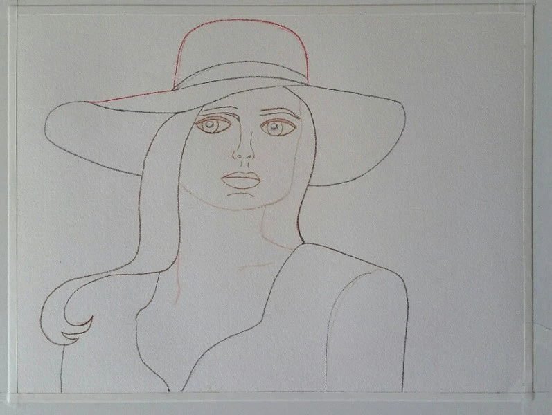
Woman in a Red Hat, wip 1 sketch.webp


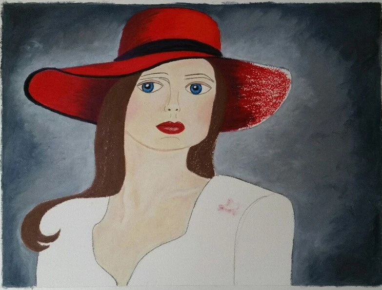
A couple of work-in-progress pics. I did the background first so I could just roll the oil pastels over it later.
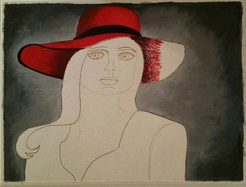
Woman in a Red Hat, wip 2.webp


Started getting really messy here.

Woman in a Red Hat, wip 4.webp


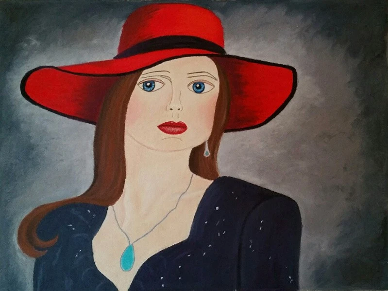
Finished:

Woman in a Red Hat.webp


I like this one better than the other one, not quite as delicate. I hadn't tried jewelry and changed it a couple times. I want to get away from the hats for awhile. Anyway, this one was fun to do - no attempt at realism from me! :lol:
 
Very cool Terri. I like the hats, it’s sort of your trademark!
 
Painted this last night after looking at some lupine photos online trying to plan “The Great Lupine Chase” for tomorrow. Heading out at 1am to drive up to NH mountains for sunrise at a lupine field. This painting is, IMO, too in the middle. Not loose enough to be loose and not detailed enough to be realism. I actually liked the Instagram crop the best since I messed up the bottom.

FBFD12EB-DC7F-4A93-8CD6-388E664996FE.webp


E32B407E-E346-4CB3-BBCC-6DBA696B381C.webp
 
This is cool, I like all these vertical lines. Pretty palette, too, with your yellow sky. I don't think you messed up the bottom at all.

You're heading out at 1 am? ! Now that's dedication for a sunrise shoot! Hope the weather and the flowers cooperate with you!

Now that you're painting, remember that all photos can be used as references, if they don't come out the way you want. :winksexy:
 
This is cool, I like all these vertical lines. Pretty palette, too, with your yellow sky. I don't think you messed up the bottom at all.

You're heading out at 1 am? ! Now that's dedication for a sunrise shoot! Hope the weather and the flowers cooperate with you!

Now that you're painting, remember that all photos can be used as references, if they don't come out the way you want. :winksexy:

Lately when I pick up my camera I am thinking more about how I would want to paint something than how to get the photo I want.
 
Another sketched face in graphite and colored pencils. The colored pencils just don't erase well enough for a crappy sketcher like me. I'm probably going to stick with graphite pencils. They erase well enough, and if I think I'm going to paint over them, I can use a workable fixative spray to cover. I started out doing that, then broke away while experimenting with other sketching media.

Here's the new face:

View attachment 192842


A couple of work-in-progress pics. I did the background first so I could just roll the oil pastels over it later.

View attachment 192843


Started getting really messy here.

View attachment 192844


Finished:

View attachment 192845


I like this one better than the other one, not quite as delicate. I hadn't tried jewelry and changed it a couple times. I want to get away from the hats for awhile. Anyway, this one was fun to do - no attempt at realism from me! :lol:
I agree with Sharon, that hat is awesome. I love the shading
 
Lately when I pick up my camera I am thinking more about how I would want to paint something than how to get the photo I want.
:icon_eek: This is how it starts.
 
What a great sign! I bet that was fun to sketch out. The scaffold looks like Star Trek communicators. :lol: Love it!

I see the glowing effect around it, and reflection in the foreground. Quite fabulous. :1247: The only thing I'd be tempted to do would be darkening the sky a bit more, to make it pop. Purple and black make a great sky combo. Yay!
 
What a great sign! I bet that was fun to sketch out. The scaffold looks like Star Trek communicators. :lol: Love it!

I see the glowing effect around it, and reflection in the foreground. Quite fabulous. :1247: The only thing I'd be tempted to do would be darkening the sky a bit more, to make it pop. Purple and black make a great sky combo. Yay!
Thanks! I’ll darken it tonight to see how it looks and will repost.
 
The only thing I'd be tempted to do would be darkening the sky a bit more, to make it pop.
You’re so right, it looks great with a darker sky. I also found a blending pencil and went wild.


Neon Sign 2
by Wade, on Flickr

ETA: and now I see spots that need fixed... I’m done, tell me I’m done lol
 
I've tried flowers a few more times and am starting to feel like the ones that came out looking good are just beginner's luck :icon_sad: So I am just going back to sort of doodling to figure out what the paint does, and what style I'm trying to achieve. I know I am not going for any kind of realism, but I'm still working out what I am going for. I love the loose, delicate look of the water colors, and simple shapes, and am looking for tutorials on how to achieve that without it looking like I'm a 5-year-old finger painting :lol: (And yes, I make notes to myself on my doodle pages.)

IMG_20200606_115831 - Edited.webp
 
A few more doodle pages. I have an emulsion lift of stained glass doors and I wanted to practice shapes, so I used it as a model. The really crappy attempts were me realizing that I'm not good at copying, and then trying to work instead on interpreting.

IMG_20200610_234240 - Edited (5).webp


Trying out different shapes and brushstrokes, and the squares on top are different paint consistencies and layering.

IMG_20200610_234240 - Edited (2).webp


And finally, a little abstract I just felt like doing in the midst of more doodling :)

IMG_20200610_234240 - Edited (4).webp
 

Create an account or login to comment

You must be a member in order to leave a comment

Create account

Create an account on our community. It's easy!

Log in

Already have an account? Log in here.

Back
Top Bottom