gsm275
TPF Noob!
- Joined
- Mar 24, 2010
- Messages
- 108
- Reaction score
- 4
- Location
- Vancouver, BC
- Can others edit my Photos
- Photos OK to edit
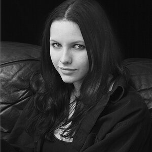
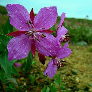
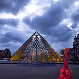
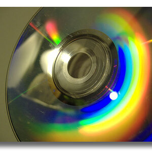
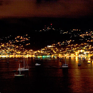
Hey guys, looking for some feedback on a handful of my pics from my second outing. I had joined a Photography Walking Tour here in Vancouver, BC to learn a bit about photography and my camera. Please don't hold back!
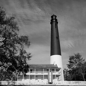
Pic 1:

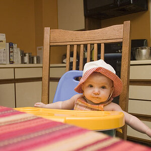
Pic 2:

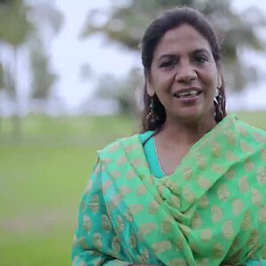
Pic 3:

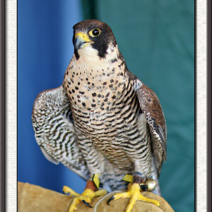
Pic 4:

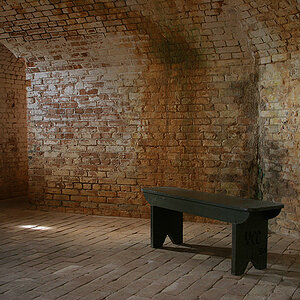
Pic 1:
Pic 2:
Pic 3:
Pic 4: