Ramirez/Barton wedding 4/21/2012

DiskoJoe

Been spending a lot of time on here!
Joined
Mar 24, 2011
Messages
4,540
Reaction score
528
Location
Houston
Can others edit my Photos
Photos NOT OK to edit
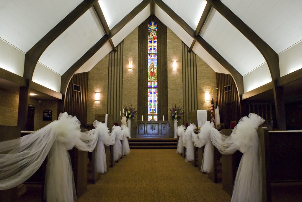
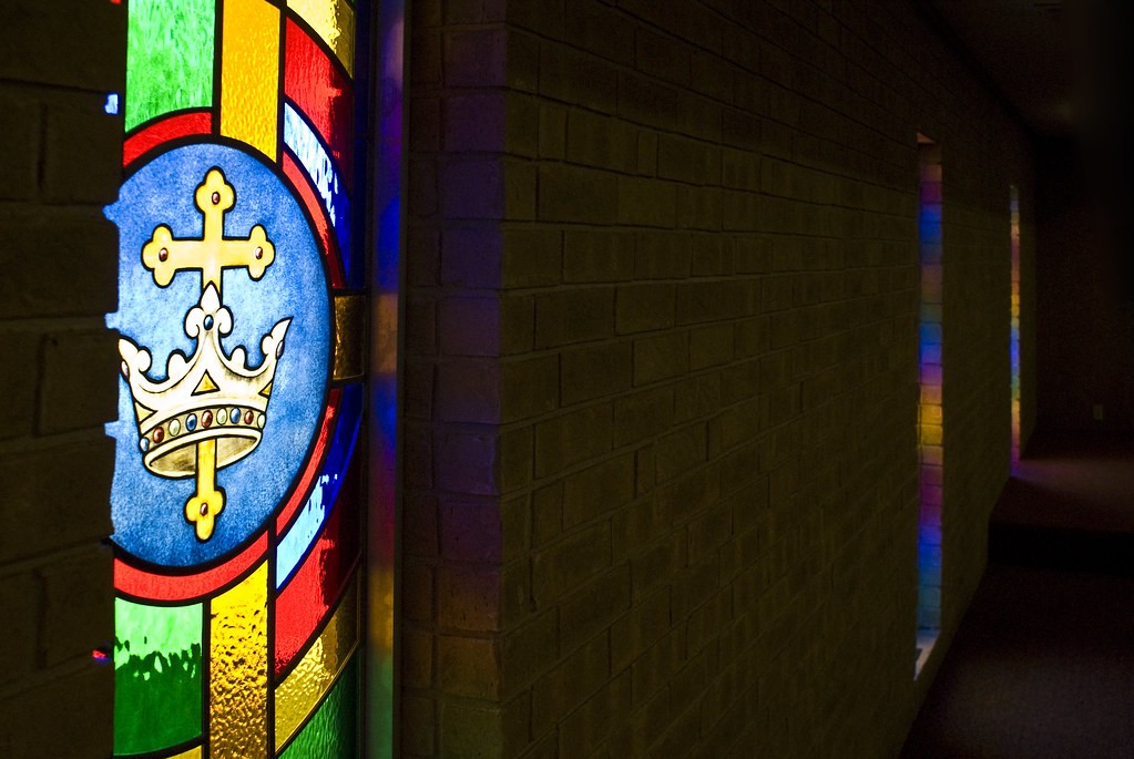
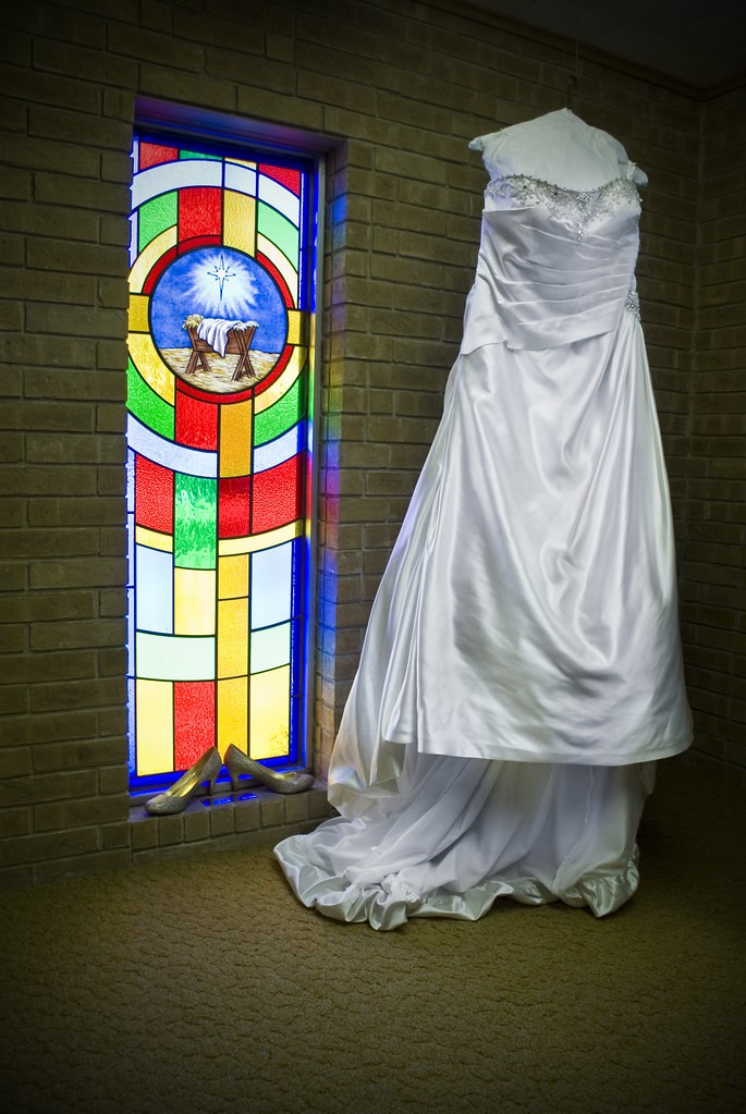
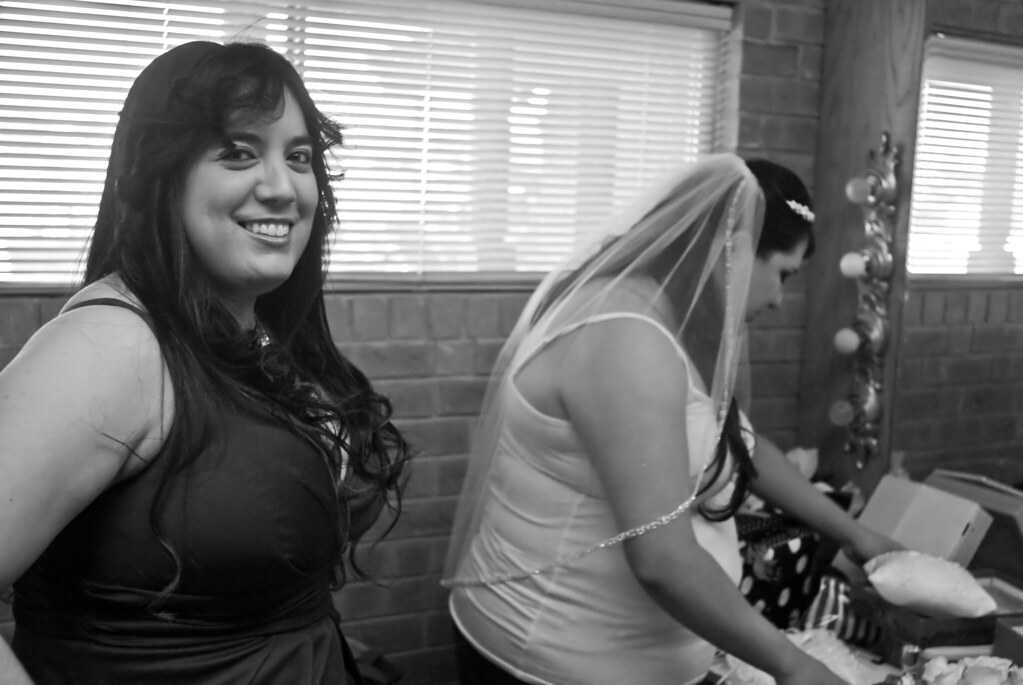
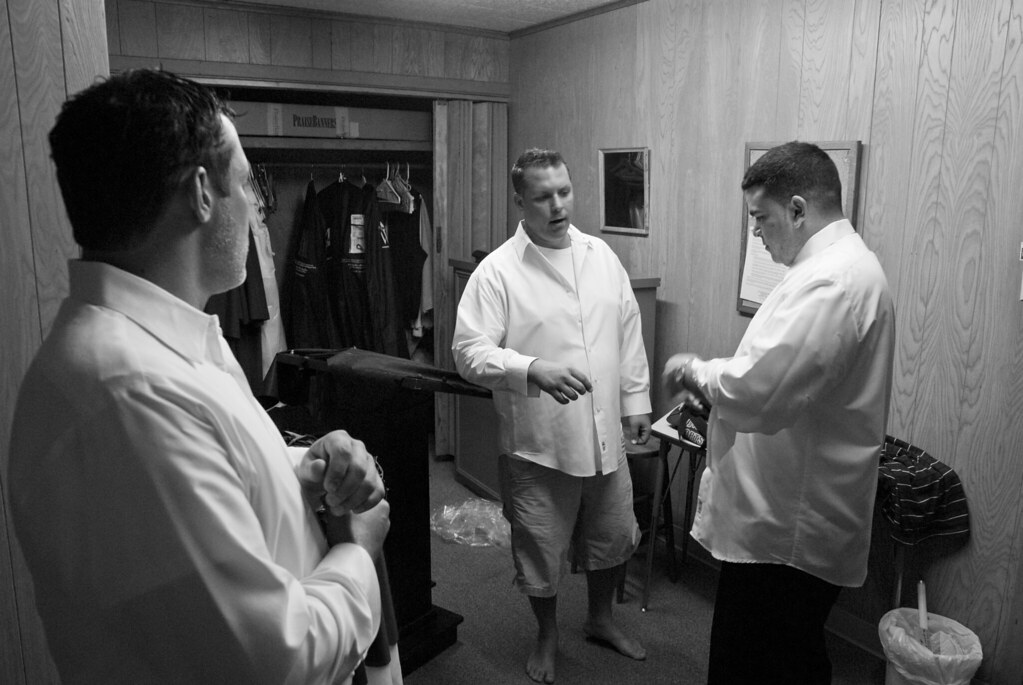
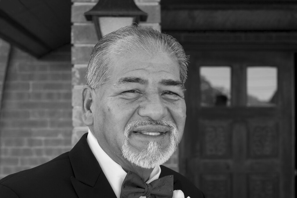
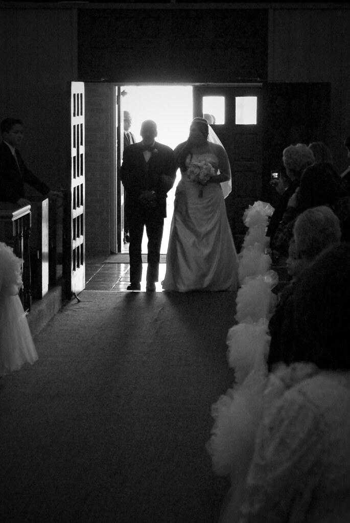
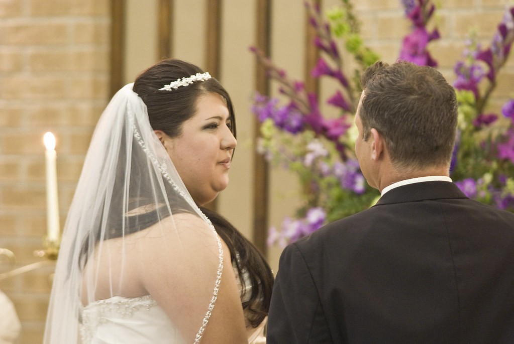
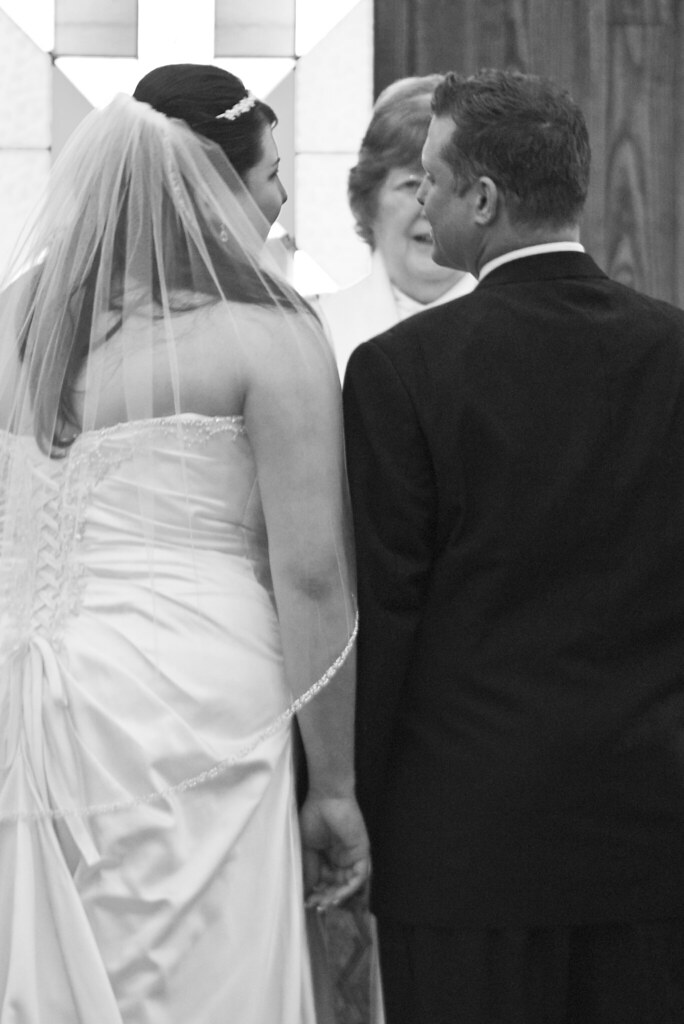
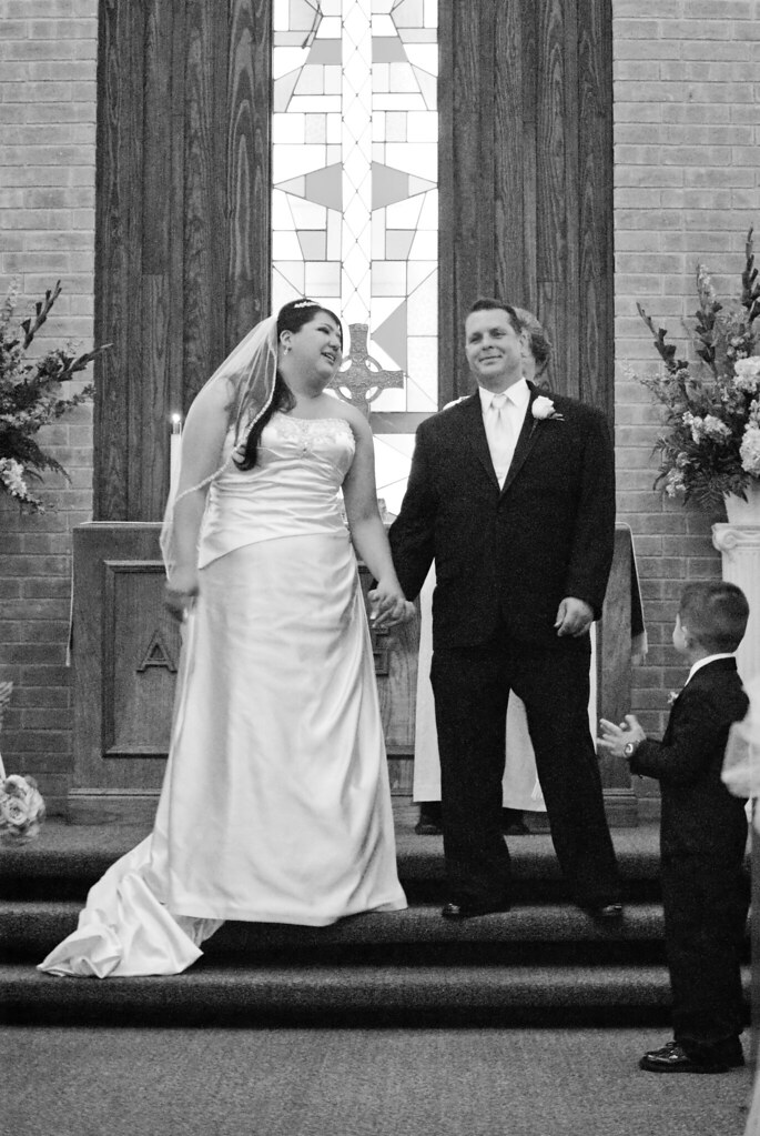
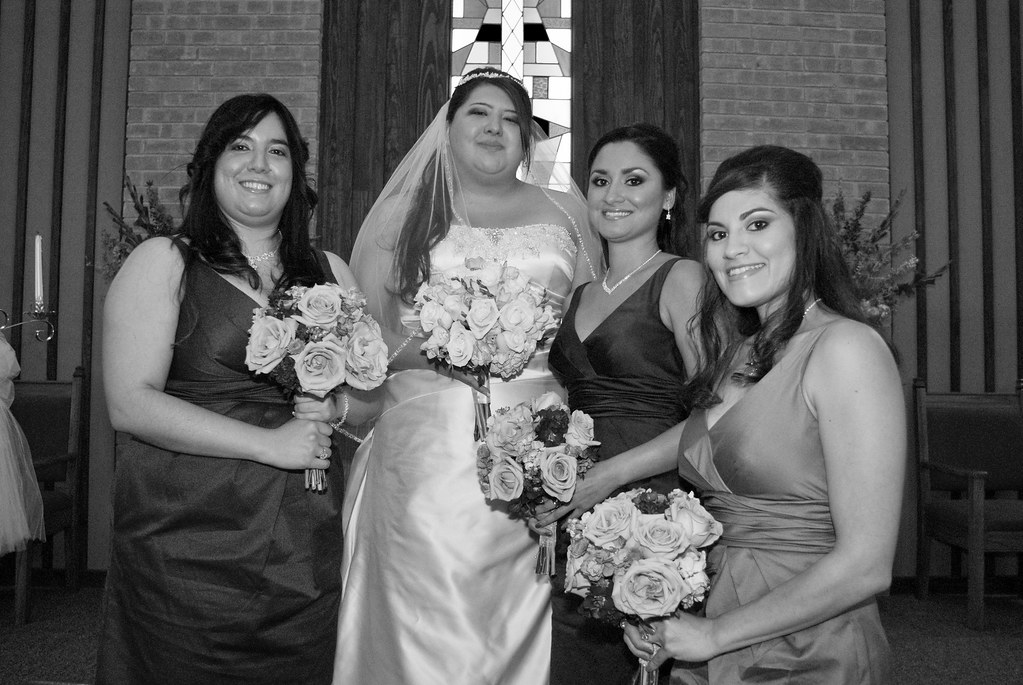
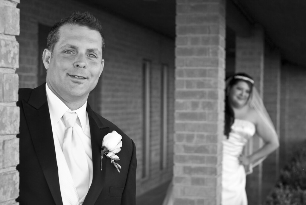
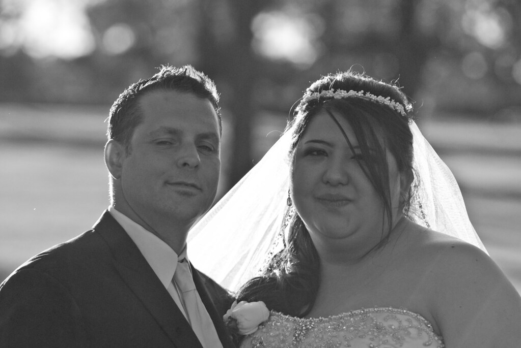
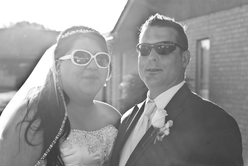
Just a few highlights from the Last wedding I shot. Starting to feel the stress of doing wedding photography. Bride and groom are very nice people but gave little to no direction about what they wanted from their photos. i just got the line, "I trust you." Sounds good but basically it means I have no idea. Think it still turned out okay. I may post some more shots later since Im still editing.

1

2

3

4

5

6

7

8

9

10

11

12

13

14

15

16

17

18

Bride/Groom Shades by DiskoJoe, on Flickr
 
Watch out for having all grey tones in your b&w images.
 
I hate the "I trust you" and "Use your judgement" lines.

Me too. Funny thing was that she was a total bridezilla for everyone else but me. I got no directions and probably needed them the most.

Watch out for having all grey tones in your b&w images.

i know what you are saying but this is about as good as it gets. If you look the white are pure white (vail, shirts, etc). So this is more the effect of skin tone. She is orange and he is slightly tan with red hues, white people problem. I tried to make the orange and yellow tones lighter to brighten up the skin some. It worked better in some then others. Plus this was a rather rushed wedding. ceremony was only half an hour and had 1 hour in between ceremony and reception to get all posed shots. There are lots of cheesy family group portraits that I spared yall from cause I thought they were a bit boring.
 
Last edited:
With their names as your thread title I would be cautious about the bridezilla comments.... Google you know......
 
With their names as your thread title I would be cautious about the bridezilla comments.... Google you know......

Not worried about that at all. She had good reason to be that way to some of the people that were involved with her wedding, specifically the caters and the country club.

So how are the fish?
 
Last edited:
:) Lol..... Pretty good.
Actually I need to change my user name cause I'm not Balmiesgirl any more. "Balmie" and I were married for 20 years..... But things changed recently....
 
Last edited:
Did you do some cloning on the top of the building to remove something in the first shot? There are some odd patterns, a break in the roof line, and a dark spot over the roof line at the back of the building.
 
Sorry man. I am not a fan of these. I think one of the most important thing you have to improve if you want to be a good wedding photographer is the ability to choose what looks good and what looks bad. If it looks bad, dont deliver it. Why do you think this photo looks good? Come on man. Just pretend you are her. Do you really think this photo looks good? She is not looking at the camera and it looks like she is cross eyed.
7005071446_9cea1c3b60_b.jpg


Also, you really need to work on your B&W conversion. Too much middle tone. Very gray.
 
Did you do some cloning on the top of the building to remove something in the first shot? There are some odd patterns, a break in the roof line, and a dark spot over the roof line at the back of the building.

Good eye. I missed that spot. Dust on the lens. Little bit of cloning on some of the leaves. No Cloning on the building though.
 
:) Lol..... Pretty good.
Actually I need to change my user name cause I'm not Balmiesgirl any more. "Balmie" and I were married for 20 years..... But things changed recently....

So you're saying your available now? I see you like martini as well as fish. I LOVE martinis. Dirty with Vodka and shaken with just a spritz of vermouth on the glass. You?
 
I agree about the very grey tone in ALL of your black and whites, it's rather unappealing. Also, I am sure it was a lack of flash availability in the church, but the lighting as a whole is flat and lacking. Also, as others mentioned the poses are also lacking.

The best photos in this set are the ones without people in them.
 
This is a very underwhelming set to me for a variety of reasons. I want to take a moment and point out what I see as the good and the bad in the images.


I know you didn't specifically request feedback, but I had a few moments and wanted to address each image on a deeper level.

1

Roof smudge or dust on sensor/lens, could use a bit of a contrast bump as the image is flat. Also, some stray spots the sky need to be taken care of.

2

Nice, clean symmetrical shot. I'm sure you had to shoot at high ISO in here. The whites along the aisle are not quite white, a good indication that WB and/or exposure bump may be necessary.

3

Nice colorful abstract

4


As someone else mentioned, the best photos are those without people in them. It's a lot easier to produce a good image with a static subject. Nice colors and symmetry.

5

The vignette is pretty strong.. Don't mind it at the bottom so much but along the right frame and at the top it feels like it's encroaching on the subjects of the image. Nice composition and really solid image here, aside from the vignette.
6

Fairly snap-shotish. Wish limbs weren't cut off. Maybe a full step backwards if possible. You also had the mirror there to play with compositions with reflections.

7

Good use of the WAL here to give us a nice feel for the groomsman area. A decent candid.

8


When you're shooting individual people, like the father's of the bride, you really need to shoot portrait. This is your best BW conversion of the set and probably the best expression capture, but the shot is killed for me because you opted to horizontally frame. In other words, the door and the brick take up more of the frame than your subject! When people are standing up, especially as a couple or by themselves, flip to portrait.

9

Peculiar expression, horizontally framed. Not one that the father of the bride would be impressed with, probably.
10

Ouch. Huge dynamic range here with the sunlight coming through the door. Details lost throughout. Noisy and lossy everywhere. No detail in brides face or the fathers. B&W does not save this image. Needed to fire OCF if possible, spot meter the face, or just not shoot against such a bright doorway...

11

Framing is peculiar. The mans right shoulder is cut off. Crop from the left, too much dead/distracting space.
12

A bit soft and noisy. But a decent capture from an expression and pose standpoint.
13

14


Pretty solid shot. Maybe crop in from both sides a bit.
15


Don't give this one to the client.
16

Good use of DOF, creative shot, well implemented. Good conversion here with the BW.

17

The BW conversion, like others in the set, has too many middle grays. Need to work on your BW conversions.

18


Bride/Groom Shades by DiskoJoe, on Flickr
Humans are drawn to faces. We are drawn to eyes as they are the primary interface of the face. Covering them up (intentionally or not) is not, in my opinion, a good photographic choice.

Thanks for posting. I found many in the set that I liked and disliked for various reasons.
 
I would KILL for clients who give me the gree light to do what I want! It gives you the oppotunity to create something really unique for them, rather than having to adhere to some boring shot list.

Some C&C - take it or leave it :)

1) Grey
2) It's okish. Kinda flat and bland.
3) Could be good filler in an album, but not worthy of a stand alone image
4) Would be nice to see more window, less wall. I different perspective would be good. Clone out the outlet on the wall.
5) Not for me. Maybe if the dress was infront of the window. Sorry just really poor composition.
6) Okay candid - but grey
7) Same as 6
8) Best of them all, in my opinion, but still grey
9) I mean it kinda funny, but not flattering. At all. If he was one face is a sea of faces sure, but for a portrait? NO
10) Again, with a different composition it could have been much stronger - like just the bride and father, where the backlighting is there, the noise, but that perfect moment captured makes it all okay... and its grey
11) Its good but needs contrast
12) Grey
13) Not too bad, grey, very noisy
14) Crooked, shot close and wide giving the girl on the right distortion. Try to back up, and zoom in, if you can.
15) This is awful and should never be show. I cannot for the life of me figure out why this was posted.
16) Cute, but you can straighten it out, add some blacks.
17) Doesnt do much for me or show much love
18) Kinda cheeseballish. If clients are wanting to do these kinds of shots, try get them in a more candid way. They will look less posed and you can catch some good smiles and real laughter.

Sorry for the harshness, but its only meant to help you grow. Work on those B&W conversions. And I'm not sure what ISO you were shooting at, but if your camera has that hard of a time with noise, get a tripod, faster glass, or a better body. The noise level is pretty darn harsh for those indoor shots.

K
 

Most reactions

Back
Top