What's new

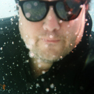
Rate the photo above you

Sharpness and focus are right on.
Pose and your expression are both a little flat and unexciting (but now that you've got the beginnings down pat, you can work on that.)

Note the pinpoint catch lights from your camera flash, try to steer away from that.
The white balance is cold, you can tell that by the blue tinge of your t-short and it does have a not-unpleasant oversaturated look.

5/10

---------------------------------------------------------------------------------------------------------
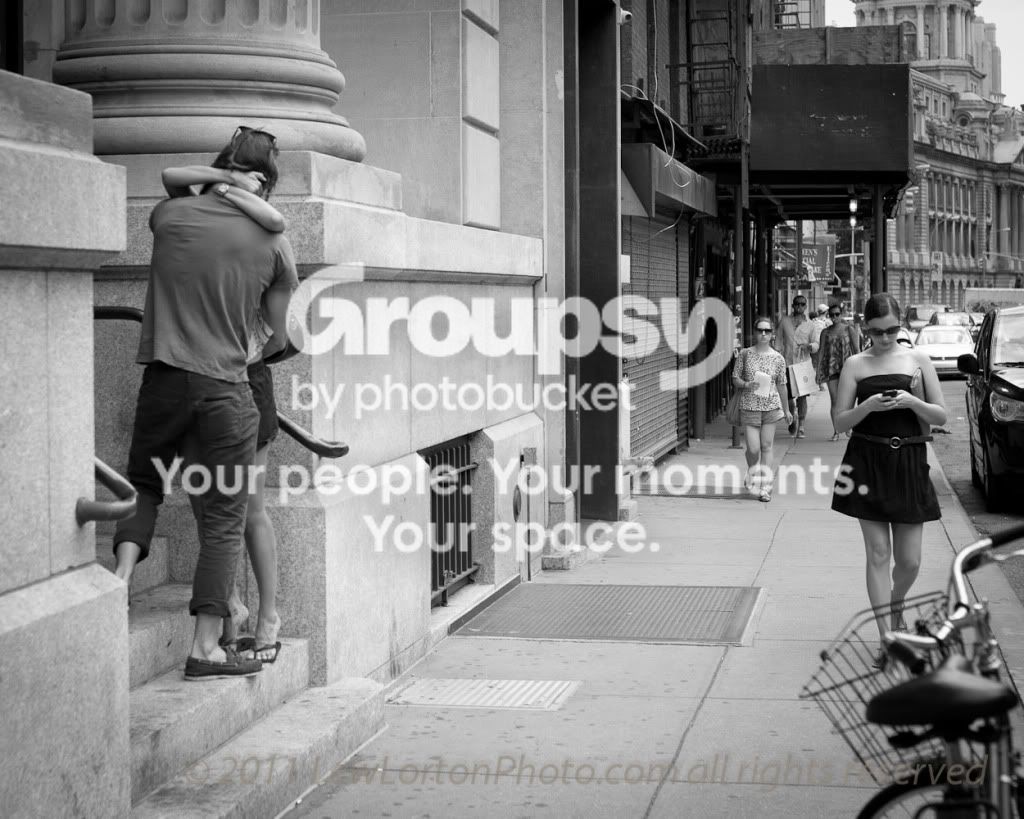
Love in New York City
loveinNYC_-0799785.jpg
 
Last edited:
Sharpness and focus are right on.
Pose and your expression are both a little flat and unexciting (but now that you've got the beginnings down pat, you can work on that.)

Note the pinpoint catch lights from your camera flash, try to steer away from that.
The white balance is cold, you can tell that by the blue tinge of your t-short and it does have a not-unpleasant oversaturated look.

5/10
Thanks for the feedback. The catchlight is actually from the windows. I don't have any lighting equipment so i had to use the natural light. I agree the pose/expression is rough. Im not a very photogenic person so i felt unnatural being on the other side of my camera.
 
6/10 I feel like there are 2 subjects in the photo that need greater separation. I think the photo could be cropped twice, one vertically of the sidewalk with the woman walking and the other of the couple. These could both be great photos as technically the image is great; however, compositionally I feel it is a bit lacking.

img4534mod.jpg
 
And here I was thinking Lew should get an 8 or maybe a 9 for a great story. Point deducted for not having the right handlebar totally in frame. Maybe I need to quit.
 
5/10 Not sure what the subject is? The guy or the light box?

A shot of my niece during a photo walk. She just wanted her picture taken.

_1050911.jpg
 
8/10
Overall great comp and light! The focus looks a little off but that is really picking at detail. Maybe to soft.

Mirror maze.....
Highhh ISO I think it was 1600+
and free hand.
c6e4e37a-d7f6-6b4e.jpg
 
I really like the curves and colors in this one. Why can’t I find neat places like that? 8/10

I had a really busy week and my forum time has been nil to none. I’m glad to see this topic is still going strong! It’s 4AM and I’m still wide awake so here’s my contribution. I took photos of all the kiddos this week at VBS – Racing/race cars was the theme. I know this boy quite well and he likes to give us attitude when he’s asked to do things he doesn’t really want to do, including having his photo taken.

IMG_1754.jpg
 
i give that it a 8/10 love the attitude

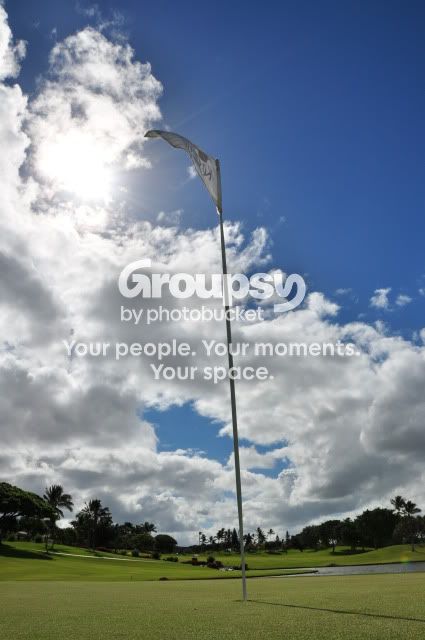
DSC_0270.jpg
 
Neat shot. Took me a few seconds to figure it out what it was. Technically is good. But it would be way better if there was a Golfer in the background putting, or at least a ball near the hole.

My department lost one of our oldest firefighters this week. He had been retired for some time. Still sad to see him go though.
1-X2.jpg
 
9/10
This is a great shot but there is too much in it. Assuming the red shirt and chair are the center of interest, the stairs and and the lower level doors are so prominent that my eyes wander over there while I wonder why you included them and allowed them to be prominent.
I would crop this from the right (and top) and vignette strongly, thus making the red shirt the only center of interest and diminishing the pull of the other doors.

1x2ll.jpg


=============================================================

Playing cards in the park in Chinatown, NYC.

from this series

p752988204-4.jpg
 
I like it, just a shame i can't see the lady's face gesturing to the player on the right 7.5/10

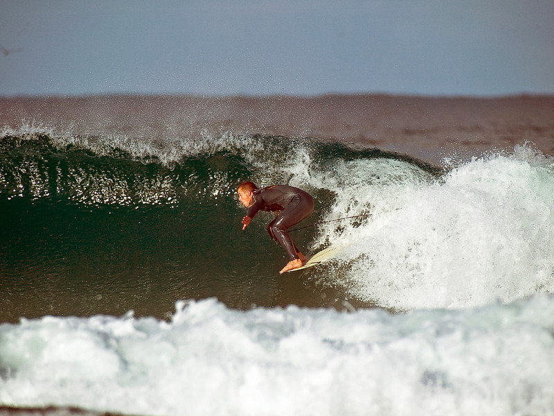
429782958_PRw78-L.jpg
 
Gary, great photo. I just wish it was cropped a little tighter, and the color of the surfer looks... off to me. Just looks like he's a way warmer WB than the water is. 8.5/10

Mine: Another HDR of our memorial to our fallen firefighter.
2-X2.jpg
 
Ive cropped them tighter before and the surfers like to see more wave
 
Gary, great photo. I just wish it was cropped a little tighter, and the color of the surfer looks... off to me. Just looks like he's a way warmer WB than the water is. 8.5/10

Mine: Another HDR of our memorial to our fallen firefighter.
2-X2.jpg

Great shot, 9/10. I think you can crop off a tad bit more on the right side though:
5951666230_15226475a8_b.jpg


Here's mine:
searching.jpg
 

Create an account or login to comment

You must be a member in order to leave a comment

Create account

Create an account on our community. It's easy!

Log in

Already have an account? Log in here.

New Topics

Back
Top Bottom