What's new

Rate the photo above you

ahh, I'm torn...7/10 It's a teaser shot.... lol I want to see her face :)

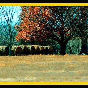
This is a heavily processed image from a color image that I almost threw away and decided to give it another shot as a vintage camera shot, hence the blowouts and softness...

Oak-Isle-1.jpg
 
4/10 I don't think the vintage effect really worked here. I dislike the vignetting a lot as well as the blowouts in the clouds. I think this could have been really nice just simply in B&W without the added effects... if it was it would probably be in the 7 range.

img4553mod.jpg
 
4/10 I don't think the vintage effect really worked here. I dislike the vignetting a lot as well as the blowouts in the clouds. I think this could have been really nice just simply in B&W without the added effects... if it was it would probably be in the 7 range.
Fair enough. Guess you have to have had a vintage camera to appreciate it. I had an old Kodak Dualflex that took pics like that.... Appreciate the input all the same. though....
 
This is a heavily processed image from a color image that I almost threw away and decided to give it another shot as a vintage camera shot, hence the blowouts and softness...
:thumbsup: I like it.
 
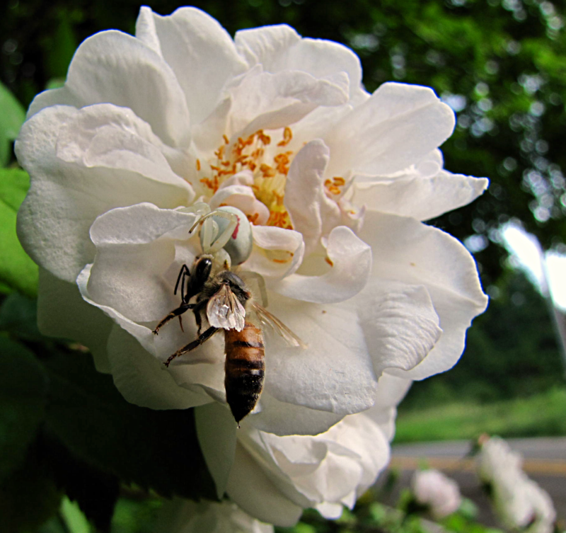
I'm guessing your subjects are the warriors, although I can really only make out one wasp. This is likely due to your focus point being beyond the subject and using an aperture value too wide. Had you stopped down the lens a bit more, you may have also rendered the stamen in focus as well as reducing the specular highlights in the background. I would consider using the spot healing/clone/patch tools to remove the large areas of white on the center, right edge of the frame. You have also amputated the flower. Colors are reasonable and nice catch on the dew drop of the wasp.

5/10


759096859_YTNAV-XL.jpg
 
Last edited:
i love everything except the angle. I would love to see a side view to get the catcher in the shot as well. Wonderful shot none the less! 9/10

B%26W.jpg
 
Very symmetrical photograph. I'm not sure if it's the angle or the lens distortion, but the building's vertical line on the top right doesn't look straight. The texture on the walls is a nice capture and lighting is soft so it doesn't over power/distract the whole photograph. I'd give it a 8/10

268103_10150250088768600_529433599_7621745_8350835_n.jpg
 
Vtec44 said:
Very symmetrical photograph. I'm not sure if it's the angle or the lens distortion, but the building's vertical line on the top right doesn't look straight. The texture on the walls is a nice capture and lighting is soft so it doesn't over power/distract the whole photograph. I'd give it a 8/10

I took the shot from a strange angle, from the side and up. I'm sure thats what gives it the uneven look. I used a grid when I was straightening it but I don't think I'll be able to get a much better shot.

Sent from my iPhone using PhotoForum
 
7/10. I love the colors and the sharpness. I feel it could've been composed a bit better.

Took this on my gfs camera. didnt have anything better. I had to edit it and it's too noisy for my liking.


lone surfer by cDimitric, on Flickr
 
I like the shot a lot. But I would have loved to see the surfer further out in the frame, giving more of a "lone surfer" feel. And it is a bit noisy like you said, but it's still a very cool shot.

7/10


EagleCloseUp.jpg
 
Slight rant-let

Without regard to the picture above, it seems that people are getting into the habit of saying how they would have taken the picture. 'I would have liked' ...... And then skipping out.
This is supposed to be about the picture posted and not an insight into the commenter's artistic vision.
I don't think people would discuss with a painter his/her point of view.

It is helpful to suggest things later but why not tell the poster how the picture affects you, what its strengths are, its weaknesses and then suggest any changes and why you think they would be useful.

And if you are new and don't know, this is the time to figure it out.

Turn this into a real and useful critique thread rather than writing a few words as a payment for posting your picture.

Lew
 
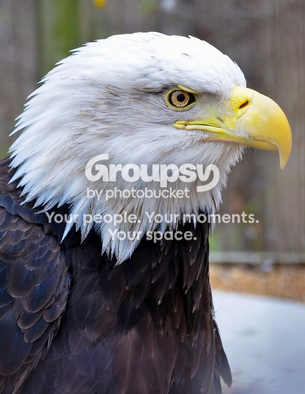
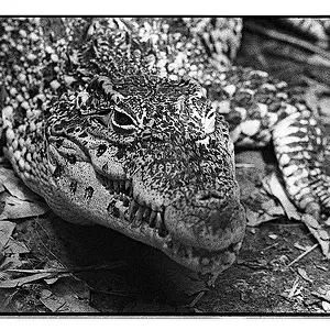
7/10. I enjoyed the eye detail and white feather detail. I think you could pull more detail out of the darker feathers on the body.

5953216318_9ed6f06d56_z.jpg
 
It is helpful to suggest things later but why not tell the poster how the picture affects you, what its strengths are, its weaknesses and then suggest any changes and why you think they would be useful. And if you are new and don't know, this is the time to figure it out.
I'm trying but I'm no way as articulate as you (and others). I fumble over myself and my CC's do nothing but show my ignorance.

So how does the latest photo make me feel? I like the bokeh but the flower is too dark. Perhaps a fill flash would have helped. The focus was supposed to be on the flower, but instead the first thing I saw was the darkened trees. 7/10

I like this photo but next time I would like to get the entire Louisville Slugger Bat to better demonstrate its the shadow on the street.

Louisville.jpg
 

Create an account or login to comment

You must be a member in order to leave a comment

Create account

Create an account on our community. It's easy!

Log in

Already have an account? Log in here.

New Topics

Back
Top Bottom