What's new

Rate the photo above you

Placing a new rule on page 14 of a 30 page thread an expecting anybody to find it is a little asinine. If you're going to have rules to a thread like this, please put them on page 1 where everybody can read this.

This wasn't a rule; I can't make RULES.
The post at post 417 is just an attempt to do two things:
1) to make the thread more useful to others
2) to encourage people, particularly relative newcomers to critique, to spell out why the picture is successful - or why not.

Without regard to the picture above, it seems that people are getting into the habit of saying how they would have taken the picture. 'I would have liked' ...... And then skipping out.
This is supposed to be about the picture posted and not an insight into the commenter's artistic vision.
I don't think people would discuss with a painter his/her point of view.

It is helpful to suggest things later but why not tell the poster how the picture affects you, what its strengths are, its weaknesses and then suggest any changes and why you think they would be useful.

And if you are new and don't know, this is the time to figure it out.

Turn this into a real and useful critique thread rather than writing a few words as a payment for posting your picture.
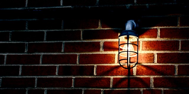
 

Sorry, didn't mean to cast a damper on this thread so will start it going again.
This is well exposed, well shot, well framed.

My problem with this is that beyond the fact that you have documented the light on the bricks, there doesn't seem to be much about the picture that is interesting.
I look at it and don't get any more than, light on bricks. There is no mystery no real interesting point that wuld cause me to want to look at it more.
You've cropped it sort-of pano but there doesn't seem to be a reason beyond trying to make something out of it.
TBH, a close up of the bulb, casing, filaments and the interesting shadows would probably hold my attention more than this far way shot.


nyc-0799674-1.jpg
 
Last edited:
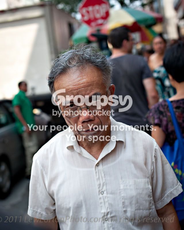
I look at this and don't think anything other then angry asian man, nothing particularly interesting but a nice shot i guess. The stop sign sort of adds a little humour to it for some reason 7/10

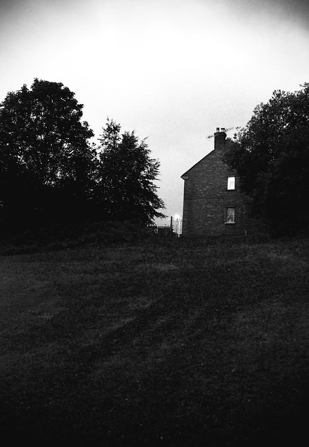
On my walk across a field at night time, saw this spooky house.

 
Sorry, but can I interject? Photo by The_Traveler, post #452. This is what I see.

Exposure on your subject is spot on. Excellent camera position. Great aperture chosen.
The fact that you have the subject's eyes pretty much dead on center is breaking the cardinal RoT. So why does this subject still command my attention even though he's not positioned in one of the "power points"?? A combination of the tilt of the camera to emphasize movement, the DoF let's you see what looks like a busy market with its primary colors but not too much definition of the supporting cast and the old man is undeniably looking straight at you....

Well done. 9.5/10
 
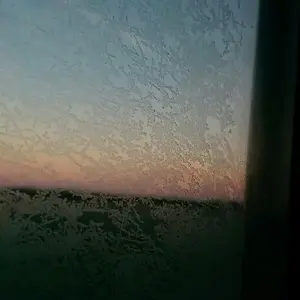
I like this photo, but I think I like it because its creepy and could be used in a vampire/slasher ext film ad- but something is off, I think its the horizon and the sky is boring and the foreground is also boring. But I don't think I would like the photo with out both. 7/10 for the creepy factor alone definitely got my mind thinking of what the story behind it is.

IMG_0883-1.jpg
 
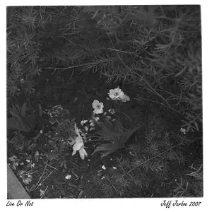
wow, is it just me or do people sometimes get a bit angry on this forum, I agree with you kundalini, the travelers photo is spot on, but you should have given the photo above you some critique... im very new but everything anyone has said to me on this forum... the good, bad and ugly has helped me in some way... I rate starkstreams photo 5/10, I love black and white photography and although the picture is flawed it was an attept.. Im my mere opinion the picture looks grainy and dark, maybe this was the intent? im not sure, also try cropping the grass out almost completly as there is not much detail in it... again, im a newbee so you might want to take what I say with a pinch of salt, but it is however an opinion.. im posting an older photo of mine, tear it to shreds if you like :)


DSC01452.jpg
 
sorry eggman, we posted at the same time! I love your picture and the idea, and its black and white, which I love, the only thing id say is that the candle should be much sharper, 7/10
 
Yeah sorry for my uneducated critique.
Don't be silly. Photography is subjective and each person has their opinion. I'm not educated in the arts, but may have been looking at photos longer and with a more ciritical eye. I saw this photo as a good example that successfully breaks "rules".

wow, is it just me or do people sometimes get a bit angry on this forum, I agree with you kundalini, the travelers photo is spot on, but you should have given the photo above you some critique...
Just so you know, there was absolutely no anger in my reply. Yes, you are correct that I should've commented on the photo above. I wanted to get my thoughts about Lew's photo down while I could remember them. I'm can get forgetful or distracted quite easily and I did not have a photo ready to post.

Peace. Carry on.
 
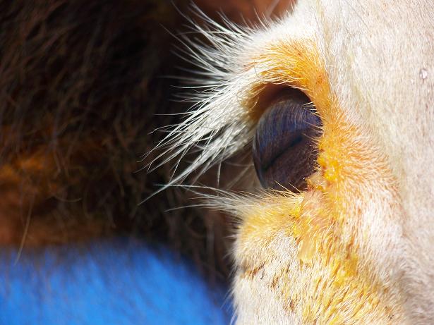
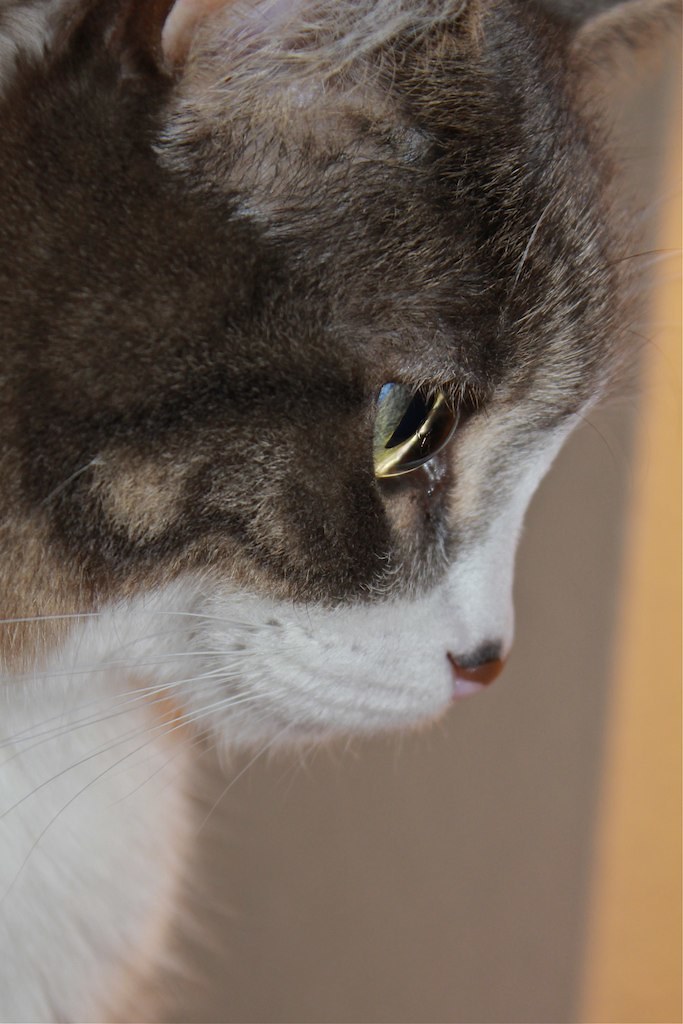
Good composition, sharpness & exposure. The blue blob in the bottom left is distracting and the biggest problem I have is that I REALLY don't know what kind of animal I'm looking at... I would guess a horse? But I like the EYEdea.. 6/10


Oh SNAP! That's right, I have a CAT shot lurking in my photo stash!
 
Last edited:
yep... its a cat

i assume it is level with the ground, but it still feels like it needs to be straitened, it makes me tilt my head when i look at it

it has that "pop up flash" feel

the dof is too shallow

and it's an awkward crop
5/10

i know it's vertically centered, but any other crop was either too tight feeling, or not tight enough, but here's mine

beatle.jpg
 
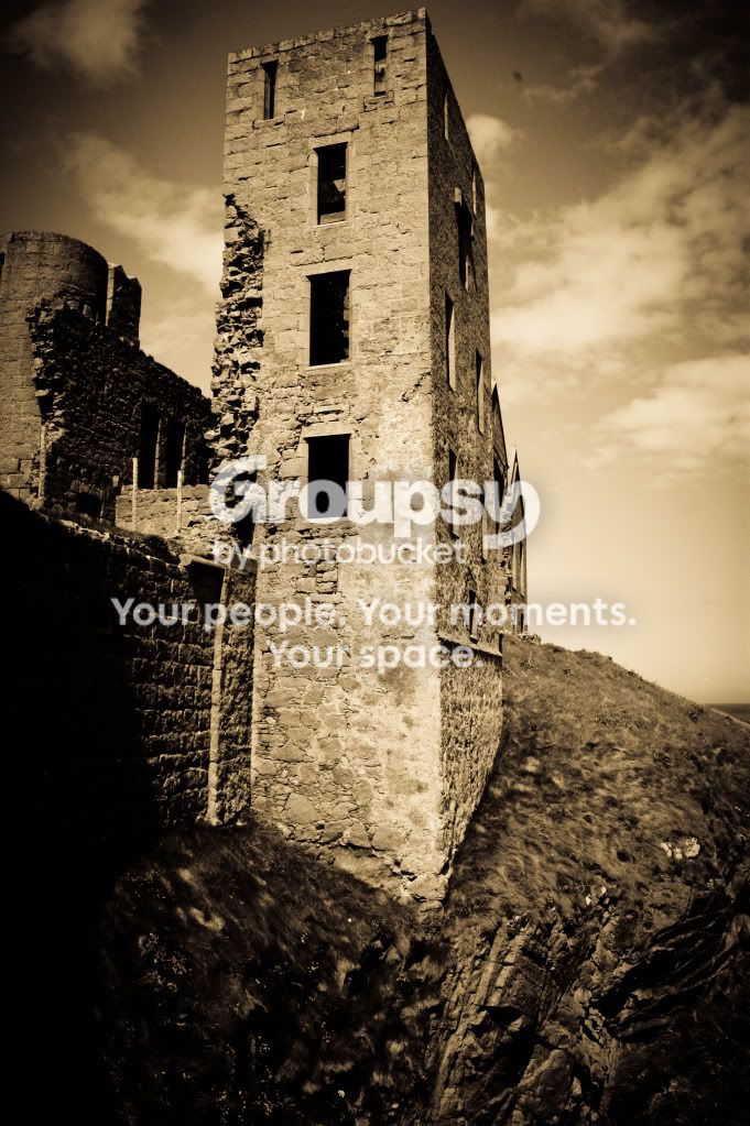
7.5/10 You were able to get just the right DOF. I like all technical sides of the photo. There is a lot of space to the right which might be better cropped. Otherwise looks good!

img5299modbw.jpg
 
6/10 the tones are a bit bland - too much middle grey sky. Might work better with a tighter crop.

5960270487_e1126db023_b.jpg
 

Create an account or login to comment

You must be a member in order to leave a comment

Create account

Create an account on our community. It's easy!

Log in

Already have an account? Log in here.

Back
Top Bottom