What's new

Rate the photo above you

Interesting 3D checkers game (I made one for my boys a long time ago)
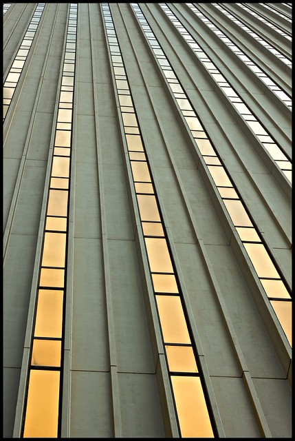
Note on the histogram that there are blown out areas, blocked up areas and not many tones in the middle.
This needed softer larger light with a reflector on the dark side to make the exposure more interesting. The perspective distortion makes the frontmost colum bend to the left and the next column straight up.
Even if this were perfectly exposed and the slants corrected, there's not a huge amount of interesting stuff and the blown out upper 1/3 doesn't add anything.

3/10

Yer those blow outs are probably because i used pro B&W Action and it makes the dark pieces too dark so i used layers and made the X closest alot brighter then it was before... maybe i should of done it with all of them but the focus was on the first column
 
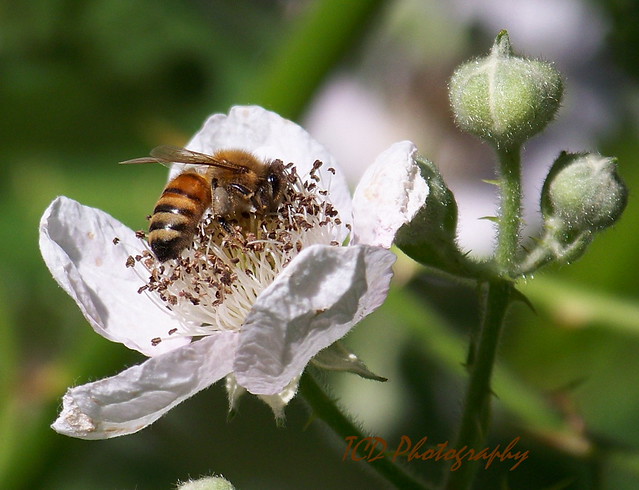
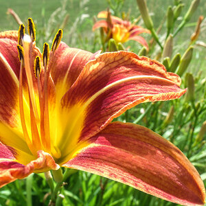
This is a great shot, very crisp and sharp. It looks a touch underexposed to my eyes but I doubt you could bring up the exposure much more without blowing the detail in the flower. Still, a very nice shot. My only nitpick is that, in my opinion, the green flower on the right competes for attention with the bee, but otherwise, well done! 8/10

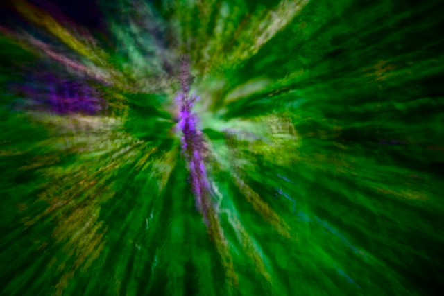
Here's one playing around with different shooting effects.

Untitled by ChrisShoemaker, on Flickr
 
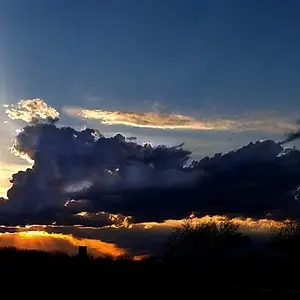
Chriss, I like the shot even though I have no idea what it is of. It has a nice aesthetic to it, and I like the way it draws the eye in to the purple near the centre. 7/10

5960768068_34274fea5a_b.jpg
 
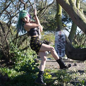
I like the shot, but her clothing choice is quite distracting to me simply because i think it's ugly :/ I'm not really big on standard portraiture, it always bores me to be honest. Putting those feelings aside tho i'll go 7/10 because her skin seems a bit too smooth, almost porcelain.

5968209677_ccbe3a6d87_z.jpg
 
8,5/10 I don't know what it is exactly, but the abstract works very well for me. :thumbup:

IMG_6569.JPG
 
8/10 I really like the off-angle view of the shot pointed upwards. It adds some depth to the effigy giving it an almost eerie feel. I'm any other photos you took from there were also very interesting.

img8938kewlmod.jpg
 
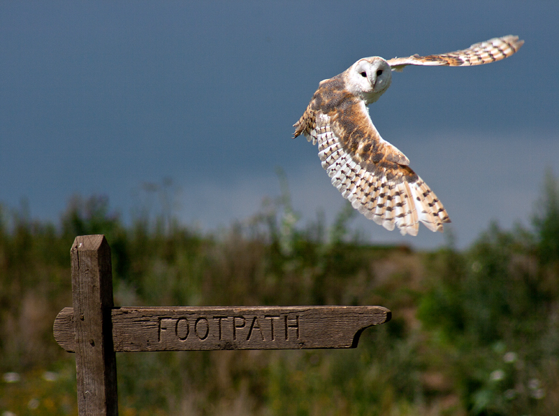
I like it. Very nice composition, the owl is sharp, it's looking at the sign. Awesome. It's underexposed, I believe, though, and that bothers me a little.

6.9/10


IMG_1300 edit by Bokehliciousness-ness, on Flickr
 
Love the way the pathway draws the eye into the shot. 7/10

5973061266_c758b27e54_z.jpg
 
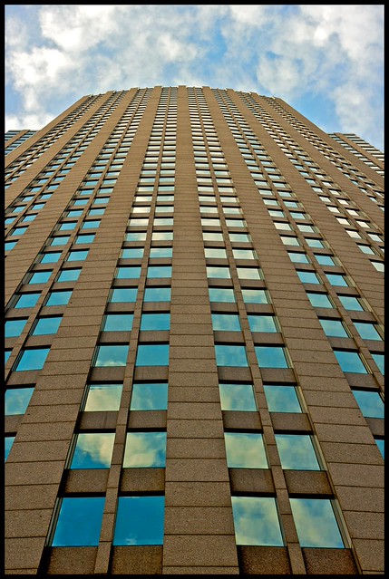
I would have to say about 8/10. But I am not that much into shooting builds so it is very hard to judge!


dancers-0224.jpg
 
Image by Bend The Light, post #489.

Rating given by Compaq, post #490
I like it. Very nice composition, the owl is sharp, it's looking at the sign. Awesome. It's underexposed, I believe, though, and that bothers me a little.

6.9/10
I'm curious about the comment of underexposure. Are you running a calibrated monitor to view images? My monitor shows a very good exposure on the subject.
 
Image by Bend The Light, post #489.

Rating given by Compaq, post #490
I like it. Very nice composition, the owl is sharp, it's looking at the sign. Awesome. It's underexposed, I believe, though, and that bothers me a little.

6.9/10
I'm curious about the comment of underexposure. Are you running a calibrated monitor to view images? My monitor shows a very good exposure on the subject.


My monitor is calibrated in the sense that I am able to distinguish from pure white to pure black on those grey tone scales or whatever you call them. Perhaps that's not what you are meaning? I called it under exposed, and I still think it is, but it's not severely under exposed imho (on my monitor). I see the white in the owl could easily be blown if one pushed the exposure up by a third, and that has already happened around the eyes. Especially with regard to the sign, I personally would like to have it a bit brighter. I realise the owl is the subject, but I feel it is strongly cooperating with the sign in this photo.
But you are much more experienced than me in this, and I may be completely off.
 

Create an account or login to comment

You must be a member in order to leave a comment

Create account

Create an account on our community. It's easy!

Log in

Already have an account? Log in here.

Back
Top Bottom