What's new

Rate the photo above you

So I'm a noob but I think this photo is pretty nice. I really like the color scheme and it makes the girl pop out more. She's also really beautiful so that always helps. 8/10 - but then again what do I know right?? LOL!
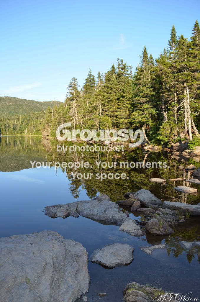
sterlingpond1.jpg
 
Also a beginner here! Your shot has nice composition/layering with the rocks leading out to the trees. I'm also a fan of the reflections in the water, definitely grade A on exposure! However my eyes want to go left, is there more lake there? Where's the rest of the panorama/wide shot? It feels like there's not enough in the frame :) 6/10
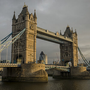

20110711-IMG_3244.jpg
 
Foxx,

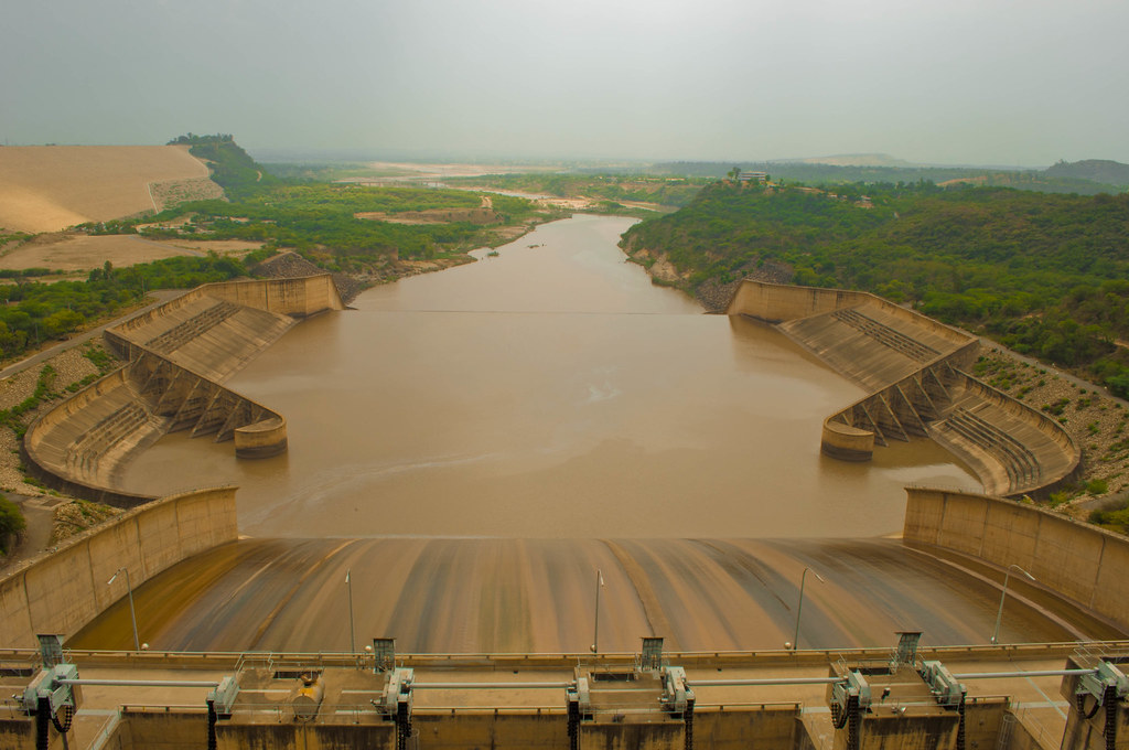
This has all the homely virtues, good DOF control, nice focus, sharp, maybe a bit over-saturated - all the supporting composition to lead up to ---------------------------.
Whoops, we are missing the subject here. Right in the center where every sight line leads, there is a dark hole.

And this is the problem here. The composition makes the bridge part of the support to the main point of interest but there isn't anything.

A good effort with all the technical stuff but there needs to be some something to pique the viewer's eye.

==============================================================================================

Taken after a demonstration on the National Mall.
The tilt is intended

teabag700__0795364.jpg
 
Last edited:
crop the tri from the top then you have the "angle" going.
free my ass sign would of been better if you had someone whose ass wasn't swallowed by his baggies, hence it needed freeing.
seems pretty soft

When nature pukes

naturepukes by tshesse, on Flickr
 
Interesting... I really like the color of the sky and how it contrasts with the dark forground - a building or structure that I can not identify. I dislike that I can not identify the dark structure in the frame. I wish that the subject had some definition to it and that it wasn't just one large black blob. The cloud formations add texture and dynamic to the frame, which I like. The road signs, light standards and hydro poles take away from this shot in my opinion. The blown out portion in the center of the light source is a little distracting to me. In my humble opinion, this scores a 5/10.


A Dusty Day on the Prairie
 
The shadows on the man in front are pretty distracting although I do like the feel the dust in the air brings to the image. 7/10 overall.
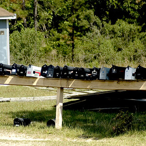
088.jpg
 
whoops, replied on the wrong photo. 7/10 moiz, i like the subject, very interesting. good thing there were people around which helps show the scale of the fort. wish the sky was a little less blown out and the image was a little sharper but nice pic overall.

compound-1.jpg
 
Last edited:
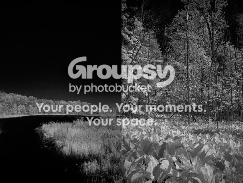
I guess it's meant to be a diptych, but the trees being cut off like that are distracting. Not a great fan of IR in general either. However, whether it was intentional or not, I like how the ground-line on the right hand side photo kind of takes over from the tree line in the left photo. This would've been better in colour. And, if they must be a diptych, I'd like to see them separated by some sort of borderline. 6/10.


Now something more manly:


French Air Force Rafale Burn by Forkie, on Flickr
 
I like the framing, symmetry, and the earthy tone. The overcast sky is a bit drab(not that there is much you could have done about it, and while I like the framing of the subject, I don't find it very interesting. 7/10


A stellar night.
stars01-1.jpg
 
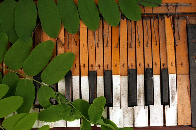
I realy like the rustic look of this, its interesting, id like to see more of the instrument, but its a nice shot 7/10


DSC03081.jpg
 
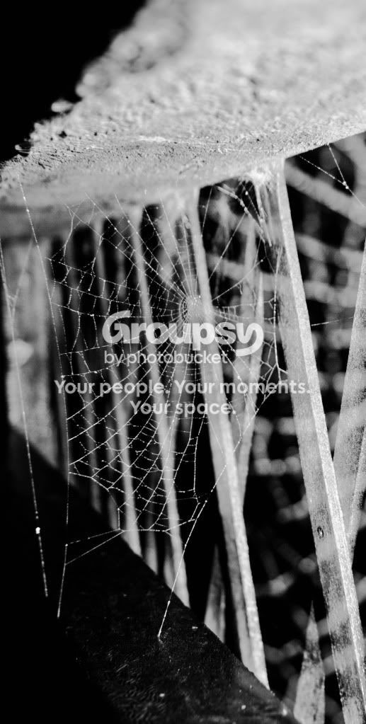
7.755555555/10 i like the composition and use of b&w. i just think the long vertical crop is a little weird and leaves a bit of negative space at the top and bottom. and i like how your eye follows the background towards the web (subject)

DSC_0175w-1.jpg
 

Create an account or login to comment

You must be a member in order to leave a comment

Create account

Create an account on our community. It's easy!

Log in

Already have an account? Log in here.

Back
Top Bottom