What's new

Rate the photo above you

wow, uhmm... that's a lot of fire... im not sure how to rate that.... for my taste, too lopsided... ...but i have no experience/knowledge with anything outside of portraits really. 6.

Candid of my cousin - SOC btw.
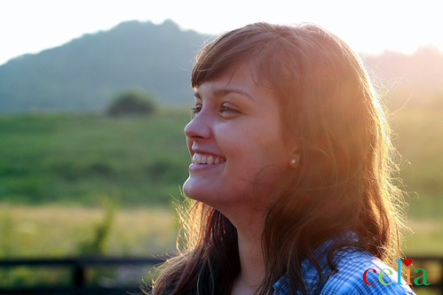
6TB by celiacphotography, on Flickr
 
Last edited:
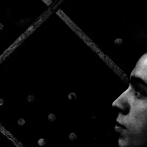
You are neither at a 2/3's mask or at a profile, somwhere in between. The far eye is an issue IMO because it breaks the plane of the far side edge. The nose is similarly breaking the plane by being positioned either too far or not near enough.

The harsh sunlight can add value in an artistic sense and does not detract here even with the lose of hair detail from the lens flair. However, the messy strands of hair on her jawline do detract quite a bit.

I think some fill flash, even from the pop-up/built-in flash or reflector would help in situations like this so that you could better expose for the background and ambient light while still properly exposing your subject.

6/10


1065488295_NqDdu-XL.jpg
 
Last edited:
:lol:
 
Kundalini...3/10
If you're talking about the Gary Coleman video, yeah I can go with that. If you talking about the image of the anole, you can go phuque yourself with that rating. It is meaningless without any descriptives.
 
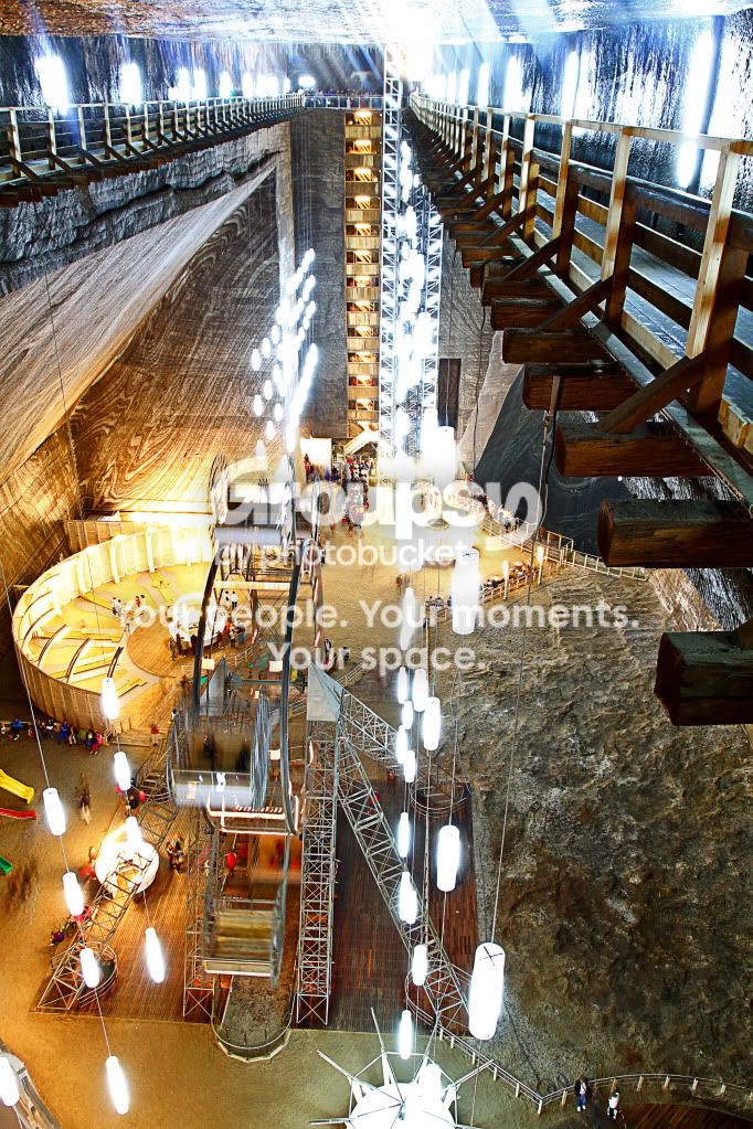
Hardrock - 7 - it's a huge visual impact, jumping right off the screen and capturing my attention and the colors are so vibrant but I can't make out what's going on, it's so busy. Too bad it can't be cropped to just the top half of the room, that is the best part IMO.


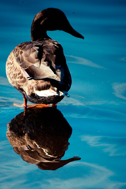
doubleduck (1 of 1) by lifebyme, on Flickr
 
Kundalini...3/10
If you're talking about the Gary Coleman video, yeah I can go with that. If you talking about the image of the anole, you can go phuque yourself with that rating. It is meaningless without any descriptives.

So its real hard for me to know if you are joking or not. The anole doesn't come close to any of the other images that you have posted as far as quality. Yeah its sharp but the anole is on a window screen (would have liked to see him in a more natural environment) and the crop is wierd for me its not quite close enough or enough of the body. Just my thoughts and I stick with my rating which is just my opinion... Maybe someone else can give you another rating.
 
So its real hard for me to know if you are joking or not. The anole doesn't come close to any of the other images that you have posted as far as quality. Yeah its sharp but the anole is on a window screen (would have liked to see him in a more natural environment) and the crop is wierd for me its not quite close enough or enough of the body. Just my thoughts and I stick with my rating which is just my opinion... Maybe someone else can give you another rating.
Thanks Hardrock for taking the time to come back and explain the reasons for your rating. The actual rating didn't bother me, but the lack of any dialogue was not constructive for anyone reading this thread. A lot of newbies are contributing here and it will be a definite benefit to them if some thought process is provided why a person rating an image finds it favorable or not. I realize this is a light-hearted "fun" thread, but if we can learn something in the process, all the better. Additionally, I considered the anole a reasonable example to further demonstrate to duck411's image I rated. It was strongly backlit and by adding some fill flash, I didn't get a silhouette of my subject.

Let the rating stand. Peace.
 
Hardrock - 7 - it's a huge visual impact, jumping right off the screen and capturing my attention and the colors are so vibrant but I can't make out what's going on, it's so busy. Too bad it can't be cropped to just the top half of the room, that is the best part IMO. doubleduck (1 of 1) by lifebyme, on Flickr
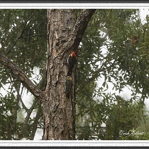
I like the idea of the shot, but the subjects face is totally blown out and not even visible on my monitor at least. The saturation is perfect, the composition I'm not really feeling, too much empty space on the right. 5/10.Photo taken from the Canadian National Exhibition.
nik670201.jpg
 
Last edited:
The sculpture alone looks very interesting!! The way you have presented the sculpture it makes it look like snap shot. The guy behind the sculpture and the rest of the background is very distracting. It has ruined the photo for me. I know you prolly didn't have optimal conditions to take this shot but the things I listed ruined it for me. Patience is half the battle. 5/10
6066952076_2e999709ab_z.jpg
 
Hi - this is my first post. I spent the last hour reading through this thread and it is amazing! I feel like it is the best hour of learning I have spent on photography.

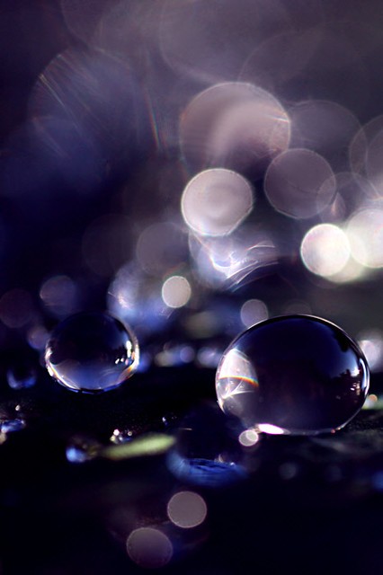
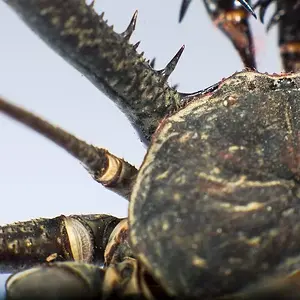
I give the above photo a 9/10. I really like the composition with the 2 drops and how the "round" theme carries through the entire image. Like I said...I am new, so my critique might not be very good...but I tried.

IMG_5556 | Flickr - Photo Sharing!

I tried to put the picture into the post as an image but it kept telling me that the URL was invalid?!
 
Last edited:
Create an account or login to comment

You must be a member in order to leave a comment

Create account

Create an account on our community. It's easy!

Log in

Already have an account? Log in here.

Back
Top Bottom