ricardouribeb
TPF Noob!
- Joined
- Feb 4, 2014
- Messages
- 14
- Reaction score
- 11
- Location
- Guadalajara, Jalisco
- Website
- www.facebook.com
- Can others edit my Photos
- Photos NOT OK to edit
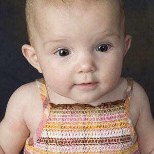
Hey guys! I've been taking a couple of shots lately and I wanted some critique on them, like hard critique! A little background of myself: I've been shooting for two years now, and my aspiration is to be a successful fashion photographer! I want to shoot for big names, and really big on it. Maybe be some day like Mario Testino! I practice as much as my design college and free time lets me, once I'm done with design school, I'm going full time into this. I'm 21 years old, living in Mexico.
Thanks everyone!


Thanks everyone!
")

![[No title]](/data/xfmg/thumbnail/30/30882-ce388519574371448d7493784524607a.jpg?1619734495)
![[No title]](/data/xfmg/thumbnail/42/42023-bdd979ff50e78cc28479297780caeb90.jpg?1619739981)