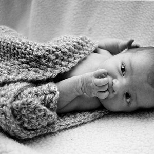
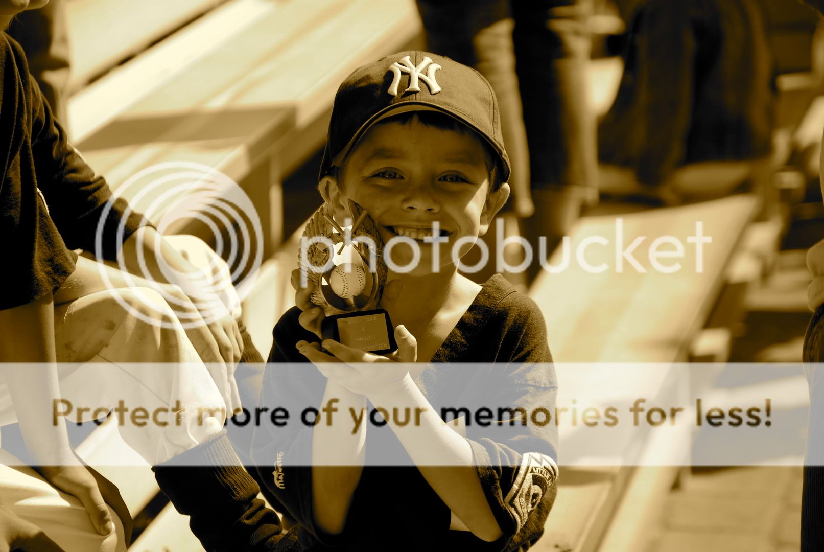
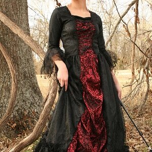
I think you could do this old-timey using some form of split toning (that sepia is very, very, very orange), but you have to solve the image's original problems first. The crop, as mentioned. Also, when you think in limited colors (black and white, quadtone, split tone, etc), you have to address the tonality of the image. When you did the sepia conversion, the subject's face becomes a background tone and very flat. It needs to 'pop'. There are some problems that are difficult if not impossible to solve here regarding the light and the in-focus backgrounds, but I think for what you're looking for that's not going to be too much of a setback.
Since you indicate your images are OK to edit, I put in about half an hour trying a few things out. Did a few tonal mods with curves, did the crop to a 5x7 ratio, did a black and white conversion on the lightness channel applied to itself with a 40% (or so) multiply, then did the split tone conversion with the black and white tool in photoshop. It defaults to a darker set of browns. I did that on a separate layer so I could fade the B&W version in behind it until it got the tone I was after. At the end I added a bit of grain on a separate layer, some more curve adjustments on an adjustment layer affecting only the luminosity, and added a very faded burn around the edges of the photo (in lieu of doing any vignetting with the lens correction tool).
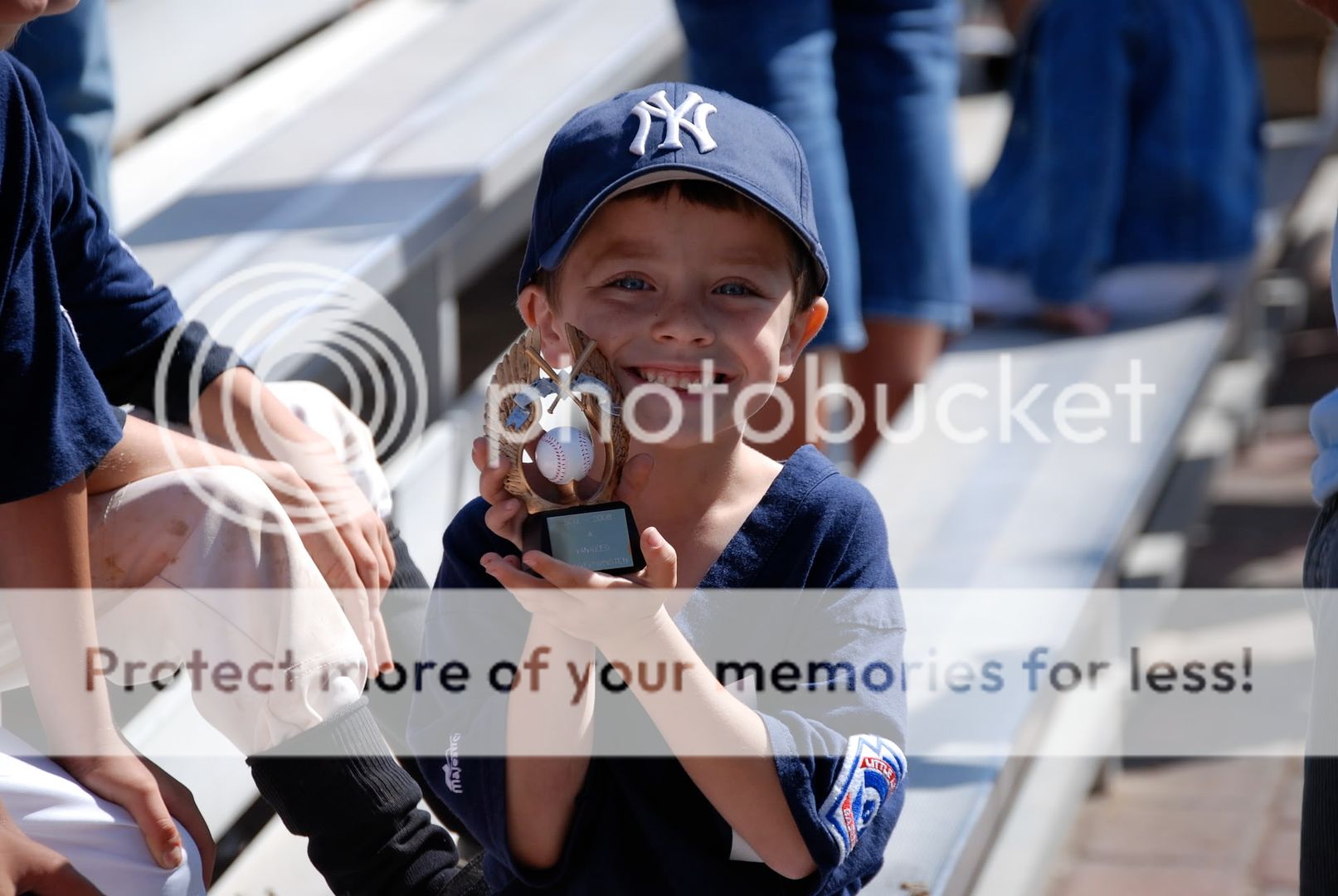
The most distinct disadvantage with the image in making it look 'old timey' is that the subject is holding something up that says '2008'.
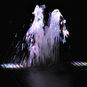
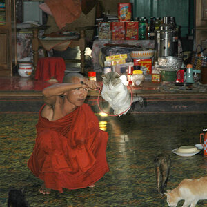
I say leave it in color. I think it looks fine with a warm tone, but the I think all the blue (and hardly any other colors) makes for a stronger color photo.
The problem is that you really want the subject's face to be the brightest part of the photo, and here you have two large, much brighter patches right up against the face on both sides.
I think you could do this old-timey using some form of split toning (that sepia is very, very, very orange), but you have to solve the image's original problems first. The crop, as mentioned. Also, when you think in limited colors (black and white, quadtone, split tone, etc), you have to address the tonality of the image. When you did the sepia conversion, the subject's face becomes a background tone and very flat. It needs to 'pop'. There are some problems that are difficult if not impossible to solve here regarding the light and the in-focus backgrounds, but I think for what you're looking for that's not going to be too much of a setback.
Since you indicate your images are OK to edit, I put in about half an hour trying a few things out. Did a few tonal mods with curves, did the crop to a 5x7 ratio, did a black and white conversion on the lightness channel applied to itself with a 40% (or so) multiply, then did the split tone conversion with the black and white tool in photoshop. It defaults to a darker set of browns. I did that on a separate layer so I could fade the B&W version in behind it until it got the tone I was after. At the end I added a bit of grain on a separate layer, some more curve adjustments on an adjustment layer affecting only the luminosity, and added a very faded burn around the edges of the photo (in lieu of doing any vignetting with the lens correction tool).
The most distinct disadvantage with the image in making it look 'old timey' is that the subject is holding something up that says '2008'.
wow. could you teach me to edit like that? you did a number on my photo, and I have some others I am wondering if you could take a look at. Could you also email me the photo?


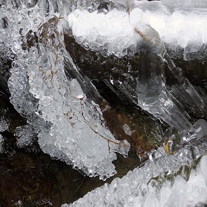
![[No title]](/data/xfmg/thumbnail/37/37489-27b092c23ed6ad63eee4cd03f96a311a.jpg?1619738111)