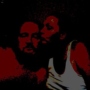
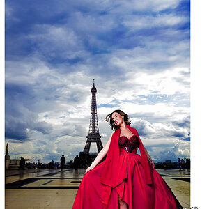
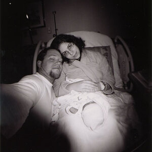
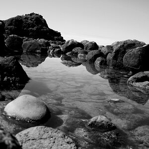
Not bad; a few thoughts for future improvement. Remember that your camera will work when rotated 90 degrees to what is known as "portrait aspect". People, generally, are tall and [relatively] thin, why not shoot that way? In the first image, it should be leveled as it leans down to the right. Composition-wise, the background is rather busy and distracting, and the vertical stacks are competing with the talent; I suspect that moving a little bit and shooting in portrait aspect would have helped greatly. In #2, he's got a great look, but you've cropped awkwardly; either move in tight on his face, or open up to include a little more of his upper body. Fill light was desperately needed. Shadows are great, but here they're just a little too deep. In #3, you have rather flat, uninteresting but even lighting. The main issue however is the huge preponderance of vertical elements which again compete with the talent for the eye's attention.


![[No title]](/data/xfmg/thumbnail/40/40299-41bf1ccac2889096fb5f4fcffdd56721.jpg?1619739411)
![[No title]](/data/xfmg/thumbnail/40/40296-1e3931509698e96fed6a0e43f5cb4adc.jpg?1619739411)

![[No title]](/data/xfmg/thumbnail/33/33875-e155733428c9a8d5f34bbc19e80e29a6.jpg?1619736181)
![[No title]](/data/xfmg/thumbnail/37/37602-1ef8dbb1c2d0e4ff347ee65d328c3603.jpg?1619738147)