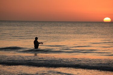
2. Good - but watch that horizon line. You've got the ocean tilted. I like the solitude of the lone fisherman at sunset.
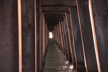
3. Good & Bad. You've got an image of structure and repetition. It's not leading to anything, which would help the image, but these are always good learning shots. But in this case the focus is soft. Watch the depth of field and focus. Images of structure and strength look better if they show tack-sharp detail.
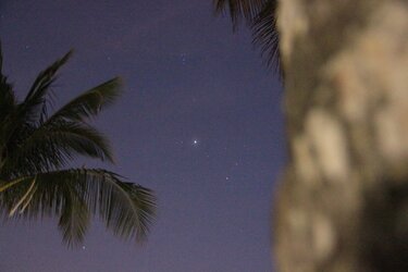
4. Ok, I'm a sucker for photos of stars. I see you've got the Pleiades, Hyades, and Jupiter in this one. Foreground elements (such as a tree in your case) can add some nice interest to a photo of just stars alone. There's a ton of "noise" in this image as well as elongated stars (especially noticeable in the top and left sides). But I'm REALLY distracted by whatever it is that's covering up the right 1/3rd of the image. Is that the trunk of a palm tree?
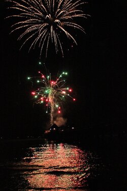
5. Nice detail on the fireworks and I do like the multicolored red/green reflection off the water. It's a bit soft on the water.
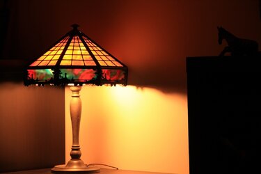
1 isn't bad at all. The silhouetted horse makes it, I think. It's certainly not to everyone's taste, though.
2 and 3 are pretty decent examples of cliches we have seen.. well, a lot. Really a lot. A LOT, if you know what I mean. Technical remarks above apply, but they're not the main problem.
I don't know what to make of 4. It's technically a horror show, noisy, out of focus foreground elements, what now? On the other hand, like 1, it kind of holds my attention and makes me wonder a bit. It's got a weird point of view sensation to it, like I am waking up on the beach incredibly hung over, an hour before dawn. If you lost the palm fronds, the tree trunk, or the stars it would disintegrate to nothing. As is, it's something. I just dunno if it's a good something.
5 isn't a bad take on fireworks. I sort of dig it. It looks technically weak as well, I'm not sure why but the color feels bad and wrong. Not enough gamut or something?

![[No title]](/data/xfmg/thumbnail/35/35262-02f8eba4a2a92dbae0b55547bba80b4f.jpg?1619736968)
![[No title]](/data/xfmg/thumbnail/32/32805-61ca9a4fb87d37c0ef4f991ac1705e1f.jpg?1619735667)

![[No title]](/data/xfmg/thumbnail/35/35867-0c74c728d92f908264af585fd93bd36c.jpg?1619737194)
![[No title]](/data/xfmg/thumbnail/35/35868-15d995e4052bf05e2038e8b2a545a08f.jpg?1619737195)
![[No title]](/data/xfmg/thumbnail/30/30986-0fbf9af8f70b46ce37aeb237ba68b573.jpg?1619734551)