What's new

Tell me about the color.

limr33 3

Moderator
Staff member
Supporting Member 📸
Joined
Jun 9, 2013
Messages
20,814
Reaction score
13,166
Can others edit my Photos
Photos NOT OK to edit
Which one looks better?

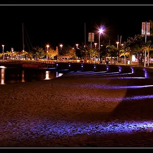
Here's the first version, edited on my laptop:

Come in we're open
by limrodrigues, on Flickr

Here's the second version, edited on my new external monitor. This monitor is clearly warmer than my laptop, and now the first version looks like it's got a greenish tint that I didn't really notice on the laptop (although it was also late when I edited and so it might have been there but my brain didn't register it.) I'm not sure if the monitor is too warm or if my laptop was too cool.

Come in we're open b.webp


Edit: A third version after making a few tweaks on my monitor and revisiting the picture:
Come in we're open c.webp
 
Last edited:
Technically, I like the colors of the seconds. Atristically, I prefer the first as it looks a bit more 'aged' to fit the subjects.
 
Dois.
 
Like the 2nd better. Probably could crop and tweak but nice colors.
 
I agree with Sparky; the first seems more appropriate, but the second more accurate ('though it seems trifle blue still). Looks like a neat place. I love off-beat flavours of fizzy.
 
  • Thread Starter 🔹
  • Moderator 🛠️
  • #6
Hmmmm, interesting...
give-it-a-ponder-o.gif


Thanks for the responses!

Anyone else? Keep 'em coming! :D
 
  • Thread Starter 🔹
  • Moderator 🛠️
  • #7
Bueller?
 
On purely esthetic grounds, I prefer the first as its colours look somewhat more what I remember. Of course, I never was there, so my memory on that can be a little hazy. On the other hand, we often "remember" stuff what never was and could never be, so why make an exception in your case? I totally remember it looking like the first. The second is 'way too clean.
 
The first image is a little too warm, the second looks about right as far as color temperature is concerned but both images have a fairly strong cyan cast.
 
Neither look accurate to me but I find the first more pleasing... the color matches a certain atmosphere that I like
 
1
 
  • Thread Starter 🔹
  • Moderator 🛠️
  • #13
See, and this is why color shooting is often a mindf*** to me. On my laptop, the first version seems fine. On the new monitor, it was clearly greenish and the second looked fine. On my netbook, they both looked almost exactly the same. On my computer at this job, the second looks too blue (but then again, this monitor is crappedy crap crap, so I don't trust it at all.) And on no computer have I seen a strong cyan cast on either one.

The only way to tell is to print. Guess I have to get printing :)

Thanks everyone very much for your input! :1247:
 
I like the first one for the color fitment of the subjects, so - 1
 
I love the image! My vote is #1.
 

Create an account or login to comment

You must be a member in order to leave a comment

Create account

Create an account on our community. It's easy!

Log in

Already have an account? Log in here.

New Topics

Back
Top Bottom