The Study - Model (Last Room) C&C Welcome!

Should be darker.
 
I like the first one. Has good balance. Not one complaint! :)
 
Nothing really jumps out at me as being wrong in this one, but someone else may see something!
Look good to me!!!
Is this the last of this shoot?
 
Last room, we'll there's one more on my flickr that I am not sure I'll post. I have a few more I may edit; a headshots and closer view of her by the doors

Thanks, I like the light better in the first one also ;)
 
This might be my favorite of the bunch.

I wish there was just a hair more breathing room under her elbow.
 
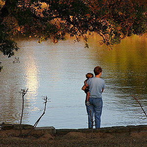
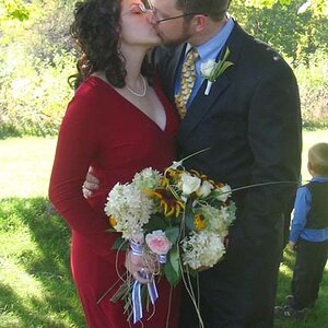
Give me your impressions here? My attempt to go dark & contemplative.


_POR9445-Edit
by WSG Photography, on Flickr

Good photo, nice work. Let me offer some reactions/suggestions...

1. I don't think this is too dark. I'd actually like it to be a tad lighter so we see more detail/lace on her top.
2. Wish her right hand didn't appear to be a fist but instead, fingers were extended to laying on the arm of the chair or the desk.
3. I like the hair: how the part is on the far side, the bulk of the hair is on the camera's/viewer's side.
4. I rate her actual pose as "okay but not great." She's in a study, a big oversized comfy chair--all sorts of things she could do with that basic pose to make it look more relaxed or reflective or energized or sexy or something. It's not a bad pose or a stiff pose, it's just that she's sexy, it's a good location, she's dressed provocatively and so that pose seems like a missed opportunity to me.
 
CLONE OUT THAT DAMN OUTLET!
 
Last room, we'll there's one more on my flickr that I am not sure I'll post. I have a few more I may edit; a headshots and closer view of her by the doors

Thanks, I like the light better in the first one also ;)

I checked out the photo on Flickr, it's the closest I have seen to her smile yet! ;)
It's not the best of the set, but I do like it! :)
 

Most reactions

New Topics

Back
Top