Mishel
TPF Noob!
- Joined
- Nov 12, 2009
- Messages
- 43
- Reaction score
- 0
- Website
- www.digitalphotographywriter.com
- Can others edit my Photos
- Photos NOT OK to edit
I guys, first photos and I want to hear you opinion about it.
Took it on my friends' Wedding:
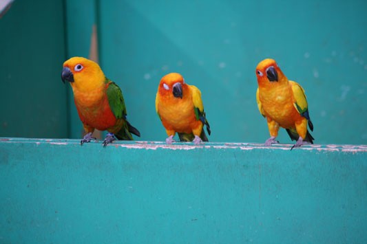
At the safari, Hello Ducky:

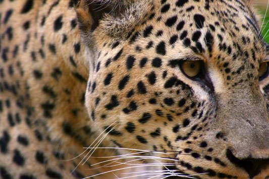
A Lion portrait (no, it wasn't that close, if yes, I wouldn't be here ):
):
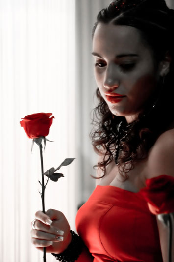
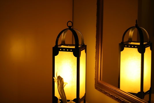
Reflection:
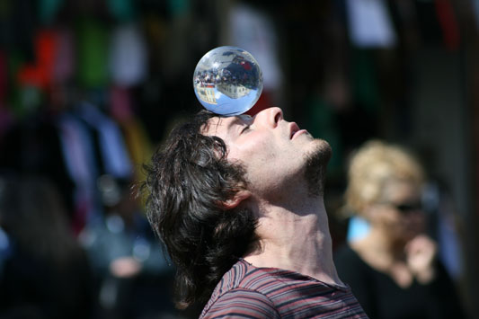
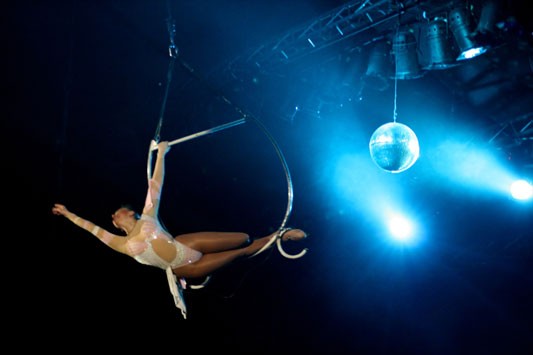
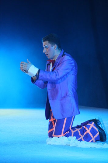
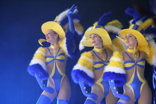
At the circus:
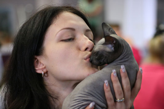
A girl and a cat:
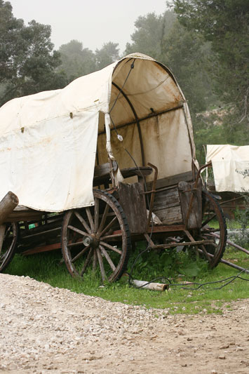
A wagon:
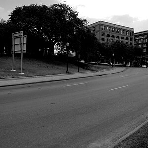
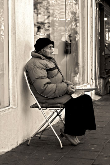
My B&W attempt:
Another circus photo:
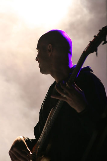
At a music show:
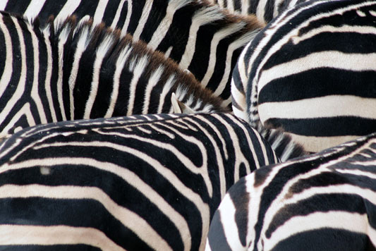
Zebras' Conspiracy:
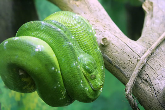
Don't wake him up, he is evil:
At the hotel (sorry for the bag at the bottom, my fault):
Shot with the Canon 400D. I want to hear you opinion, you can be rough, I want to get better.
Took it on my friends' Wedding:
At the safari, Hello Ducky:
A Lion portrait (no, it wasn't that close, if yes, I wouldn't be here
):
Reflection:
At the circus:
A girl and a cat:
A wagon:
My B&W attempt:
Another circus photo:
At a music show:
Zebras' Conspiracy:
Don't wake him up, he is evil:
At the hotel (sorry for the bag at the bottom, my fault):
Shot with the Canon 400D. I want to hear you opinion, you can be rough, I want to get better.
Last edited:


![[No title]](/data/xfmg/thumbnail/36/36134-64e77d33cc4c68e1253adc2879f24a96.jpg?1619737387)

![[No title]](/data/xfmg/thumbnail/41/41935-851da2b46dc9cbb829c8c42b2aa84873.jpg?1619739947)
![[No title]](/data/xfmg/thumbnail/36/36135-6594fe1d58af0053c3e939665e543ce4.jpg?1619737388)