What's new

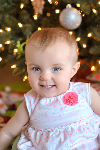
WB? Did I do better with this one?

Super cute! The only thing I could suggest would be to shoot "eye to eye" with her..
As for calibration, bring 5 color photos to a print house. Go home and after running the calibration wizard.. try to match the color as close as possible.
It might not be super-acurrate but it's certainly cheap enough!

Super noob over here.. I don't know what you mean by eye to eye unless you mean down at her level.. which I did do here, or so I think? And then a print house? Clueless. Though I am venturing to say we won't have anything of the sort in my city. lol

I would guess your camera was about 6-10 inches about her eye line..
A print house, or shoot. .just go to wal-mart.. bring 5-6 pictures with you that vary in color and contrast.. use those to adjust your monitor.
 
I don't know what software you have available -- I used Photoshop.

There are numerous methods you can use to evaluate skin tones. Of course there's going to be some variation between individuals as well as between races, but there are also averages. One of my favorite and most direct methods is to simply measure the Hue value. In digital photo Hue values range from 0 (red) to 360 (back to red). Moving forward from 0 you're headed for yellow, moving backward from 360 you're headed for blue.

So the first thing I did was measure the values in your second photo. I opened the Color Picker in Photoshop and set the eyedropper to a 5x5 pixel average and sampled areas all over the child's face. I got values too high to be within an average range. I read some values above 30 which is way too yellow. Now I knew what was needed.

I set the mode of your photo to Lab and created a Levels adjustment layer. I then began in the "b" channel to reduce the midpoint value to less than 1 and in the "a" channel to raise the midpoint value above 1. I settled on "a" = 1.04 and "b" = .94. As I proceeded I continued to use the Color Picker to sample Hue values until I was getting values in the mid to high teens up to the mid twenties. For a child like this the average (sRGB color space) should be around 18 to 20.

I noticed the color casts in her top and removed those as a second step. I did a quick selection of her top and used Hue/Saturation to desaturate the white material. You do have some blown spots in her top, I didn't fix them; they're just less obvious with the surrounding colors removed.

Joe

Mad fotoshops skillz FTW, yo! :salute:
 
I agree, answer's in the middle.

Joe

View attachment 28331

That looks so good! Can you tell me how you got to this? I was also having issues with parts of her top looking blown and you seemed to have nailed that too!

I don't know what software you have available -- I used Photoshop.

There are numerous methods you can use to evaluate skin tones. Of course there's going to be some variation between individuals as well as between races, but there are also averages. One of my favorite and most direct methods is to simply measure the Hue value. In digital photo Hue values range from 0 (red) to 360 (back to red). Moving forward from 0 you're headed for yellow, moving backward from 360 you're headed for blue.

So the first thing I did was measure the values in your second photo. I opened the Color Picker in Photoshop and set the eyedropper to a 5x5 pixel average and sampled areas all over the child's face. I got values too high to be within an average range. I read some values above 30 which is way too yellow. Now I knew what was needed.

I set the mode of your photo to Lab and created a Levels adjustment layer. I then began in the "b" channel to reduce the midpoint value to less than 1 and in the "a" channel to raise the midpoint value above 1. I settled on "a" = 1.04 and "b" = .94. As I proceeded I continued to use the Color Picker to sample Hue values until I was getting values in the mid to high teens up to the mid twenties. For a child like this the average (sRGB color space) should be around 18 to 20.

I noticed the color casts in her top and removed those as a second step. I did a quick selection of her top and used Hue/Saturation to desaturate the white material. You do have some blown spots in her top, I didn't fix them; they're just less obvious with the surrounding colors removed.

Joe

Thanks! Hopefully this weekend I can get on my desktop for photoshop.. I only have lightroom on my laptop that I'm usually on. I will try and play in there with the information you shared. :)
 
That looks so good! Can you tell me how you got to this? I was also having issues with parts of her top looking blown and you seemed to have nailed that too!

I don't know what software you have available -- I used Photoshop.

There are numerous methods you can use to evaluate skin tones. Of course there's going to be some variation between individuals as well as between races, but there are also averages. One of my favorite and most direct methods is to simply measure the Hue value. In digital photo Hue values range from 0 (red) to 360 (back to red). Moving forward from 0 you're headed for yellow, moving backward from 360 you're headed for blue.

So the first thing I did was measure the values in your second photo. I opened the Color Picker in Photoshop and set the eyedropper to a 5x5 pixel average and sampled areas all over the child's face. I got values too high to be within an average range. I read some values above 30 which is way too yellow. Now I knew what was needed.

I set the mode of your photo to Lab and created a Levels adjustment layer. I then began in the "b" channel to reduce the midpoint value to less than 1 and in the "a" channel to raise the midpoint value above 1. I settled on "a" = 1.04 and "b" = .94. As I proceeded I continued to use the Color Picker to sample Hue values until I was getting values in the mid to high teens up to the mid twenties. For a child like this the average (sRGB color space) should be around 18 to 20.

I noticed the color casts in her top and removed those as a second step. I did a quick selection of her top and used Hue/Saturation to desaturate the white material. You do have some blown spots in her top, I didn't fix them; they're just less obvious with the surrounding colors removed.

Joe

Thanks! Hopefully this weekend I can get on my desktop for photoshop.. I only have lightroom on my laptop that I'm usually on. I will try and play in there with the information you shared. :)

You can still use LR to check skin tones, but it is just not as detailed as PS. You will just need to learn how to read RGB values and how luminance plays a role. I rarely go into PS anymore to check my skin tones, I will just do it straight from LR4.
 
I'm posting this for the sake of conversation and for my own purposes with respect to color management within browsers and programs.

The following is the original photo with only the green color cast removed and no further action with respect to skin tones:

i-qRtR3g3-M.jpg


I'm not posting because I think this is better or worse, but simply as a comparison to Ysarex's edit.
When I downloaded his edit to my PC, the white blouse was no longer white and looked a bit dingy (relatively speaking) despite the skin tones being pleasant.

Further complicating matters on my end is that, though my monitor is calibrated, it's also wide gamut.
Reds can get a bit cranked within certain browsers. So I was curious as to how this might look when I uploaded it.
Your thoughts/opinions are appreciated.
 
I'm posting this for the sake of conversation and for my own purposes with respect to color management within browsers and programs.

The following is the original photo with only the green color cast removed and no further action with respect to skin tones:

i-qRtR3g3-M.jpg


I'm not posting because I think this is better or worse, but simply as a comparison to Ysarex's edit.
When I downloaded his edit to my PC, the white blouse was no longer white and looked a bit dingy (relatively speaking) despite the skin tones being pleasant.

Further complicating matters on my end is that, though my monitor is calibrated, it's also wide gamut.
Reds can get a bit cranked within certain browsers. So I was curious as to how this might look when I uploaded it.
Your thoughts/opinions are appreciated.

I think this looks better than both of mine, but I still think I prefer Ysarex's edit on it. And yes, she appears a lil more pink-ish on my browser I think? Though I've only just started my cup of coffee and not all the way awake yet. lol
 
You can still use LR to check skin tones, but it is just not as detailed as PS. You will just need to learn how to read RGB values and how luminance plays a role. I rarely go into PS anymore to check my skin tones, I will just do it straight from LR4.

I have been playing with the dropper and I seem to have a hard time finding white spots that don't make the image crazy orange or yellow? Any tips? I tried using eye whites, teeth, different parts of the blouse.. and they seemed to either not change the image tones or go way yellow/orange. I'm using LR3 also.. is 4 better with this maybe?
 
I'm posting this for the sake of conversation and for my own purposes with respect to color management within browsers and programs.

The following is the original photo with only the green color cast removed and no further action with respect to skin tones:

i-qRtR3g3-M.jpg


I'm not posting because I think this is better or worse, but simply as a comparison to Ysarex's edit.
When I downloaded his edit to my PC, the white blouse was no longer white and looked a bit dingy (relatively speaking) despite the skin tones being pleasant.

Further complicating matters on my end is that, though my monitor is calibrated, it's also wide gamut.
Reds can get a bit cranked within certain browsers. So I was curious as to how this might look when I uploaded it.
Your thoughts/opinions are appreciated.

Looks really good -- a bare smidge cooler than mine, but well within tolerance as far as skin tones go. You removed the green which was the problem with the original. I started with the second version and removed the orange.

Joe
 
I have been playing with the dropper and I seem to have a hard time finding white spots that don't make the image crazy orange or yellow?

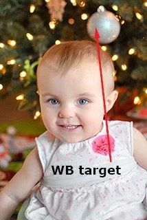
Have you tried going off that white ornament just over her head? It appears to include a lot of grey pixels.
 
You can still use LR to check skin tones, but it is just not as detailed as PS. You will just need to learn how to read RGB values and how luminance plays a role. I rarely go into PS anymore to check my skin tones, I will just do it straight from LR4.

I have been playing with the dropper and I seem to have a hard time finding white spots that don't make the image crazy orange or yellow? Any tips? I tried using eye whites, teeth, different parts of the blouse.. and they seemed to either not change the image tones or go way yellow/orange. I'm using LR3 also.. is 4 better with this maybe?

It's called a "white" balance tool or dropper and people get this idea that you need to use it on something that's "white." It works with any target that is neutral -- grey, and it often works better when the target is closer to a middle grey. You actually have a pretty good WB target in this photo, but you have to watch out for reflections. Here it is:

$target.webp

Joe


Joe,

That's exactly the same spot I used on mine. They are very close to each other!

I didn't actually use that as a WB target, I was just pointing it out to the OP. I checked it to see the result but then I completed my edit manually. I agree it gets the photo very close to right -- a silver ornament is of course neutral if it's not picking up a reflection, almost as good as a greycard.

Joe
 
using the silver ornament and dropper in LR3. thank you for all of the input and help with this everyone! I feel like I'm getting it.


DSC_0115-3 by lovemyhero, on Flickr
 

Create an account or login to comment

You must be a member in order to leave a comment

Create account

Create an account on our community. It's easy!

Log in

Already have an account? Log in here.

New Topics

Back
Top Bottom